Table of Contents
Loved what you read? Share it with others!
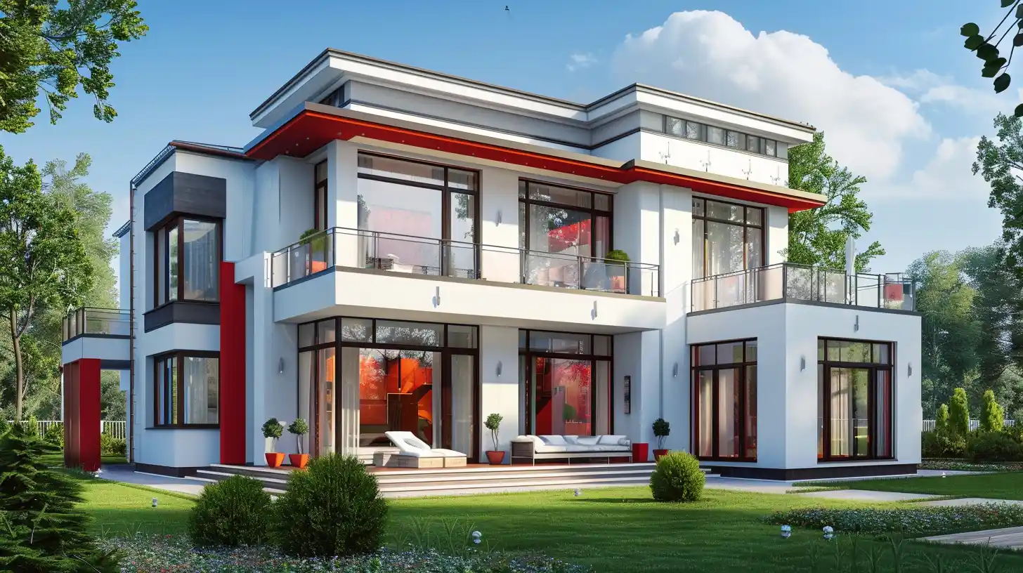
21 Best Front Elevation Colour Combinations with Codes for Modern and Stylish Homes
Updated : September 2, 2025, 4:02 PM
Author :
![]() Priyanka.saha
Priyanka.saha
Table of Contents
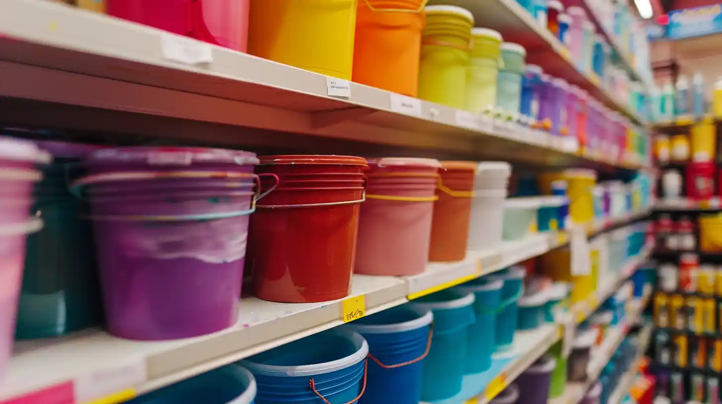
Front elevation colour combinations give the first impression of the house and make a significant difference in its overall beauty. The right house elevation painting colour combinations can add freshness, elegance and value. In 2025, some popular choices include white with charcoal, beige with brown, pastel green with off-white, and cream with a wooden texture. These blends give a modern and welcoming design. Leading paint brands, such as Asian Paints, Berger, Nerolac, and Delux, provide long-lasting exterior paints that offer protection against the weather. Prices are usually from ₹250 to ₹500 per litre, depending on the product and finish. A smart colour selection can make your house stand out beautifully.
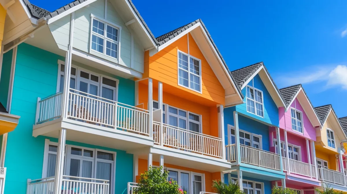
20+ Best House Front Elevation Colour Combination With Codes
Choosing the right house elevation colours can transform your house exterior into something modern and stylish. Below are 20+ best house elevation colour combinations with codes for perfect inspiration.
1. Colour Combination for Front Elevation With Coastal Harmony
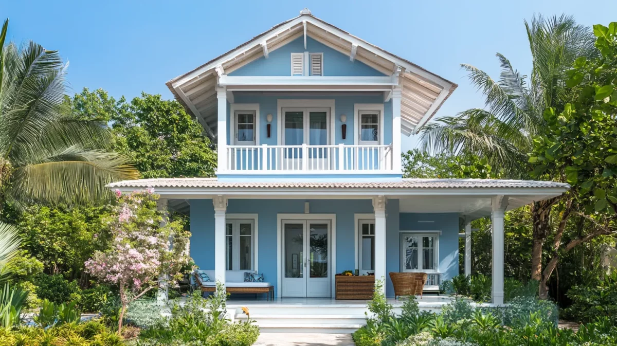
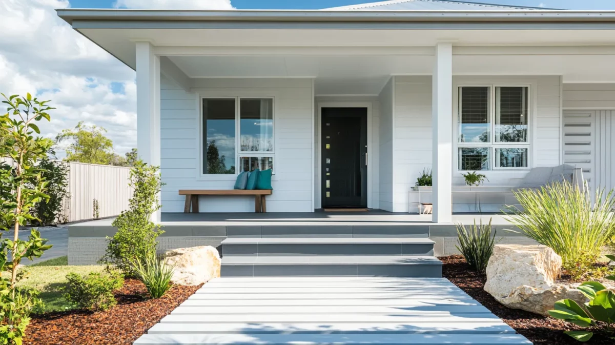
This is one of India's most popular front-side front elevation colour combinations. Embrace the tranquility of coastal living with soft pastel blues, sandy beiges, and crisp whites. This colour scheme evokes the calming essence of beachfront properties, creating an inviting and serene ambience. Imagine relaxing on your front porch, sipping a cool drink while feeling the gentle sea breeze against a backdrop of these soothing coastal hues.
Colour Codes:
- Asian Paint:
- Blue: Hawaiian Blue (9703)
- Beige: Beige Accent (8505)
- White: White Bush (L176)
- Berger:
- Blue: Blue Gin (5T2224)
- Beige: Vay Sands (8T2739)
- White: White Sphere (8P2679)
- Nerolac:
- Blue: Dusty Blue (4911)
- Beige: Log House (4938)
- White: Windchill (W-196)
2. Front Elevation Colours in Modern Monochrome
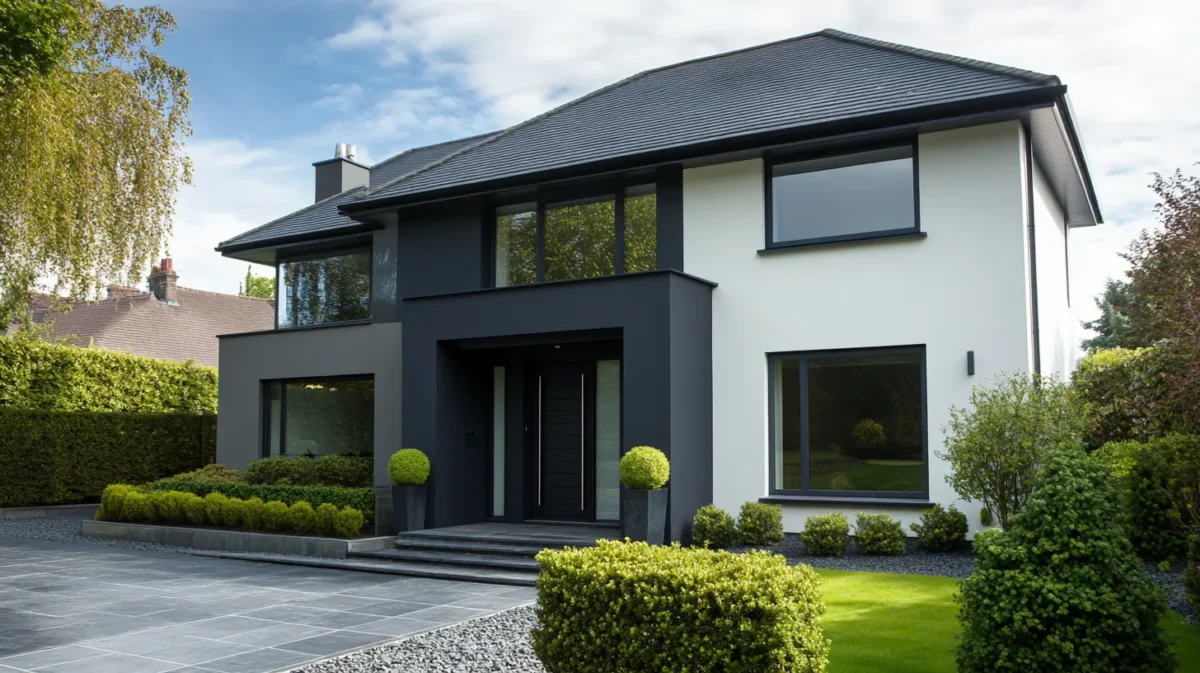
Opt for a monochrome palette with varying shades of grey for a sleek and contemporary look. The play of light and shadow in these neutral tones adds depth and sophistication to your front elevation. This timeless and elegant colour combination for front elevation complements modern architectural designs, making a bold statement while maintaining an air of simplicity.
Colour Codes:
- Asian Paint:
- Grey: Grey Here (K295)
- White: White Sugar (L181)
- Berger:
- Grey: Charcoal Sky (8A0348)
- White: White Sphere (8P2679)
- Nerolac:
- Grey: Jet Grey (2873)
- White: Violette (W179)
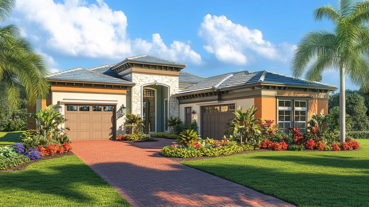
3. Rustic Warmth Indian House Elevation Colour Combination
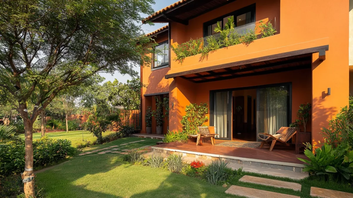
Bring the warmth of the countryside to your doorstep with earthy tones like terracotta, olive green, and warm browns. This front elevation colour combination In India exudes a rustic charm that complements natural surroundings. Imagine a front facade adorned with wooden accents and a lush garden, harmoniously blending with the natural colour palette for a cosy and inviting exterior.
Colour Codes:
- Asian Paint:
- Terracotta: Terracotta Gold (9912)
- Olive Green: Chrome green (X160)
- Brown: Millet Brown (K195)
- Berger:
- Terracotta: Home Fires (2A0632)
- Olive Green: Olive Ridge (3AO864)
- Brown: Aged Oak (3A0256)
- Nerolac:
- Terracotta: Campfire’s burning (4697)
- Olive Green: Pond Moss (2616)
- Brown: Amber brown (2105)
4. House Elevation Colour Combination for Timeless Elegance
Classic and evergreen, a combination of ivory, charcoal, and hints of gold imparts a sense of timeless elegance to your home. It's a perfect choice for those who seek understated luxury. This sophisticated colour palette adds a touch of luxury without being overly extravagant, creating an enduring and refined facade that never goes out of style.
Colour Codes:
- Asian Paint:
- Ivory: Ivory Coast (3165)
- Charcoal: Charci=oal Chalk (K129)
- Gold: Gold Rush (X101)
- Berger:
- Ivory: Ivory Coast (2P0045)
- Charcoal: Seahorse (8D2671)
- Gold: Fools Gold (2T2056)
- Nerolac:
- Ivory: Tangelo Cream (2108)
- Charcoal: Magnet Grey (4534)
- Gold: Golden Age (2727)
5. Front Elevation Paint Colours Vibrant Oasis
Let your home become a vibrant oasis with a fusion of bold and energetic colours like teal, coral, and mustard yellow. This daring combination brings a refreshing and lively atmosphere to your facade. Perfect for homeowners with a zest for life and a desire to make a bold impression, this palette promises to turn heads and make your home stand out on any street.
Colour Codes:
- Asian Paint:
- Teal: Teal Twist (7555)
- Coral: Coral Pearl (9966)
- Mustard Yellow: Billboard Yellow (9888)
- Berger:
- Teal: Opaque Teal (5P0133)
- Coral: Coral Sea (1T0223)
- Mustard Yellow: Happy Celebration (3D0240)
- Nerolac:
- Teal: Teal tone (4328)
- Coral: Papaya Salad (4680)
- Mustard Yellow: Saffron Pie (4626)
6. Nature’s Embrace in House Elevation Colour Combination
Blend seamlessly with nature using shades of green, from lush emerald to muted sage. Paired with wooden accents, this colour combination embraces the beauty of the outdoors. Imagine your home nestled in a landscape of lush trees, with the front elevation harmoniously mirroring the surrounding environment for a natural and eco-friendly look.
Colour Codes:
- Asian Paint:
- Green: Madras Green (X184)
- Cream: Crema Pie (L152)
- Brown: Mille Brown (K195)
- Berger:
- Green: Camellia Leaf (4D0935)
- Cream: Creamer (7T2409)
- Brown: African Safari (7D1559)
- Nerolac:
- Green: Green Envy (2545)
- Cream: Linen Cream (2743)
- Brown: Cuppa Cocoa (4456)
7. Urban Chic Home Front Colour
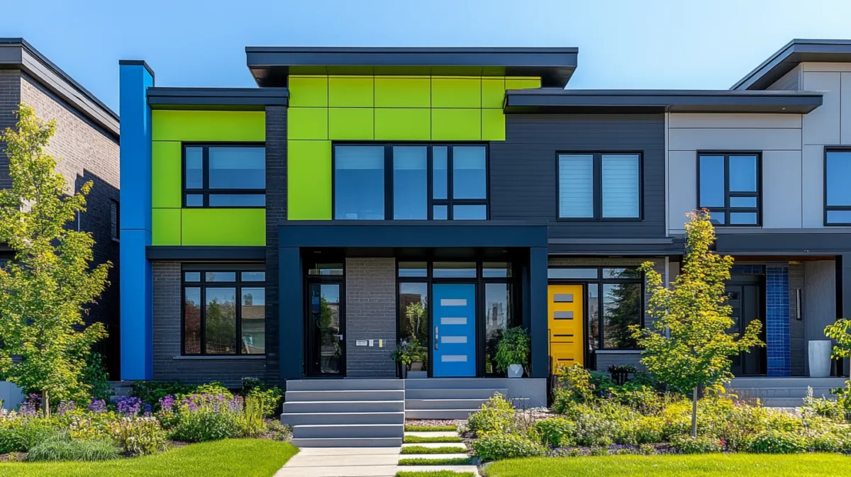
Create an urban oasis by combining modern greys with pops of bright colours like electric blue or neon green. This bold and edgy fusion adds a contemporary flair to any architectural style. Ideal for homeowners with a penchant for modern design, this colour combination exudes an air of sophistication and urban charm, making a striking statement on city streets.
Colour Codes:
- Asian Paint:
- Neon Green: Konkan Green (X176)
- Electric Blue: Electric Azure (9665)
- Grey: Graphite Grey (K127)
- Berger:
- Neon Green: Pepper Pot (4A0410)
- Electric Blue: Rhythmic Blue (5D2249)
- Grey: Deep Woods (7A2931)
- Nerolac:
- Neon Green: Poolside party (4339)
- Electric Blue: Poolside blue (4920)
- Grey: Tough rey (4547)
8. Indian House Elevation Color Combination in Subtle Sophistication
Muted hues such as dusty rose, soft lilac, and light grey offer a sophisticated and charming facade that is both welcoming and refined. This delicate colour palette creates a soft and inviting ambience, perfect for those who prefer a subtle yet elegant front elevation that exudes timeless appeal.
Colour Codes:
- Asian Paint:
- Rose: Softest Rose (K258)
- Lilac: Luring Lilac (V117)
- Grey: Graphite Grey (K127)
- Berger:
- Rose: Antique Scroll (7P2472)
- Lilac: Amur Lilac (6P0165)
- Grey: Deep Wood (7A2931)
- Nerolac:
- Rose: Taffeta Rose (4134)
- Lilac: Dusky Lilac (2248)
- Grey: Deep Forest Grey (4548)
9. Home Front Colour Combination in Desert Dream
Inspired by arid landscapes, this combination of sandy beige, burnt orange, and deep terracotta infuses your home with a warm and inviting allure. This colour scheme pays homage to desert terrains and evokes a sense of comfort and cosiness, making your home a serene retreat amidst the hustle and bustle of the outside world.
Colour Codes:
- Asian Paint:
- Beige: Cane Beige (8563)
- Orange: Orange Tango (X113)
- Deep Terracotta: Terracotta Gold (9912)
- Berger:
- Beige: Beigeful (2P0601)
- Orange: Home Fires (2A0632)
- Deep Terracotta: Textured Terracotta (1D0558)
- Nerolac:
- Beige: Log House (4938)
- Orange: Campfire Burning (4697)
- Deep Terracotta: Tulip Field (4695)
10. Colonial Charm in Home Colour Design Front
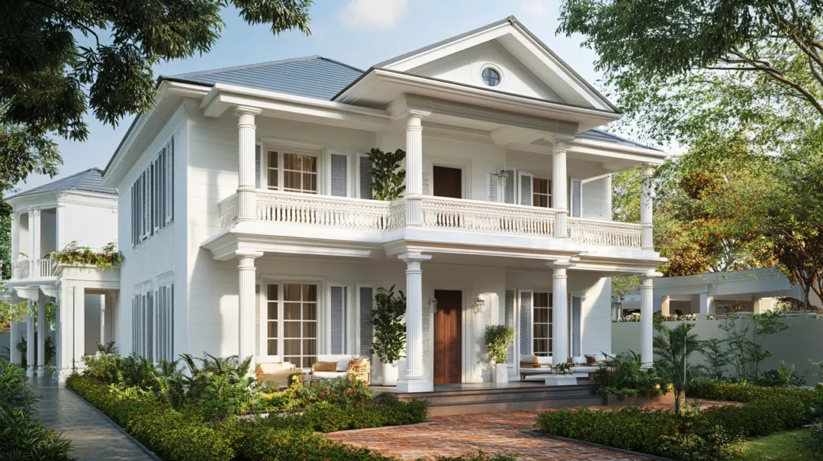
Revisit the colonial era with a blend of whites, creams, and pale blues, exuding a sense of nostalgia and grace. This classic colour combination pays tribute to traditional architecture, offering a refined and charming facade that stands the test of time.
Colour Codes:
- Asian Paint:
- White: White Forest (L184)
- Cream: Cream Pie (L152)
- Pale Blue: Colonial Blue (X144)
- Berger:
- White: Aztec (5P0146)
- Cream: Antique Cream (2P0713)
- Pale Blue: Blue Ensemble (5A2244)
- Nerolac:
- White: Windchill (W-196)
- Cream: Honey Cream( 2568)
- Pale Blue: Big Blue Whale (4907)
11. Playful Pops Using Front Elevation Paint Colours
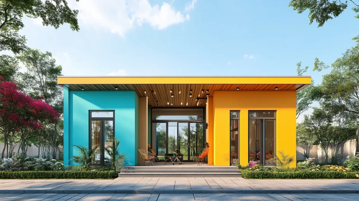
Add a touch of playfulness to your front elevation with vibrant colours like sunny yellow, bright orange, and aqua blue. This palette will make your home stand out and infuse it with youthful and cheerful energy, making it the talk of the neighbourhood.
Colour Codes:
- Asian Paint:
- Yellow: Baisakhi Yellow (X168)
- Orange: Mustard Orange (9899)
- Aqua Blue: Retro Blue (9680)
- Berger:
- Yellow: Brilliant Light (3A0385)
- Orange: Hyped Up (2D2040)
- Aqua Blue: Newport (5D1039)
- Nerolac:
- Yellow: Hallo Halo (4598)
- Orange: Orange Peel (4661)
- Aqua Blue: Pacific Bay (4935)
12. Elevation Colour Combination for Nordic Cool
Embrace the minimalistic charm of Nordic design by pairing whites and light greys with splashes of cool blues or greens, creating a fresh and clean ambience. This understated yet visually striking colour combination embraces simplicity and modernity, making it an ideal choice for homeowners who appreciate clean lines and a calming atmosphere.
Colour Codes:
- Asian Paint:
- White: Innocent White (L180)
- Light Grey: Stormy Grey (K126)
- Berger:
- White: Artec White (5P0146)
- Light Grey: Great Outback (8A2789)
- Nerolac:
- White: Snow Storm (W-198)
- Light Grey: Stunning Grey (4545)
See More Latest Designs for Your Homes for 2025
13. Create Regal Opulence With Front Elevation Paint Colours
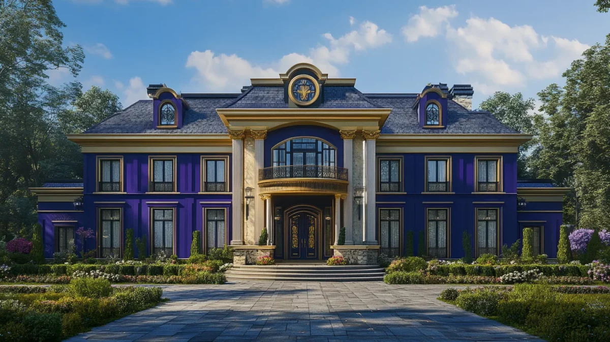
Indulge in regal elegance with deep purples, royal blues, and rich gold. This luxurious palette exudes grandeur and sophistication, making your front elevation a sight to behold. Ideal for those seeking to make a bold and glamorous statement, this colour combination promises to impress and enchant.
Colour Codes:
- Asian Paint:
- Deep Purple: Festive Purple(X180)
- Royal Blue: Scholar’s Blue: 9685)
- Rich Gold: Golden Ray (7870)
- Berger:
- Deep Purple: Enchanted evening (5A0303)
- Royal Blue: Deep River (5A1112)
- Rich Gold: Eternal Gold (3A0816)
- Nerolac:
- Deep Purple: Purple Gaga (4212)
- Royal Blue: Silence (2426)
- Rich Gold: Ra Gold (2042)
14. Vintage Allure With Home Front Colour
Step back in time with vintage-inspired colours like faded rose, mint green, and dusty lavender, reviving the elegance of yesteryears. This nostalgic colour palette adds a touch of vintage charm to your facade, invoking a sense of romance and elegance reminiscent of a bygone era.
- Asian Paint:
- Rose: Soapstone Rose (K245)
- Mint Green: Wispy Mint (9751)
- Dusty Lavander: Lavender Love (K051)
- Berger:
- Rose: Dewey Rose (1T0451)
- Mint Green: Diva Mint (4P0273)
- Dusty Lavander: Basket of Lavenders (7T2991)
- Nerolac:
- Rose: Mademoiselle (2185)
- Mint Green: Peppermint (2555)
- Dusty Lavander: Miss Universe (4900)
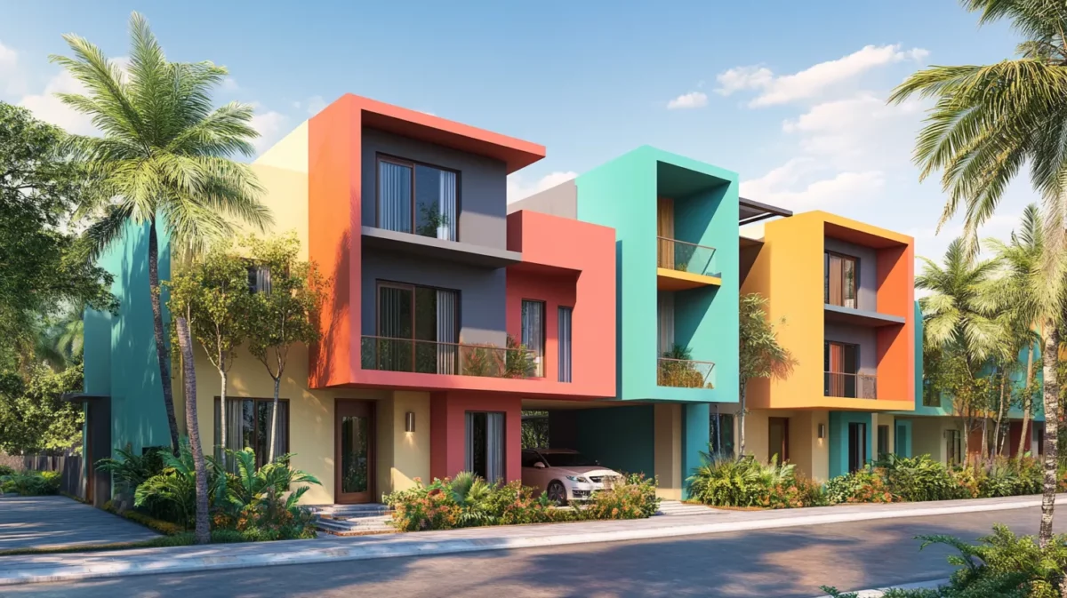
15. Tropical Paradise Using Home Front Colour Combination
Transport yourself to a tropical haven with vibrant greens, exotic oranges, and bright yellows, evoking the essence of a paradise getaway. This playful and inviting colour combination promises to make your home a tropical escape where every day feels like a vacation.
Colour Codes:
- Asian Paint:
- Green: Konkan Green (X176)
- Orange: Roasted Orange( 9949)
- Yellow: Sport Yellow (X104)
- Berger:
- Green: Frontenac Hills (3D0863)
- Orange: Sun Blazer (2D2034)
- Yellow: Yellow Yolk (3D2858)
- Nerolac:
- Green: Pippin (2635)
- Orange: Melon Melody (4681)
- Yellow: All Hyped Up (4592)
16. Blue and White in Home Colour Design Front
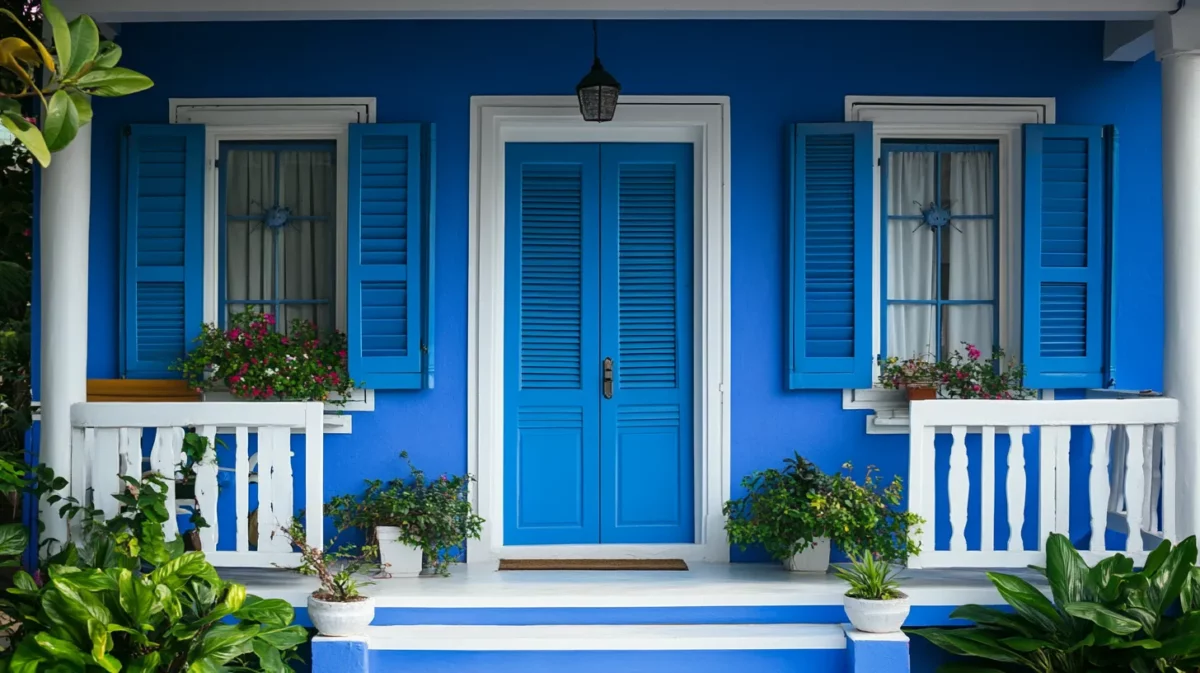
White and blue front elevation colours could provide a calming and revitalizing effect. Blue shutters and white walls could bring back the original appearance. Painting the front or entrance porch with blue and white stripes can give it a nautical vibe.
Colour Codes:
- Asian Paint:
- Blue: Retro Blue (9680)
- White: White Sugar (L181)
- Berger:
- Blue: Pool Reflection ( 5D2906)
- White: Creme White (4P1842)
- Nerolac:
- Blue: Poolside Blue (4920)
- White: Baby Bloom (W-190)
17. Charcoal Grey and Teal Modern House Elevation Colour Combination
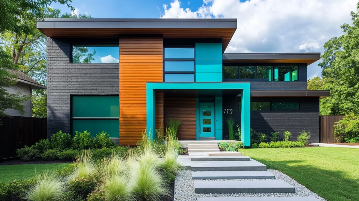
This house elevation colour combination of charcoal grey and teal will help you enter the modern design world. Charcoal grey complements the colourful burst of life and energy in the house front and lends it a refined, strong look. Perfect for individuals who want to balance the strength and subtlety of design, this color scheme conveys a lot of information without being overpowering.
Colour Codes:
- Asian Paint:
- Charcoal Grey: Charcoal Shadow (8286)
- Teal: Bright Teal (9740)
- Berger:
- Charcoal Grey: Exclusive Grey (8A0427)
- Teal: Teal Garden (4A2205)
- Nerolac:
- Charcoal Grey: Grey Fannel (2964)
- Teal: Mayfair (2553)
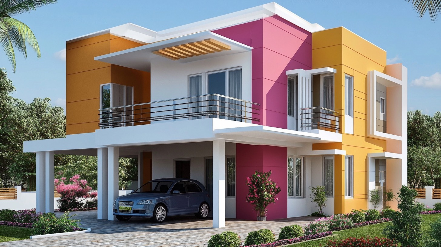
18. Color Combinations for Monochromatic Front Elevation Designs
Many tones of the same hue are used in a monochromatic colour scheme. This colour combination for front elevation can give the façade of your property a refined and well-coordinated appearance.
Colour Codes:
- Asian Paint:
- Blue: Azure Sky (7407)
- Orange: Orange Peel (7957)
- Pink: Tinge Of (8066)
- White: White Bush (L176)
- Berger:
- Blue: Aqua Chill (5P0136)
- Orange: Hyped Up (2D2040)
- Pink: Fairy Pink (1T1992)
- White: Fabulous White (8P2750)
- Nerolac:
- Blue: Jazzy Blue (4919)
- Orange: Orange Melon (4682)
- Pink: Mademoiselle (2185)
- White: Baby Bloom (W-190)
19. Fiesta With Orange and Red Colour Combination for Elevation
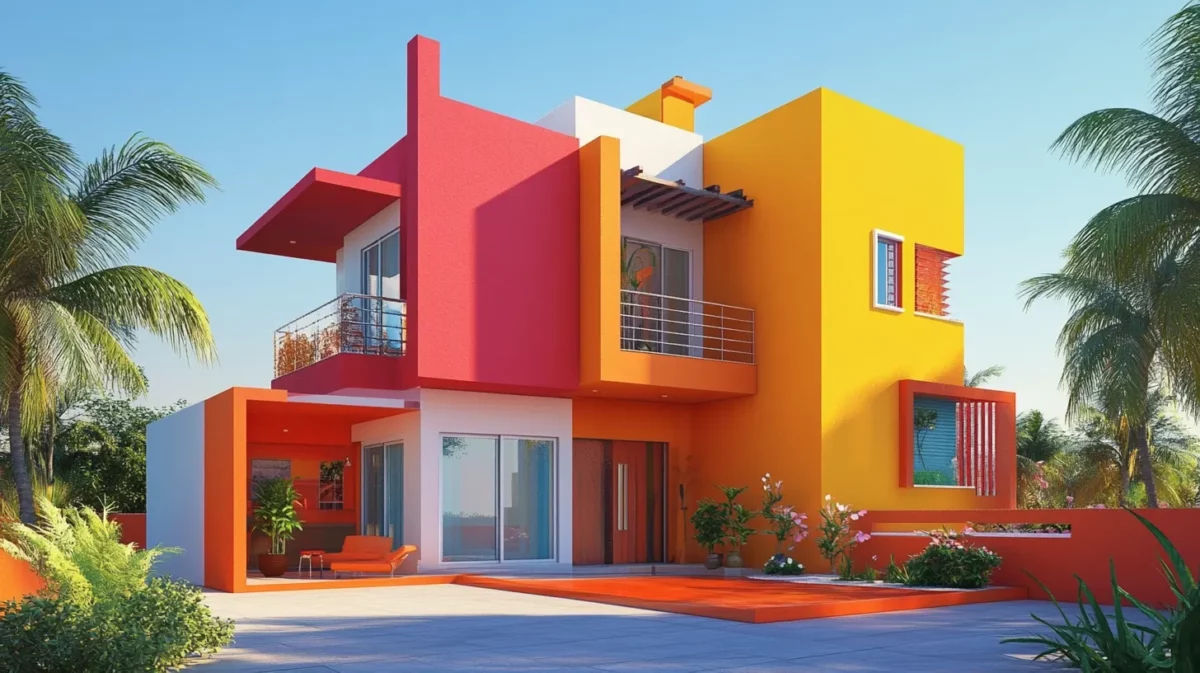
For individuals who enjoy playing with bright and exciting colours, energetic red should be combined with an eruption of orange. Your home will appear extremely cheerful and friendly with this lively colour combination for elevation, which is warm and lively.
Colour Codes:
- Asian Paint:
- Yellow: Baisakhi Yellow (X168)
- Orange: Orange Vision (X110)
- Red: Code Red (X120)
- Berger:
- Yellow: Go to the Light (4A0395)
- Orange: Orange Spice (2A0664)
- Red: Red Siren (1A0496)
- Nerolac:
- Yellow: Hallo Halo (4598)
- Orange: Carrot Stick (4683)
- Red: Vivacious Red (4781)
20. Sunny Delight in Vibrant White and Yellow Home Front Colour
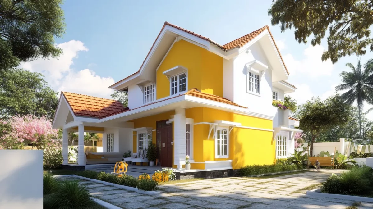
The colour palette expertly combines white and vivid yellow tones. This cheerful colour combination for front elevation brings a bright splash of sunshine into any house. It was inspired by the popular beverage. The vivid, bold tone of yellow exudes a contagious sense of optimism.
Colour Codes:
- Asian Paint:
- Yellow: Baisakhi Yellow (X168)
- White: White Cheese (L177)
- Berger:
- Yellow: Yellow Yolk (3D2858)
- White: Creme White (4P1842)
- Nerolac:
- Yellow: All Hyped Up (4592)
- White: Violet Bloom (W-187)
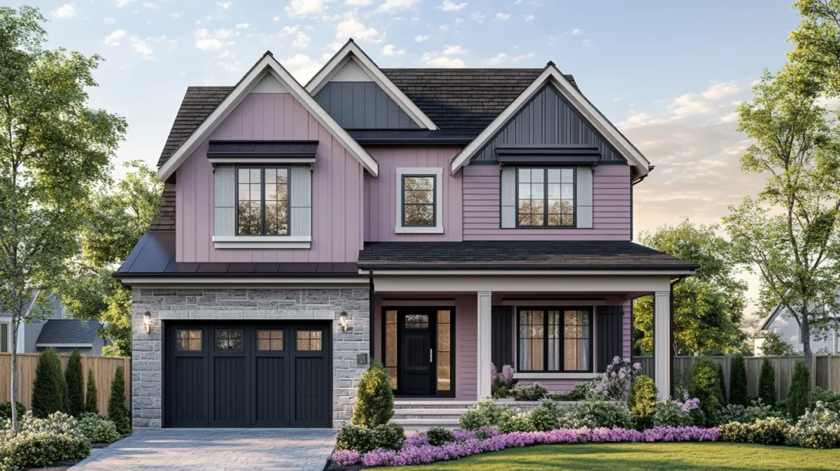
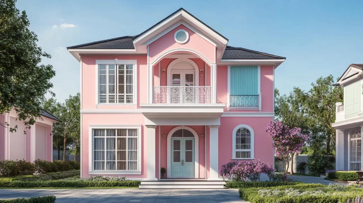
21. Pastel Pink and Soft Grey Minimalist Home Colour Design Front
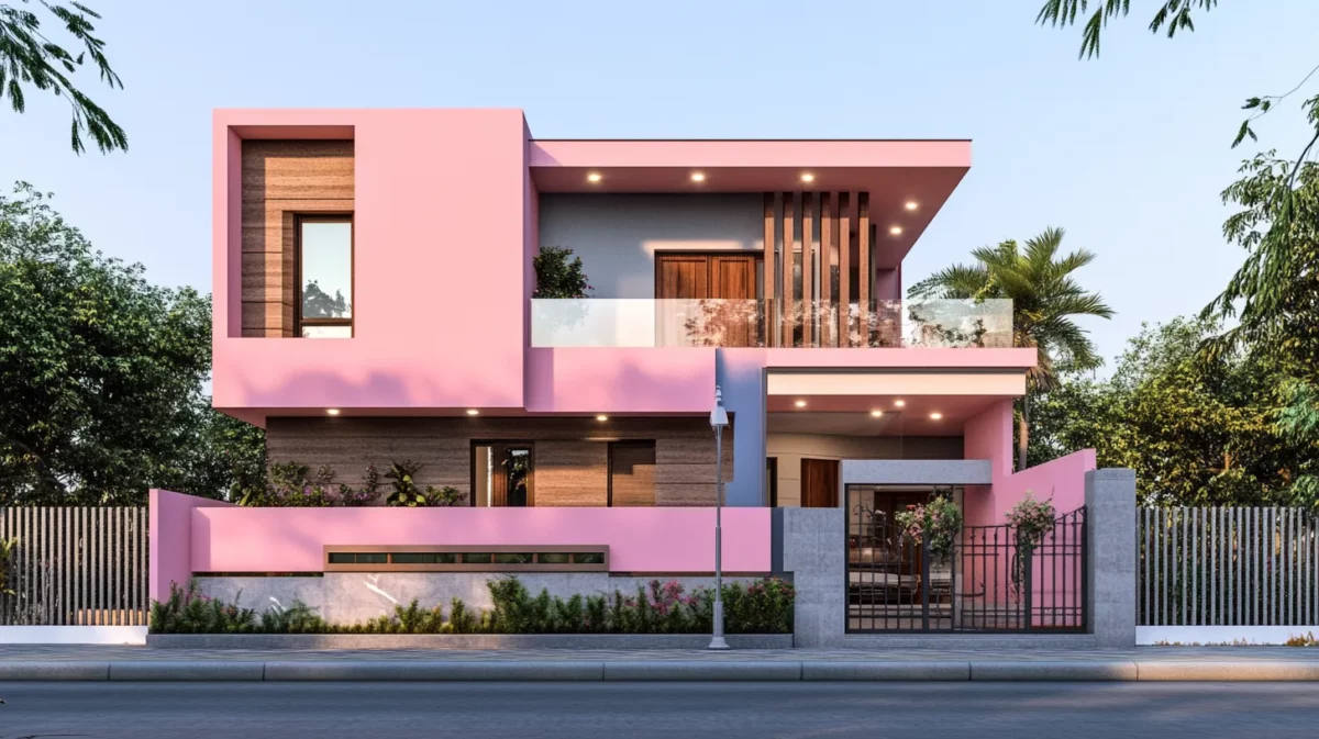
The front elevation colour combination of pastel pink and soft grey creates a minimalist look aimed towards complete simplicity. The gentle gray provides a neutral, cool, collected, and serene grounding base.
Colour Codes:
- Asian Paint:
- Pink: Warm Oink (K242)
- Grey: Serene Grey (K274)
- Berger:
- Pink: Fairy Pink (1T1992)
- Grey: Bountiful Grey (8D2775)
- Nerolac:
- Pink: Pink Bangles (4128)
- Grey: Mute Gray (4538)
See More Designs for Your Homes for 2025
How to Choose the Best Colour for Your Front Elevation?
Your front elevation is the face of your home, the first thing that greets visitors and passersby. Choosing the right colour combination is crucial as it can significantly impact your home's overall appearance and set the mood for the entire neighbourhood. Follow this step-by-step guide to make an informed and inspired decision in selecting the perfect colour combination for your front elevation:
1. Know Your Architectural Style:
Before diving into the world of colours, take a close look at the architectural style of your home. Different styles have distinct characteristics that pair better with certain colour schemes. Traditional homes often favour classic and neutral tones, while modern architecture may embrace bold and vibrant shades. Understanding your home's style will ensure a harmonious blend of structure and colour.
2. Consider Your Surroundings:
The environment in which your home is situated plays a vital role in choosing the right colours. Observe the neighbouring houses, landscapes, and the overall ambience of the area. Your front elevation should complement the existing surroundings while still standing out uniquely. Natural elements such as trees, flowers, and the general climate can also influence colour choices.
3.Embrace the Power of Neutrals:
Neutrals are timeless and versatile, making them a safe yet elegant choice for front elevations. Colours like white, beige, grey, and muted tones can provide a clean and sophisticated look. They also allow you to experiment with bolder accents on doors, trims, and shutters.
4. Explore Colour Psychology:
Colours evoke emotions and can create a specific ambience. Warm hues like reds, oranges, and yellows exude energy and excitement, while cooler tones like blues and greens promote calmness and serenity. Consider the atmosphere you want to create when people approach your space and choose home front elevation colours accordingly.
5. Take Natural Lighting into Account:
How natural light interacts with your front elevation can alter how colours appear throughout the day. Test paint samples on different parts of the front elevation to see how they look under various lighting conditions. A perfect colour in direct sunlight might appear different during cloudy or twilight hours.
6. Play with Accents and Trims:
Don't limit yourself to one colour for the entire front elevation. Utilise accents and trims to add depth and visual interest. A contrasting colour for the door, window frames, or architectural details can make your home's facade pop and leave a lasting impression.
7. Test with Samples:
Never underestimate the power of paint samples. Once you've narrowed your colour choices, get sample pots and apply them on a small area of your front elevation. Observe them at different times of the day and in various weather conditions to ensure you're making the right decision.
8. Seek Expert Advice:
If you find yourself overwhelmed or unsure about colour choices, consider seeking the advice of a professional colour consultant or an architect. They can offer valuable insights and help you find the perfect colour combination that aligns with your vision.
Choosing the best colour for your front elevation is an exciting creative process. Take your time, consider all aspects, and let your personal preferences shine through. With careful thought and consideration, your front elevation can become a captivating masterpiece that reflects your unique style and leaves a lasting impression on everyone who passes by.
Vastu Colour Tips for Front Elevation
According to Vastu, choosing the right elevation colour combinations for your house front can bring positivity, harmony and prosperity. Below are simple Vastu colour tips for the front elevation:
- Use a white or cream shade to create a sense of calmness and peace, enhancing positivity and welcoming energy into your home.
- Light yellow and beige promote happiness, growth and harmony and also balance the natural light for a warm exterior look.
- Green shades encourage health and prosperity, making them ideal for nature-inspired and refreshing home elevation design.
- Blue tones represent trust, stability, and peace, making them perfect for east-facing homes to invite good fortune and success.
- Avoid dark black or deep red as they may attract negativity; instead, use a softer tone to balance the energy.
How Can NoBroker Help?
NoBroker helps you with professional painting services at affordable prices. From wall painting to waterproofing, they provide expert painters, colour consultation, and high-quality branded paints. Their services include exterior, interior and texture finishes for a complete makeover. If you are choosing the right colour combination for the front elevation, NoBroker experts guide you to make your house stylish. Apart from this, they also assist with property-related needs, including buying, renting, selling, legal work, and packers and movers. It is a one-stop shop for people.
Frequently Asked Questions
Ans: When used thoughtfully, contrasting colours can create a striking visual impact. Pairing light and dark shades or warm and cool colours can add depth and character to the building's facade.
Ans: While trends can be inspiring, choosing a colour combination that suits the building's architecture and complements the surrounding environment is essential. Timeless and classic colours often have a broader appeal and longevity.
Ans: Regular maintenance, such as cleaning and touch-ups, is essential to preserve the colour's vibrancy. Use high-quality exterior paint products that offer durability and resistance to weathering for a longer-lasting finish.
Ans: To test colour combinations, utilise online visualizer tools or paint sample swatches on a small area of the front elevation. Observing the colours under different lighting conditions will help you make an informed decision.
Ans: Yes, certain colour palettes complement specific architectural styles. For instance, earthy tones work well with rustic designs, while pastel shades enhance the charm of Victorian-style buildings.
Ans: Dark colours look bold and stylish, but should be used carefully. Pairing them with lighter shades balances the design and prevents the house from looking heavy.
Ans: Yes, you can mix more than two colours, but keep them balanced. Use one main shade, one secondary shade and an accent shade for highlight to maintain harmony.
Recommended Reading
40+ Best Stunning Two Colour Combinations for Bedroom Walls to Elevate Your Space in 2026
January 31, 2025
336770+ views
Top 25 Outside Color Combinations with Colour Codes for Indian Homes in 2026
May 16, 2025
314401+ views
25 Latest Main Gate Colour Combination Ideas: Direction and Placement as Per Vastu in 2026
October 9, 2025
159714+ views
Top 26 Wall Paint Colour Combinations Ideas With Codes for Every Room in 2026
February 3, 2025
137136+ views
Asian Paints Off White Colour Codes: Names, Product Range and Paint Price
January 31, 2025
98949+ views
NoBroker Painting Tips & Color Ideas Testimonials
Before this festive season
get your house painted
Most Viewed Articles
40+ Best Stunning Two Colour Combinations for Bedroom Walls to Elevate Your Space in 2026
January 31, 2025
336770+ views
Top 25 Outside Color Combinations with Colour Codes for Indian Homes in 2026
May 16, 2025
314401+ views
Asian Paint Price 20 Litre for Different Variants in India: Coverage, Durability and Benefits
May 17, 2025
176033+ views
25 Latest Main Gate Colour Combination Ideas: Direction and Placement as Per Vastu in 2026
October 9, 2025
159714+ views
Top 26 Wall Paint Colour Combinations Ideas With Codes for Every Room in 2026
February 3, 2025
137136+ views
Painting Services in Top Cities of India
Top Paint Brands in India
| Asian Paints | Nerolac Paints |
| Berger Paints | Indigo Paints |
| Dulux Paints | Nippon Paints |
| Shalimar Paints |
Exterior Painting Services in Top Cities of India
 Author
Loved what you read? Share it with others!
Recent blogs in
Top Simple Paint Design on Home Walls
March 27, 2026 by Krishnanunni H M
Top 10 Light Grey Paint Colors Combination with Codes That Improve Room Appearance in 2026
March 27, 2026 by Krishnanunni H M


 Full RM + FRM support


Join the conversation!