- https://www.asianpaints.com/colour-catalogue/blue-wall-colours/blue-charm.html
- https://www.asianpaints.com/colour-catalogue/green-wall-colours/paan-i.html
- https://www.bergerpaints.com/colour/colour-catalogue/blue-wall-paints/mercury-glass
- https://www.bergerpaints.com/colour/colour-catalogue/green-wall-paints/green-nursery
- https://www.asianpaints.com/catalogue/colour-catalogue/yellow-wall-colours/baisakhi-yellow-i.html
- https://www.asianpaints.com/colour-catalogue/grey-wall-colours/serene-grey-n.html
- https://www.bergerpaints.com/colour/colour-catalogue/yellow-wall-paints/yellow-yolk
- https://www.bergerpaints.com/colour/colour-catalogue/earth-tone-wall-paints/counter-grey
- https://www.asianpaints.com/colour-catalogue/purple-wall-colours/thai-purple-n.html
- https://www.asianpaints.com/colour-catalogue/off-white-wall-colours/white-forest.html
- https://www.bergerpaints.com/colour/colour-catalogue/white-wall-paints/aztec-white
- https://www.asianpaints.com/colour-catalogue/orange-wall-colours/terracotta-n.html
- https://www.asianpaints.com/colour-catalogue/off-white-wall-colours/skimmed-cream.html
- https://www.bergerpaints.com/colour/colour-catalogue/orange-wall-paints/textured-terracotta
- https://www.bergerpaints.com/colour/colour-catalogue/white-wall-paints/antique-cream
- https://www.asianpaints.com/colour-catalogue/green-wall-colours/kodaikanal-teal-n.html
- https://www.bergerpaints.com/colour/colour-catalogue/green-wall-paints/touch-teal
- https://www.bergerpaints.com/colour/colour-catalogue/dark-accent-wall-paints/neon-yellow
- https://www.asianpaints.com/colour-catalogue/brown-wall-colours/old-brick.html
- https://www.asianpaints.com/colour-catalogue/green-wall-colours/sugarcane-juice-i.html
- https://www.bergerpaints.com/colour/colour-catalogue/red-wall-paints/boston-brick
- https://www.bergerpaints.com/colour/colour-catalogue/green-wall-paints/desert-saguaro
- https://www.asianpaints.com/colour-catalogue/pink-wall-colours/oyster-blush-n.html
- https://www.asianpaints.com/colour-catalogue/green-wall-colours/blue-light.html
- https://www.bergerpaints.com/colour/colour-catalogue/orange-wall-paints/blush-beige
- https://www.bergerpaints.com/colour/colour-catalogue/blue-wall-paints/barely-blue
- https://www.asianpaints.com/colour-catalogue/grey-wall-colours/black-sand-n.html
- https://www.asianpaints.com/colour-catalogue/off-white-wall-colours/old-lace-m0950.html
- https://www.bergerpaints.com/colour/colour-catalogue/earth-tone-wall-paints/black-eyed-beauty
- https://www.bergerpaints.com/colour/colour-catalogue/yellow-wall-paints/go-the-gold
- https://www.asianpaints.com/colour-catalogue/purple-wall-colours/blooming-lavender-n.html
- https://www.asianpaints.com/colour-catalogue/green-wall-colours/pale-peppermint-n.html
- https://www.bergerpaints.com/colour/colour-catalogue/violet-wall-paints/lavender-lane
- https://www.bergerpaints.com/colour/colour-catalogue/green-wall-paints/carpetted-green
- https://www.asianpaints.com/catalogue/colour-catalogue/blue-wall-colours/kedarnath-skies-i.html
- https://www.asianpaints.com/colour-catalogue/orange-wall-colours/orange-vision.html
- https://www.bergerpaints.com/colour/colour-catalogue/blue-wall-paints/royal-raisa
- https://www.bergerpaints.com/colour/colour-catalogue/dark-accent-wall-paints/tuscan-orange
- https://www.bergerpaints.com/colour/colour-catalogue/white-wall-paints/celestial-white
- https://www.asianpaints.com/furnishing/listing/bakshi-terracota-aaa2021ess40112273.html
- https://www.asianpaints.com/colour-catalogue/green-wall-colours/chrome-green.html
- https://www.bergerpaints.com/colour/colour-catalogue/dark-accent-wall-paints/earthy-terracotta
Table of Contents
What Is a PoP Colour Combination?Top PoP Colour Combination for BedroomBest PoP Colour Combinations for HallBest 4 PoP Colour Combination for Living RoomHow to Choose the PoP Colour Combination for Every Room?Tips on PoP Colour Combinations for Every Room on a BudgetHome Painting Services Offered by NoBrokerHow to Book NoBroker House Painting Services?Why Choose NoBroker Painting Services?Make Your Home Look Great with NoBroker Painting ServicesFrequently Asked Questions?
Loved what you read? Share it with others!
12 Trending PoP Colour Combinations With Codes for Living Room, Hall and Bedroom in 2026
Updated : January 6, 2026, 1:27 PM
Author :
![]() Suju
Suju
Summary
Choosing the right PoP colour combination can effortlessly transform any room. PoP colour combinations help create aesthetic appeal, brighten spaces, and complement furniture perfectly. Costs vary depending on design complexity, from ₹5,000 to ₹20,000 per room, making it affordable for modern Indian homes. Opting for these combinations ensures durability, elegance, and a personalised touch. Whether it’s a bedroom, living room or kitchen, the right PoP shades elevate the interior while staying budget-friendly.
Table of Contents
What Is a PoP Colour Combination?Top PoP Colour Combination for BedroomBest PoP Colour Combinations for HallBest 4 PoP Colour Combination for Living RoomHow to Choose the PoP Colour Combination for Every Room?Tips on PoP Colour Combinations for Every Room on a BudgetHome Painting Services Offered by NoBrokerHow to Book NoBroker House Painting Services?Why Choose NoBroker Painting Services?Make Your Home Look Great with NoBroker Painting ServicesFrequently Asked Questions?
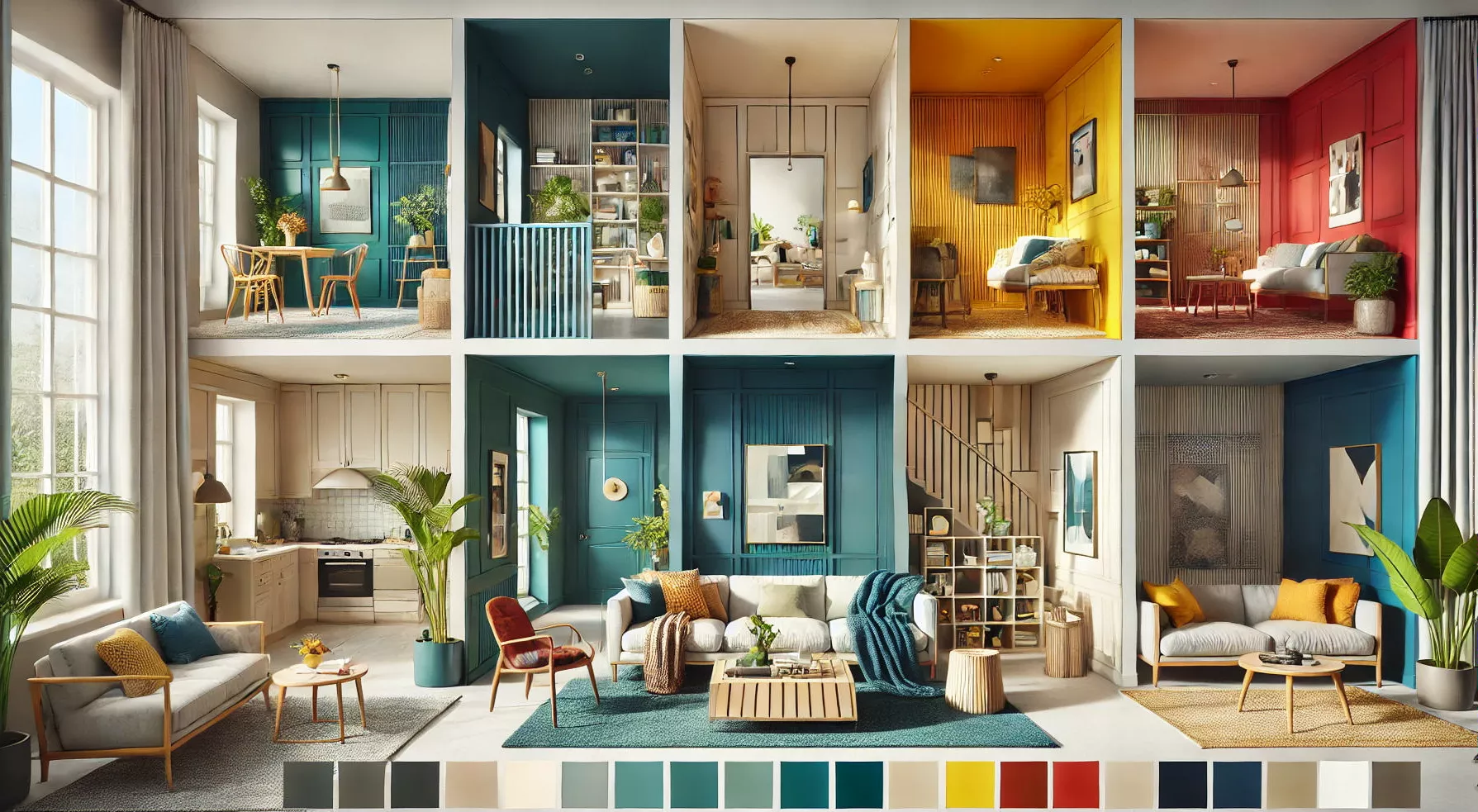
12 PoP colour combinations can give every room a fresh, stylish look. The PoP colour combination makes the ceiling, walls, and corners more lively and attractive. Top colours for Indian homes include soft pastels, warm neutrals, and bright accents. Using the latest PoP colour combinations instantly modernises your home. Costs usually range from ₹5,000 to ₹20,000, depending on the design. These combinations are easy to maintain, long-lasting, and make your home look beautiful and cosy.
What Is a PoP Colour Combination?
A PoP colour combination blends shades applied to ceilings and walls using Plaster of Paris to create stylish interiors. Using PoP colour paint highlights shapes, adds depth, and brings a modern, vibrant look that transforms any room beautifully with ease.
Top PoP Colour Combination for Bedroom
Choosing the right bedroom PoP colour helps create a calm, stylish, and cosy space. Soft shades, creative contrasts, and modern PoP designs make your bedroom feel more relaxing, elegant, and beautifully balanced. Below are a few colour combinations to keep in mind:
1. Blue and Green PoP Colour Combination
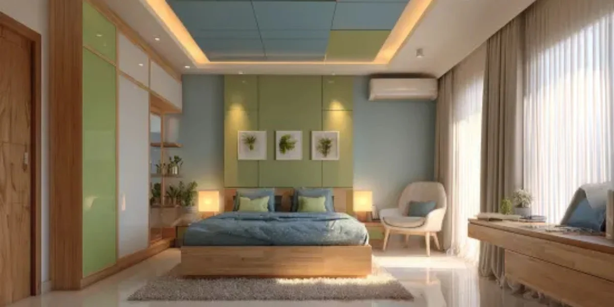
This is the best colour for PoP design. You can use light blue as the base colour on the walls and incorporate green accents through throw pillows, bedspreads or artwork.
Colour Codes:
- Asian Paint Colour Codes:
- Berger Paints Colour Codes:
2. Yellow and Grey PoP Colour Combination
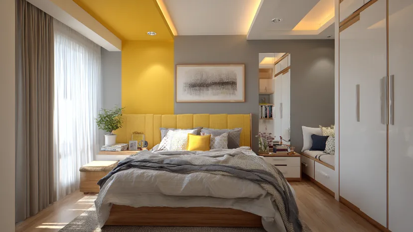
Yellow promotes happiness and optimism, while grey adds a touch of sophistication. This contrasting combination is both lovely and uplifting. Use sunshine yellow as an accent wall behind the headboard and balance it out with cool grey tones on the remaining walls and furniture.
Colour Codes:
- Asian Paint Colour Codes:
- Berger Paints Colour Codes:
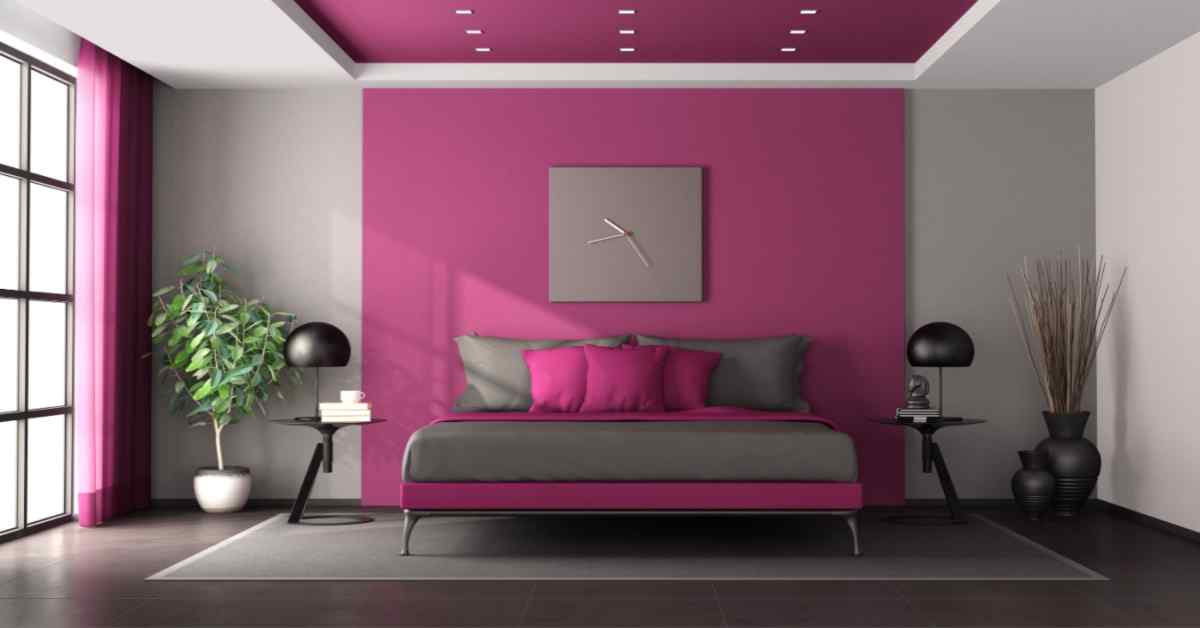
3. Purple and White PoP Colour Combination
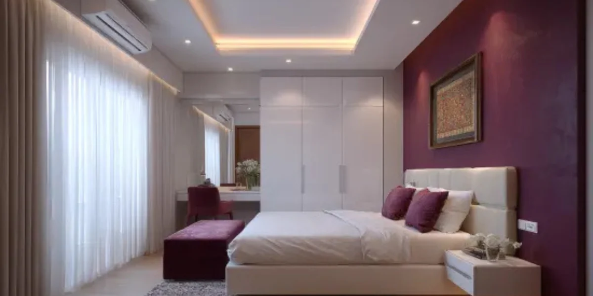
This combination is a fabulous choice for a bedroom that exudes elegance. Paint the ceiling or an accent wall in a rich purple hue, and keep the remaining walls and furniture white.
Colour Codes:
- Asian Paint Colour Codes:
- Berger Paints Colour Codes:
4. Terracotta and Cream PoP Colour Combination
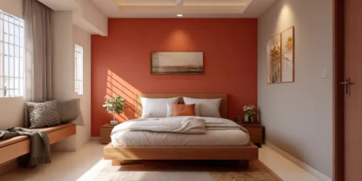
This earthy combination is perfect for a nature-inspired retreat. Use terracotta on an accent wall and cream for the remaining walls. You can also incorporate natural textures like wood and woven fabrics to complete the look.
Colour Codes:
- Asian Paint Colour Codes:
- Berger Paints Colour Codes:
Best PoP Colour Combinations for Hall
Choosing a modern hall PoP colour combination helps create a bright, stylish, and welcoming space. Balanced shades, creative PoP patterns, and subtle lighting make the hall look spacious, elegant, and visually appealing for everyday living.
1. Teal & Sunshine Yellow PoP Colour Combination
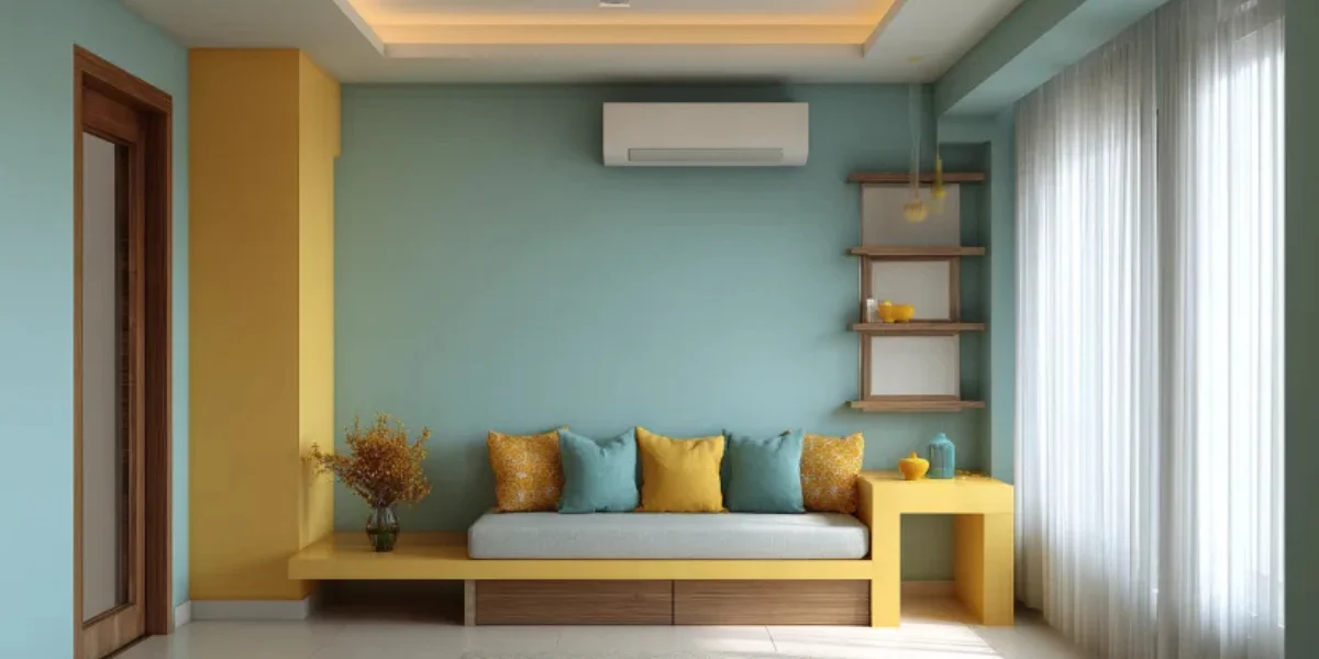
This combo injects a burst of personality into your hall. Paint one wall in cool teal and use sunshine yellow for the rest, and use it for throw pillows, a console table, or a vibrant front door. This playful mix is both welcoming and energising.
Colour Codes:
- Asian Paint Colour Codes:
- Berger Paints Colour Codes:
2. Brick & Muted Sage Green PoP Colour Combination
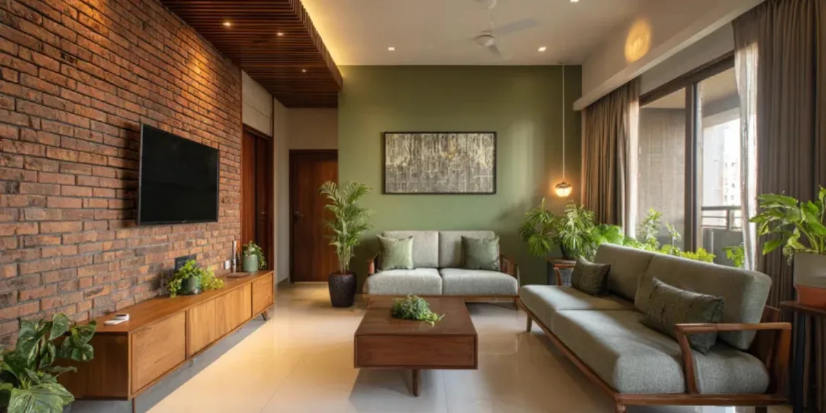
This simple PoP colour combination brings a natural, earthy feel with an exposed brick accent wall (real or wallpaper). Balance the reddish tones of the brick with a muted sage green on the remaining walls. Add warmth with woven baskets or a wooden bench.
Colour Codes:
- Asian Paint Colour Codes:
- Berger Paints Colour Codes:
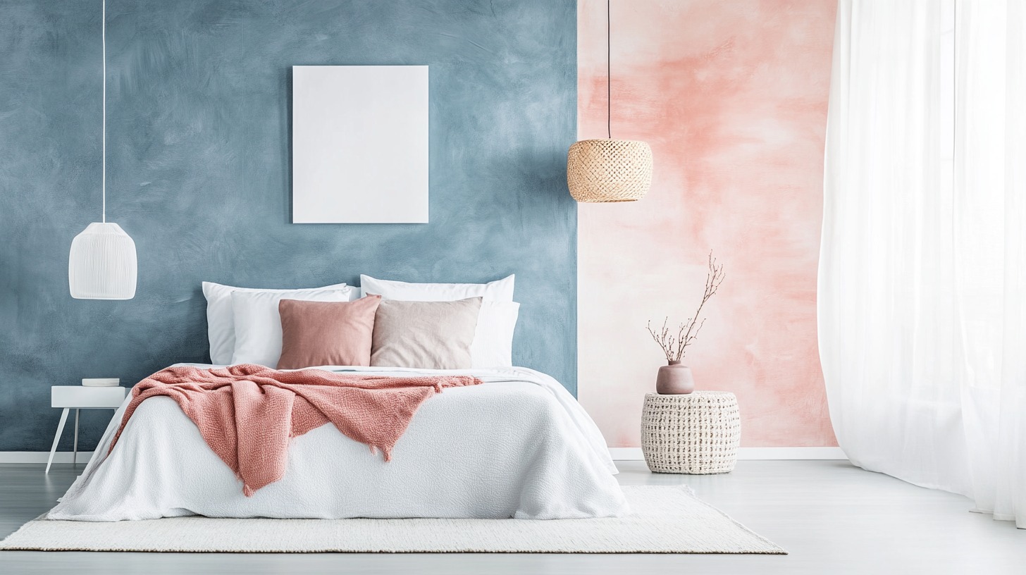
3. Blush Pink & blue Accents PoP Colour Combination
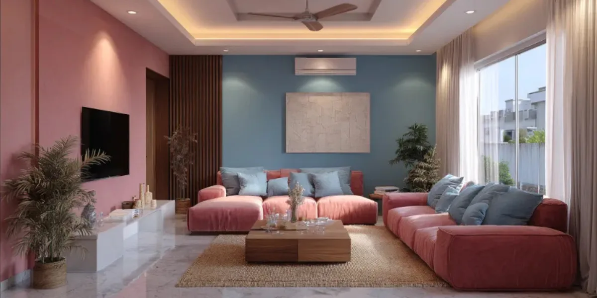
Create a touch of elegance with a blush pink on one wall and another wall in a calming blue. To prevent it from feeling too overwhelming, keep the ceiling and trim white. Introduce a PoP of gold with a metallic light fixture, a decorative mirror frame, or a sculpture.
Colour Codes:
- Asian Paint Colour Codes:
- Berger Paints Colour Codes:
4. Dramatic Black & Gold PoP Colour Combination
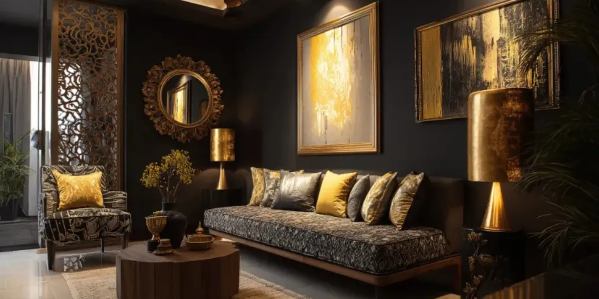
Make a grand entrance with a sophisticated black and gold combination. Paint the walls a dramatic black and add PoP of gold with a statement mirror, metallic lampshades, or framed artwork with gold accents. This glamorous look works well in halls with good natural light.
Colour Codes:
- Asian Paint Colour Codes:
- Berger Paints Colour Codes:
Best 4 PoP Colour Combination for Living Room
A living room PoP colour combination enhances style and comfort. Using balanced shades, creative ceiling designs, and subtle accents makes the space feel spacious, welcoming, and visually appealing for family and guests. Below are 4 PoP colour combinations to choose from:
1. Lavender and Pale Green PoP Colour Combination
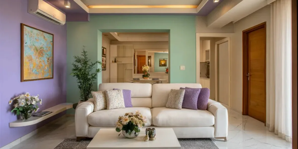
This calming combination features soft pastels that create a tranquil atmosphere. Think lavender paired with a pale green. You can use these colours for the PoP design on your ceiling or accent walls, and balance them out with white furniture and natural textures like wood and woven baskets.
Colour Codes:
- Asian Paint Colour Codes:
- Berger Paints Colour Codes:
2. Royal Blue and Fiery Orange PoP Colour Combination
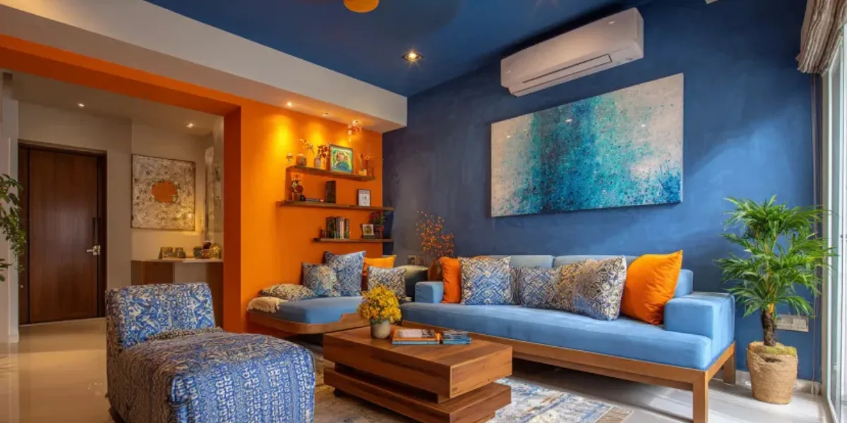
Royal blue and a fiery orange can create a striking impact. Use blue for the PoP design and orange for throw pillows, artwork, or an accent wall. If this combination feels too intense, you can tone down the orange with a terracotta or rust shade.
Colour Codes:
- Asian Paint Colour Codes:
- Berger Paints Colour Codes:
3. Yellow and White PoP Colour Combination
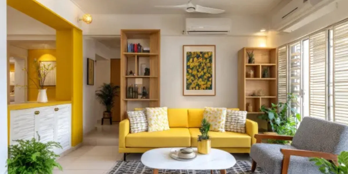
Bring a touch of sunshine into your living room with a combination of yellow and white. This cheerful pairing creates a bright and airy feel. You can use sunshine yellow for the PoP design and pair it with crisp white walls and furniture. Add PoPs of green with plants or botanical prints to complete the look.
Colour Codes:
- Asian Paint Colour Codes:
- Berger Paints Colour Codes:
4. Terracotta and Olive Green PoP Colour Combination
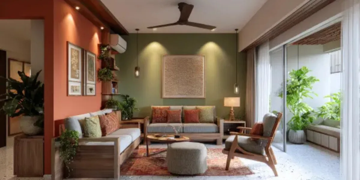
Nature lovers will adore this combination. Terracotta and olive green bring the outdoors in, creating a warm and grounded feel. Complement this palette with woven textures, light wood furniture, and PoPs of copper or brass. To add depth and interest, play with textures like velvet upholstery or metallic accents.
Colour Codes:
- Asian Paint Colour Codes:
- Berger Paints Colour Codes:
How to Choose the PoP Colour Combination for Every Room?
Selecting a PoP colour combination becomes simple when you focus on each room’s mood and function. Pick shades that brighten the space, match your decor, and create a clean, comfortable, and stylish look.
1. Room Function and Mood:
- Living rooms: Aim for sociable and inviting vibes. Try cool blues and greens for relaxation, or warm yellows and oranges for a more energetic feel.
- Bedrooms: Create a calming atmosphere. Soft blues, lavenders, and greens promote tranquillity. For a touch of luxury, consider deep jewel tones like emerald or sapphire.
- Halls: Spark creativity and energy. Bold yellows, oranges, and reds can add a cheerful touch. Balance them with neutrals for a more grounded feel.
2. Lighting:
- Sunny rooms: Use cooler PoPs of colour to balance the warmth. Think blues, greens, or light purples.
- Dim rooms: Opt for warmer PoPs like yellows, oranges, or reds to brighten the space.
3. Existing Colour Scheme:
- Neutral base: This is a blank canvas for PoPs of any colour! Play with bold accents or softer pastels depending on your mood.
- Colourful base: Choose a PoP colour that complements the existing palette. Look for colours that sit next to each other on a colour wheel (analogous colours) or opposite it (complementary colours) for a vibrant contrast.
Tips on PoP Colour Combinations for Every Room on a Budget
Adding PoPs of colour is a fantastic way to add personality to your home without breaking the bank. Here are some tips for using PoP colour combinations on a budget:
1. Pick Your PoP Colour Wisely:
- Consider the room's function: For relaxing spaces like bedrooms, go for cooler colours like blues or greens. For energetic areas like kitchens, try warmer tones like yellows or oranges.
- Think about the natural light: If a room gets a lot of sunlight, cooler colours can help balance the warmth. In rooms with less light, consider warmer PoPs of colour to brighten the space.
2. Use Paint Strategically:
- Accent walls: Paint one wall in your chosen PoP colour and keep the rest neutral. This creates a focal point without overwhelming the space.
- Paint trim or details: Spruce up mouldings, doors, or trim with a PoP of colour. This adds a touch of personality without a huge investment.
3. Accessorise With PoP Colour:
- Throw pillows and blankets: These are inexpensive ways to add PoPs of colour and can be easily swapped out if you get tired of the look.
- Artwork and wall hangings: Look for artwork or prints with PoPs of your chosen colour. This is a great way to add both colour and personality.
- Rugs and runners: Area rugs are a fantastic way to add a PoP of colour to a room, especially on hardwood floors.
4. Repurpose and Revamp:
- Give old furniture a new lease on life: Paint an old dresser or table in your PoP colour. This is a fun and budget-friendly way to add a unique piece to your home.
- Upcycle old decour: Transform old lampshades, vases, or picture frames with a fresh coat of your PoP colour.
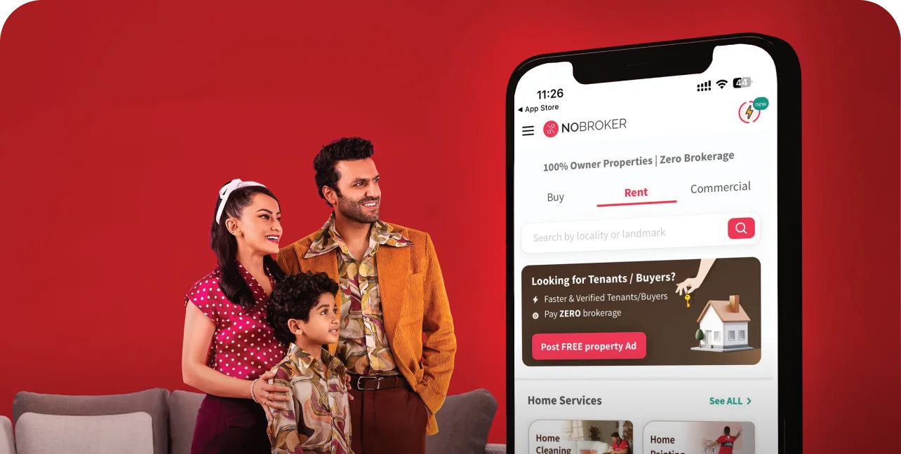
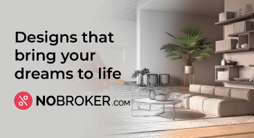
Home Painting Services Offered by NoBroker
NoBroker's professional painters can refresh your home with high-quality painting. They make it easy by offering a variety of services to fit your needs, all at affordable prices. No matter what, NoBroker's painting services can give your place a whole new look. Let's explore how NoBroker's painting services can transform your home inside and out.
- Interior Painting: Revitalise the ambience of your interiors with our meticulous interior painting services. Our experienced painters will skillfully renew your walls, ceilings, and trim, ensuring smooth and flawless finishes. Whether you're aiming for a modern, cosy, or sophisticated look, our interior painting service will exceed your expectations.
- Exterior Painting: Enhance your property's exterior with our exterior painting solutions. Our skilled painters use top-quality paints and techniques to protect your home from the elements and boost its overall appearance. Expect a durable finish that improves your home's curb appeal.
- Waterproofing: Secure your property with our trusted waterproofing service. Our experts use advanced methods to prevent moisture seepage, leaks, and structural damage. By opting for our waterproofing, you'll ensure your property remains well-protected over time.
- One Wall Painting: Add a focal point to any room with our one-wall painting service. Our painters pay attention to detail, making sure your chosen wall stands out as an artistic centrepiece that adds character to your space.
- One-Room Painting: Give a room a fresh new look with our one-room painting service. Whether it's your bedroom, living room, or kitchen, our skilled painters will revamp the space according to your preferences, creating a harmonious blend of colours that rejuvenates the entire room.
How to Book NoBroker House Painting Services?
Booking NoBroker house painting services is quick and simple. Just visit their platform, choose your service, share your requirements, and schedule your visit. Below is the step-by-step process:
- Book a home inspection: Our team will come to your home and inspect the areas that you want to be painted. This will help us to determine the scope of work and give you an accurate quote.
- Tell us your preferred time to book: We will work with you to schedule your painting project at a time that is convenient for you.
- Get accurate quotes with laser measurements: Our team will use laser measurements to get an accurate quote for your painting project. This will ensure that you are not overcharged.
- Guaranteed on-time project initiation and completion: We will start and finish your painting project on time, as promised.
- Post-paint cleanup and quality check: Our team will clean up the worksite after the painting project is complete. We will also do a quality check to make sure that you are satisfied with the results.
Why Choose NoBroker Painting Services?
NoBroker Painting Services offers a comprehensive and hassle-free painting solution for your home or office. We use genuine branded paints, provide end-to-end managed services, and offer a variety of value-added benefits.
- Genuine Branded Paints: We use only genuine branded paints from top manufacturers like Berger, Asian Paints, and Dulux. This ensures that your walls will be protected and look their best for years to come.
- End-to-end Managed Services: We take care of everything from the initial consultation to the final cleanup. This means you can relax and let us handle the entire process.
- Wall Health Checkup: Before we start painting, we will perform a wall health checkup to identify any areas that need repair. This will ensure that your walls are in good condition and that the paint will adhere properly.
- Professionally Trained Painters: Our painters are experienced and qualified professionals who are committed to providing you with a high-quality finish.
- Furniture and Electrical Outlets Masking: We will carefully mask your furniture and electrical outlets to protect them from paint damage.
- Free Insurance for Damages of Up to Rs. 10,000: We offer free insurance for damages of up to Rs. 10,000, so you can be confident that your home or office is protected.
- 1-Year Service Warranty against Chipping and Bubbling: We offer a 1-year service warranty against chipping and bubbling, so you can be sure that your paint job will last for years to come.
Free Cancellation: If you are not satisfied with our services for any reason, you can cancel your order for free.
Make Your Home Look Great with NoBroker Painting Services
Make your home look great with NoBroker painting services, featuring expert guidance, high-quality materials, and smooth execution. Their 3D visual preview helps you see colours before painting. Skilled professionals, transparent pricing, and zero brokerage make the experience simpler than traditional painters. With reliable support, on-time completion, and customised colour suggestions, NoBroker ensures a beautiful, long-lasting finish for every room.
Frequently Asked Questions?
Q: What are PoP colours?
Ans: PoP colours are vibrant, bold hues that create a sense of energy and excitement. They can include colours like turquoise, emerald green, fiery orange, or hot pink.
Q: Why use PoP colour combinations?
Ans: PoP colours can add personality to a space, make it feel more inviting, or draw attention to specific features. They can also be used to create a certain mood, like a playful or sophisticated feel.
Q: Is it hard to use PoP colours?
Ans: Not necessarily! While they can be bold, there are many ways to incorporate them tastefully.
Q: What colours go well with PoP colours?
Ans: PoP colours often pair well with neutrals like white, grey, or black. You can also use them with complementary colours from the colour wheel for a bolder look. You can also find inspiration online by searching for “PoP colour combination images”.
Q: Where can I use PoP colour combinations?
Ans: PoP colours can be used in any space, from living rooms and bedrooms to kitchens and bathrooms. They can be used on walls, furniture, accessories, or even artwork.
Q: How much PoP colour is too much?
Ans: It depends on the overall effect you want to achieve. A small PoP of colour can be very effective, while a larger area of PoP colour can create a more dramatic statement.
Q: I'm scared of making a mistake with PoP colours. What can I do?
Ans: Start small! Use a PoP of colour on an accent wall, throw pillows or artwork. You can also use online tools or design resources to visualise different colour combinations.
Q: Can PoP colours be used in a small space?
Ans: Yes! Lighter PoP colours or PoPs of colour used strategically can make a small space feel larger and more open.
Q: Are there any trends in PoP colour combinations for 2026?
Ans: The trend for 2026 is using PoP colours with unexpected neutrals, like brown or terracotta. This creates a more grounded and sophisticated feel.
Q: I need help choosing PoP colours for my home. Who can I ask?
Ans: NoBroker offers professional painting services that can help you select the perfect PoP colour combination for your space. You can also consult with an interior designer for personalised advice.
Recommended Reading
40+ Best Stunning Two Colour Combinations for Bedroom Walls to Elevate Your Space in 2026
January 31, 2025
336662+ views
Top 25 Outside Color Combinations with Colour Codes for Indian Homes in 2026
May 16, 2025
313964+ views
25 Latest Main Gate Colour Combination Ideas: Direction and Placement as Per Vastu in 2026
October 9, 2025
159239+ views
Top 26 Wall Paint Colour Combinations Ideas With Codes for Every Room in 2026
February 3, 2025
136985+ views
Asian Paints Off White Colour Codes: Names, Product Range and Paint Price
January 31, 2025
98465+ views
ARTICLE SOURCES
NoBroker Painting Tips & Color Ideas Testimonials
Before this festive season
get your house painted
Most Viewed Articles
40+ Best Stunning Two Colour Combinations for Bedroom Walls to Elevate Your Space in 2026
January 31, 2025
336662+ views
Top 25 Outside Color Combinations with Colour Codes for Indian Homes in 2026
May 16, 2025
313964+ views
Asian Paint Price 20 Litre for Different Variants in India: Coverage, Durability and Benefits
May 17, 2025
175867+ views
25 Latest Main Gate Colour Combination Ideas: Direction and Placement as Per Vastu in 2026
October 9, 2025
159239+ views
Top 26 Wall Paint Colour Combinations Ideas With Codes for Every Room in 2026
February 3, 2025
136985+ views
Painting Services in Top Cities of India
Top Paint Brands in India
| Asian Paints | Nerolac Paints |
| Berger Paints | Indigo Paints |
| Dulux Paints | Nippon Paints |
| Shalimar Paints |
 Author
Loved what you read? Share it with others!
Recent blogs in
Top 8 Modern Marble Texture Wall Paint for Stylish Homes in [2026]
March 27, 2026 by Krishnanunni H M
Top 10 Light Grey Paint Colors Combination with Codes That Improve Room Appearance in [2026]
March 27, 2026 by Krishnanunni H M
Colour Psychology for Home Interiors: How to Choose Wall Colours Based on Mood
March 27, 2026 by Kruthi


 Full RM + FRM support


Join the conversation!