Top Red Wall Paint Combinations to Elevate Your Home's Style 2026
Painting Tips & Color Ideas
8.5K Views
Table of Contents
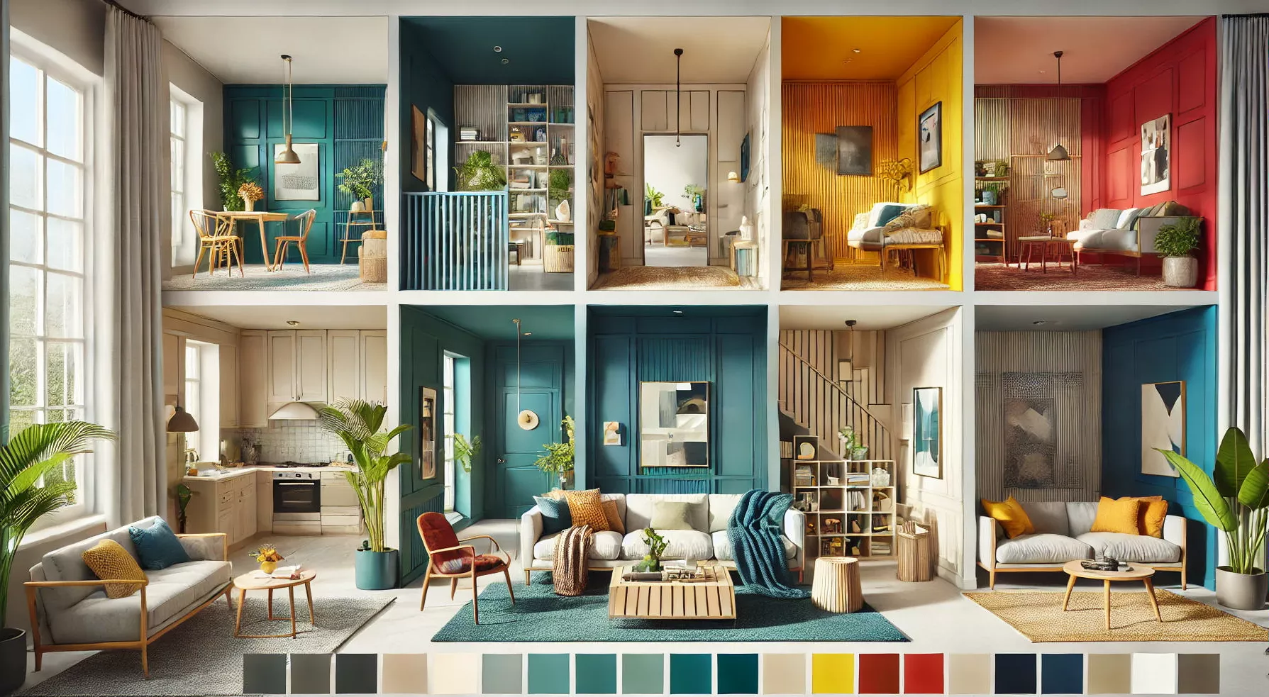
Red wall paint combinations can make any room in your house appear and feel different. They bring warmth, depth, and character to the place. Whether you choose a strong, rich hue or a gentler, subdued shade of red, it is a bold, brilliant colour that can have an effect.
With many complementary hues available, like white, black, grey, blue, green, and yellow, you may design a striking and harmonious colour scheme that matches your aesthetic and personal style. In this article, we look at many red wall paint combinations that may help you create the atmosphere and vibe you want in your house.
Recommended Reading
40+ Best Stunning Two Colour Combination...
338.6K Views
Top 25 Outside Color Combinations with C...
320.2K Views
25 Latest Main Gate Colour Combination I...
168.5K Views
Top 26 Wall Paint Colour Combinations Id...
139.3K Views

Asian Paints Colour Codes with Colour Na...
116.7K Views
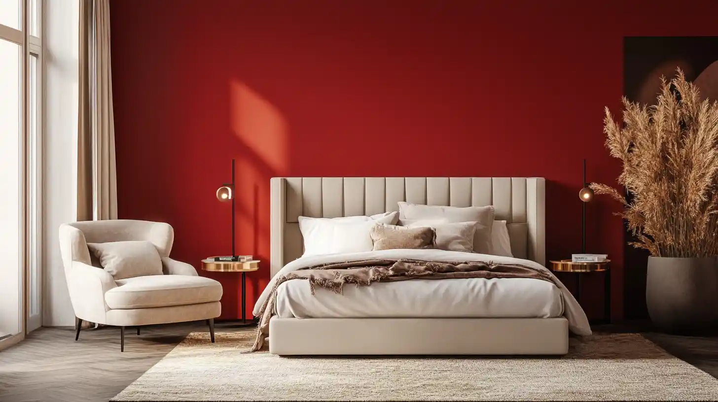
15+ Best Stylish Red Wall Paint Combinations For Home
Red is a strong, vibrant colour that can infuse any space with warmth and charm. However, selecting the ideal colour scheme for red may be challenging. The following red wall paint mixes might help you design a beautiful and fashionable interior.
1. Red and Yellow Combination For Walls
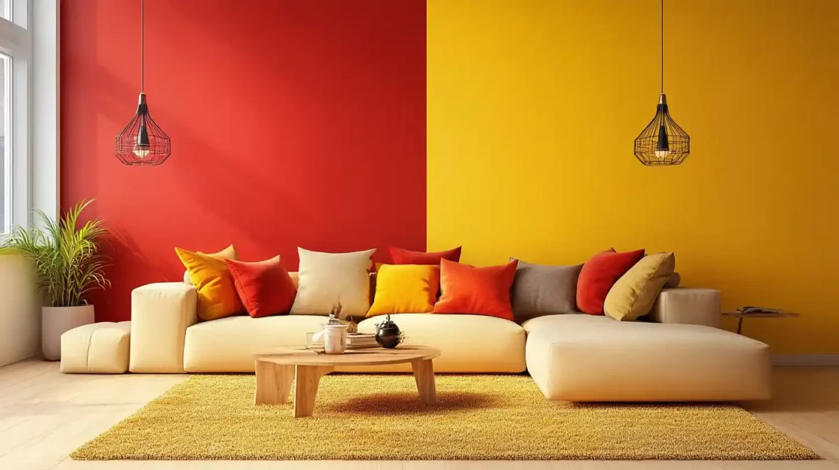
Red and yellow work well together to create a hospitable atmosphere. The living room or dining room benefits from this colour combination. You may paint one wall red and the other three yellow, or you can paint all four walls with an equal mixture of the two colours. Think about complementing the intensity of these colours with neutral furnishings and accents.
2. Combination of Red and Wood Finish
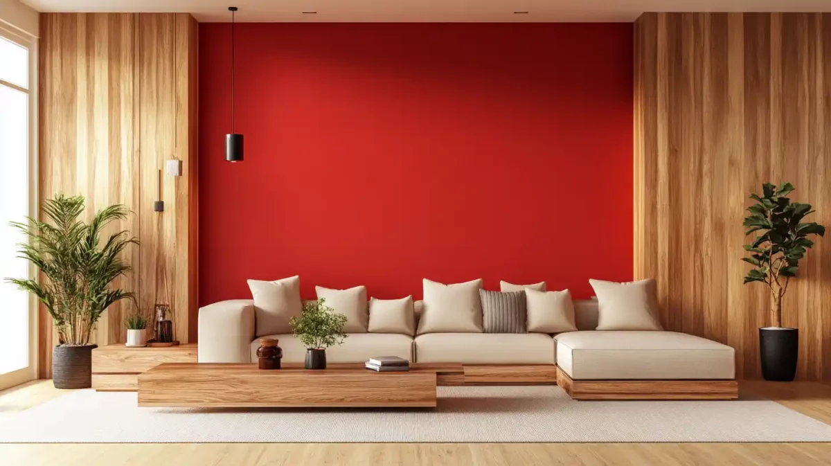
A rustic and inviting atmosphere is produced using red and wood finishes. The furniture can have a light wood finish and go well with a solid red accent wall. The bedroom and study both benefit from this colour scheme. Use other earthy hues like brown or green to give the whole design a unified feel.
3. Grey and Red Wall Paint Combination
Red and grey work well together to create a chic and contemporary atmosphere. You may paint the walls a light shade of grey and add red accessories like cushions, drapes, or artwork. In the living room or bedroom, these colours look great. Add metallic accessories like silver or gold to your outfit to create a glamorous aesthetic.
4. Orange and Red Wall Paint Combinations
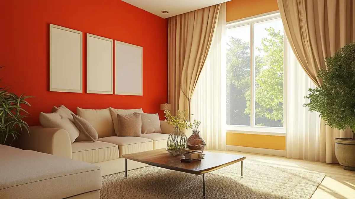
Red and orange together provide a cosy and refreshing atmosphere. This colour scheme benefits the living room or kitchen. You may paint the walls a dark shade of red and add orange decorations like curtains, pillows, or carpets. Use neutral hues like beige or white to assemble a unified aesthetic.
5. Using The Colours Red and Turquoise Together
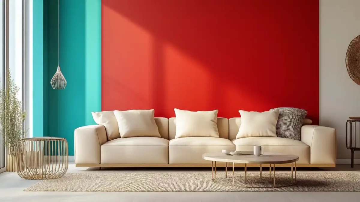
Red and turquoise work well together to create a daring and fun atmosphere. The bedroom and study both benefit from this colour scheme. You may paint the walls a soft shade of turquoise and add a striking red accent wall to the space. Consider utilising wood or metallic to offset the brightness of these colours.
6. Red and Blue Wall PaintCombinations
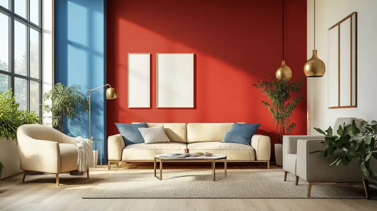
Red and blue work together to create a timeless and opulent atmosphere. This colour combination benefits the living room or dining room. Light blue walls can be used with red accessories like artwork or drapes. Think about using traditional furniture and accessories to create a timeless vibe.
7. Combination of Red, Black and White
Red, black, and white create a sleek, contemporary atmosphere. This colour combination benefits the living room or dining room. You may choose black and white as the main colours on the walls and furnishings, with red touches like cushions or artwork. Consider employing straightforward and clean-lined furniture to achieve a minimalist vibe.
8. Red and Gold Combined
Red and gold together create an opulent and wealthy atmosphere. The bedroom and study both benefit from this colour scheme. Walls painted in a dark crimson can be accented with golden elements like chandeliers and picture frames. Use velvet or silk fabrics to give off a refined appearance.
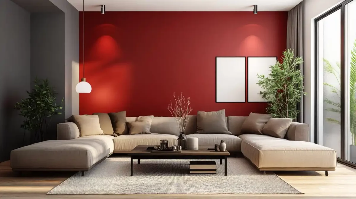
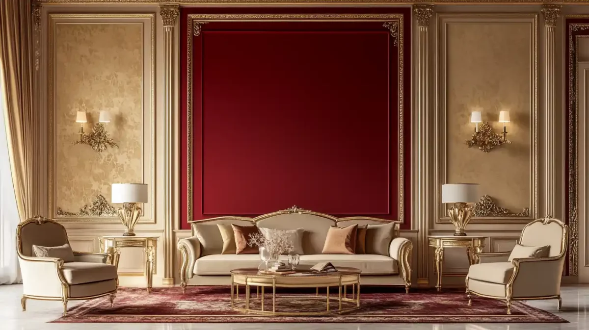
9. Neutrals and Traditional Reds
Classic crimson and neutral hues like beige, ivory, or grey combine to create a timeless and opulent atmosphere. This colour combination benefits the living room or dining room. Use a light neutral colour for the walls and add red accessories, such as curtains or carpets, to complete the look. Think about using antique or vintage furnishings to get a classic vibe.
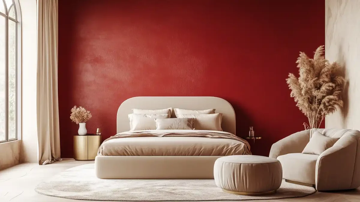
10. Bedroom in Red and White
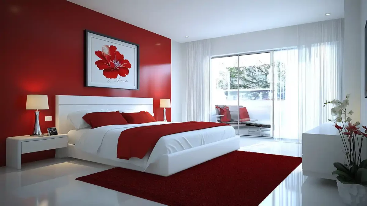
Red and white create a clean and refined atmosphere—the bedroom benefits from this colour scheme. You can paint the walls a soft shade of red and contrast them with white bedding and furnishings. Think about including patterned cushions or rugs to give interest and texture.
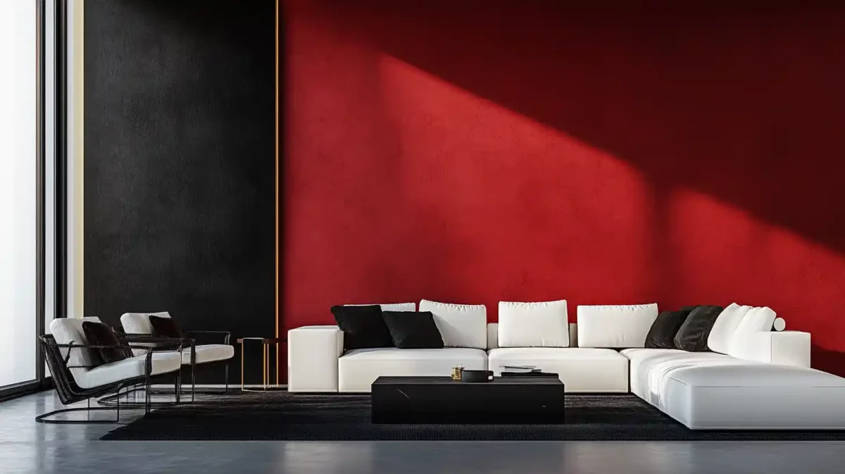
11. Red and Black Colour Combinations
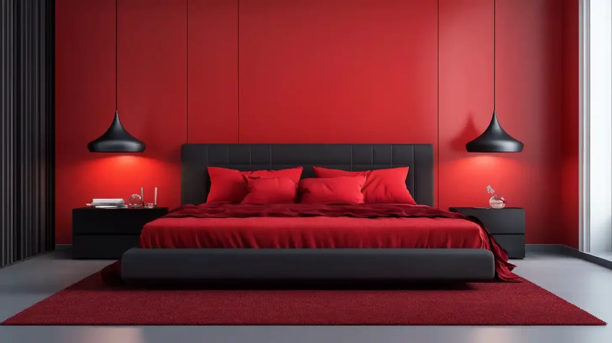
Black and crimson work well together to create a dramatic and opulent atmosphere—the living room or dining room benefits from this colour combination. You may paint the walls a rich shade of red and complement them with black details like furniture, carpets, and artwork. Use materials that are slick and shiny to give off a contemporary appearance.
12. Green and Red Colour Wall Paint Combinations
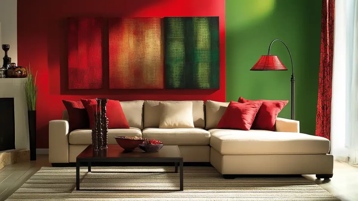
Red and green together provide a lively, energising atmosphere. This colour combination benefits the dining room or kitchen greatly. Combine vivid red for the walls with green decorations like plants, dinnerware, or artwork. Use woven or wooden materials to give an area a clean, natural aesthetic.
13. Purple and Red Wall Paint Colour Combinations
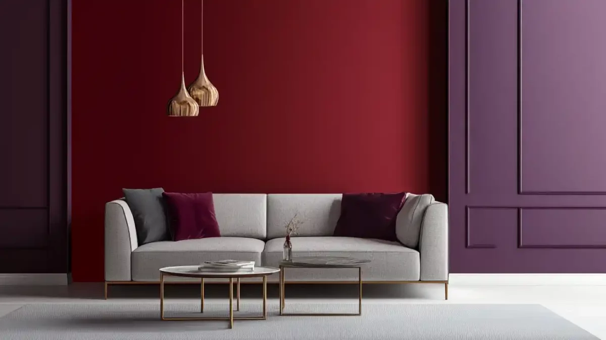
Purple and red work well together to create an unforgettable and opulent atmosphere. This colour scheme benefits the bedroom and study. A rich hue of red may be used for the walls, while purple furnishings like beds, curtains, or carpets can be used as accents. Consider utilising velvet or silk fabrics to add a little glitz.
14. Pink and Red Wall Paint Colour Combinations
Red and pink work well together to create a feminine and romantic atmosphere. This colour scheme benefits the bathroom or bedroom. You may paint the walls a delicate shade of red and add pink furnishings, such as bedding, towels, or artwork. Consider utilising flowery or lace fabrics to produce a delicate and lovely appearance.
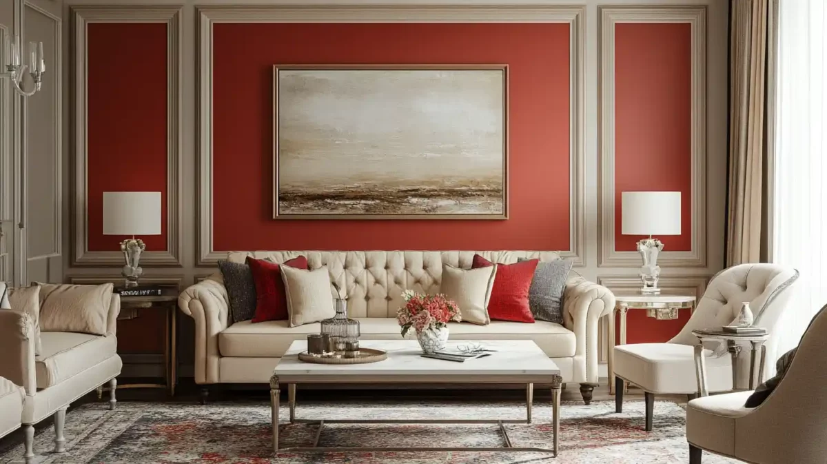
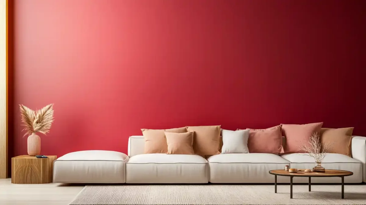
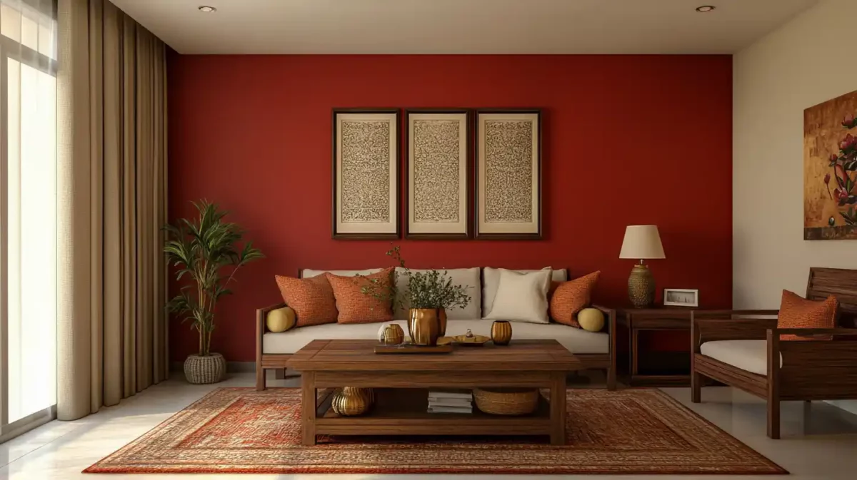
15. Beige and Red Wall Colour Combinations
Red and beige work well together to create a cosy and welcoming atmosphere. This colour combination benefits the living room or family room. The walls may be painted a light shade of red, and beige elements like area rugs, throw pillows, and furniture should complement them. Use soft or textured fabrics to give the space a warm and inviting atmosphere.
Using Red Colour Combination in Interior Design: Dos and Don'ts
Dos
- Use red as an accent: Red is a very powerful colour, so it's best to use it in moderation. A great way to do this is to use it as an accent colour in a room. This could mean painting one wall red, adding red pillows or curtains, or using red accessories.
- Pair red with neutral colours: Neutral colours like white, black, and grey are a great way to balance out the intensity of red. This creates a sophisticated and elegant look.
- Use complementary colours with red: Complementary colours are opposite on the colour wheel. When used together, they create a vibrant and eye-catching combination. Some complementary colours for red include green, blue, and yellow.
- Experiment with different shades of red: There are many different shades of red, from bright and bold to deep and dark. Experiment with other shades to find the ones that work best for you.
Don'ts
- Don't use too much red: Too much red can be overwhelming and create anxiety or stress. If you're using red as an accent colour, use it sparingly.
- Don't pair red with clashing colours: Some colours don't go well together, and red is one of them. Avoid pairing red with colours like pink, orange, or purple.
- Don't use red in small spaces: Red can make a small space feel smaller. If you're using red in a small room, use it sparingly and balance it with neutral colours.
- Don't use red in rooms where you want to relax: Red is a stimulating colour, so it's not the best choice for rooms where you want to relax, such as bedrooms or living rooms. If you do want to use red in these rooms, use it in moderation and pair it with calming colours.
Vastu Tips for Using Red Color in Your Home
According to Vastu, the choice of colours for space may significantly affect the residents' energy and attitude. For example, red is a vibrant, energising colour for strength. Here is some Vastu advice for incorporating red into your home.
- Pick The Proper Shade
It's critical to select the appropriate red colour for each room in the house. For example, a lighter shade of red may be used in the bedroom to create a romantic and relaxing ambience, while a deeper shade of red can be utilised in the living room or dining room to create a warm and welcoming setting.
- Add Accents In Red
Consider adding red accessories to a room, such as pillows, drapes, or rugs, rather than painting the entire space that colour. This will give the space a splash of colour without becoming too dominating.
- Red Should Be Used Correctly
According to Vastu Shastra, each direction corresponds to a certain colour. For instance, the colour red is related to the South. As a result, it is advised to use red in rooms facing south of the home, such as the living room or dining room.
- Colour Harmony With Other Hues
Red is a powerful and assertive colour. Therefore it's crucial to balance it with other hues to prevent the surroundings from disorganising. Utilise neutral hues like white, beige, or grey to counteract the red and provide a unified look.
- Red Should Not Be Used In The Bedroom
Red is a great colour for fostering a warm and passionate atmosphere, but it is advised to use it outside the bedroom. According to Vastu Shastra, red may make the bedroom restless and disturbed. So use calming hues instead, such as light blue or green.
How Can NoBroker Help?
Red wall paint combinations provide a flexible and striking method to improve your home's aesthetic appeal. There is a red wall paint mixture to meet your needs, whether you are trying to make a warm, private room or a strong, dramatic statement.
In addition, you may create a unique and visually beautiful design that represents your style and personality by combining your red walls with matching colours and accessories. So, whether you're painting a full room or just an accent wall, think about using a red wall paint mixture to improve the appearance and ambience of your house.
For homeowners and renters seeking ideas and direction on red wall paint choices, the NoBroker website is a terrific resource. In addition, NoBroker can assist you in making educated choices and building a lovely, unique area that you'll be proud to call home, thanks to its user-friendly layout and educational blog section.
Frequently Asked Questions
Q: What other colours go well with red wall paint as complementing hues?
Q: Which red colour is ideal for a bedroom?
Q: Can you use red wall paint in a tiny space?
Q: How many walls in a room should be painted red?
Q: How can I pick the perfect red paint for my house's walls?
Q: What are some of the best colour combinations with red?
About the Author

Sriharsakthi
Senior Editor
I am a SEO content writer with 4 years of working experience in the painting category. I create simple and clear content about interior, exterior, and decorative painting services. I focus on explaining colors, finishes, and techniques in an easy way, making painting information easy to understand for readers....
Recent Blogs
Subscribe to our Newsletter
Get latest news delivered straight to your inbox