- https://www.thedecorholic.com/pastel-wall-colors-your-guide-to-serene-stylish-spaces/
- https://www.asianpaints.com/blogs/pastel-paint-shades-for-your-space.html
- https://en.wikipedia.org/wiki/Pastel_(color)
- https://www.pixartprinting.co.uk/blog/pastel-colours-guide/
- https://www.asianpaints.com/colour-catalogue/blue-wall-colours/sky-watch.html
- https://www.nerolac.com/colour-catalogue/californian-sky
- https://www.bergerpaints.com/colour/colour-catalogue/earth-tone-wall-paints/silky-sage
- https://www.asianpaints.com/colour-catalogue/green-wall-colours/dry-sage.html
- https://www.asianpaints.com/catalogue/colour-catalogue/pink-wall-colours/rose-bud.html
- https://www.nerolac.com/colour-catalogue/little-pink-purse
- https://www.asianpaints.com/colour-catalogue/purple-wall-colours/lilac-tint-n.html
- https://www.nerolac.com/colour-catalogue/sensuous-lilac
- https://www.asianpaints.com/colour-catalogue/brown-wall-colours/light-butter-n.html
- https://www.nerolac.com/colour-catalogue/burst-of-energy
- https://www.asianpaints.com/colour-catalogue/off-white-wall-colours/white-butter.htm
- https://www.asianpaints.com/colour-catalogue/blue-wall-colours/light-sky.html
- https://www.nerolac.com/colour-catalogue/cool-blue
- https://www.nerolac.com/colour-catalogue/northern-winds
- https://www.asianpaints.com/colour-catalogue/blue-wall-colours/mint-blue.html
- https://www.asianpaints.com/catalogue/colour-catalogue/green-wall-colours/iced-teal.html
- https://www.nerolac.com/colour-catalogue/clear-blue-sky
- https://www.nerolac.com/colour-catalogue/perrier
- https://www.asianpaints.com/colour-catalogue/brown-wall-colours/military-boots-n.html
- https://www.nerolac.com/colour-catalogue/down-to-earth
- https://www.nerolac.com/colour-catalogue/platinum-lilac
- https://www.asianpaints.com/catalogue/colour-catalogue/pink-wall-colours/barbie-pink-n.html
- https://www.asianpaints.com/colour-catalogue/blue-wall-colours/nightfall-n.html
- https://www.asianpaints.com/colour-catalogue/green-wall-colours/celadon-mist-n.html
- https://www.nerolac.com/colour-catalogue/loyalty
- https://www.nerolac.com/colour-catalogue/sugared-peach
- https://www.nerolac.com/colour-catalogue/pistachio-nut
- https://www.asianpaints.com/colour-catalogue/green-wall-colours/wise-sage-n.html
- https://www.asianpaints.com/colour-catalogue/blue-wall-colours/night-swimming-n.html
- https://www.nerolac.com/colour-catalogue/pistachio-nut
- https://www.asianpaints.com/colour-catalogue/green-wall-colours/lemon-souffle.html
- https://www.nerolac.com/colour-catalogue/super-moon
- https://www.asianpaints.com/colour-catalogue/green-wall-colours/baby-aqua.html
- https://www.asianpaints.com/colour-catalogue/green-wall-colours/fresh-mint.html
- https://www.nerolac.com/colour-catalogue/light-reflections
- https://www.asianpaints.com/colour-catalogue/grey-wall-colours/dusk-blue.html
- https://www.asianpaints.com/colour-catalogue/orange-wall-colours/peach-rose.html
- https://www.bergerpaints.com/colour/colour-catalogue/earth-tone-wall-paints/elegantly-lilac
- https://www.nerolac.com/colour-catalogue/peach-tea
Table of Contents
What is Pastel Paint Colour? Popular Pastel Paint Colours for Home Walls Pastel Colour Combinations for Walls Pastel Paint Ideas by Room Type How to Style Pastel Walls - Expert Tips Mistakes to Avoid When Using Pastel Wall Colours Pastel Paint Colors vs Bright Colors â Which Should You Choose? How NoBroker Helps You Choose and Apply the Perfect Pastel Paint Colours Frequently Asked Questions?
Loved what you read? Share it with others!

14 Trending Pastel Paint Colors for Walls With Codes: Elevate Your Space in 2026
Updated : January 6, 2026, 10:53 PM
Author :
![]() Kruthi
Kruthi
Summary
Pastel paint colours are soft, muted shades created by mixing vibrant hues with white, giving them a calm, airy, and soothing appearance. These colours, such as pastel blue, green, pink, yellow, and lavender, gently reflect light, making rooms look brighter and more spacious. Homeowners choose pastels because they create a peaceful ambience, pair effortlessly with most décor styles, and work beautifully in bedrooms, living rooms, kitchens, and kids’ rooms. They’re also easier on the eyes compared to bold, saturated colours. With expert guidance, NoBroker helps homeowners pick and apply the perfect pastel wall shades for any space.
Table of Contents
What is Pastel Paint Colour? Popular Pastel Paint Colours for Home Walls Pastel Colour Combinations for Walls Pastel Paint Ideas by Room Type How to Style Pastel Walls - Expert Tips Mistakes to Avoid When Using Pastel Wall Colours Pastel Paint Colors vs Bright Colors â Which Should You Choose? How NoBroker Helps You Choose and Apply the Perfect Pastel Paint Colours Frequently Asked Questions?
Choosing the perfect pastel paint color for walls is the secret to creating the light-filled, serene, and sophisticated interiors seen in contemporary home designs. These soft, dreamy hues, far from being childish, bring a refined elegance and a sense of calm to any space. This essential guide explores the most effective pastel shades for home walls, detailing how to select the right undertones, create cohesive colour schemes, and apply these versatile hues to maximise light and aesthetic impact across your entire home.
What is Pastel Paint Colour?
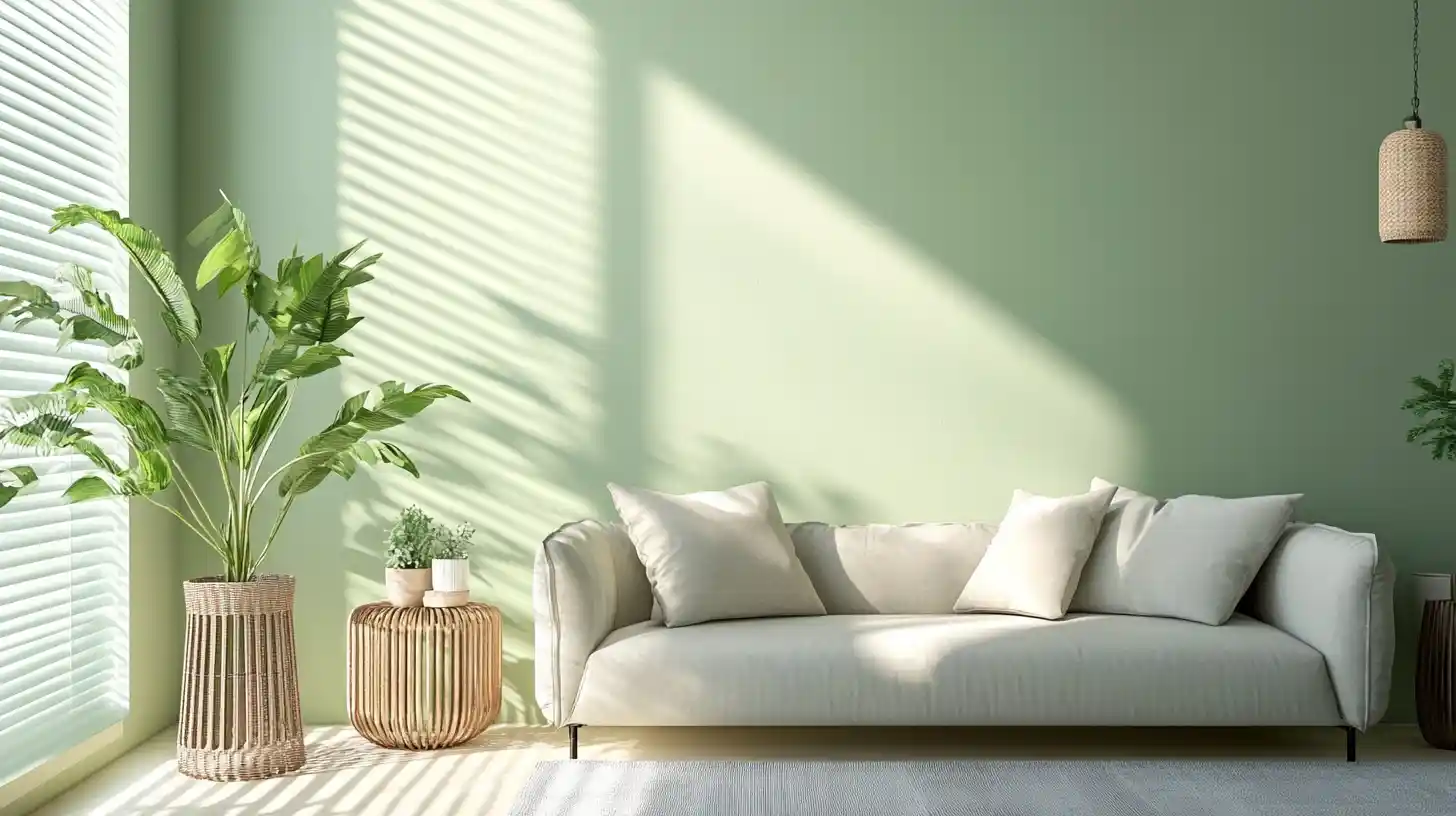
A pastel wall colour is defined by its high concentration of white pigment mixed with a pure hue, resulting in a soft, diluted appearance that is inherently light-reflecting. This distinct composition makes these shades gentle on the eye and prevents them from carrying the intense energy of their saturated counterparts. Pastels are strategically used in modern interiors to evoke feelings of serenity, calmness, and sophistication, often helping to make a space feel visually larger and more open. [1] [2] [3] [4]
Popular Pastel Paint Colours for Home Walls
The popularity of pastel wall colours has surged because each colour family offers unique psychological benefits, creating specific moods tailored to the room's function.
1. Blues Pastel
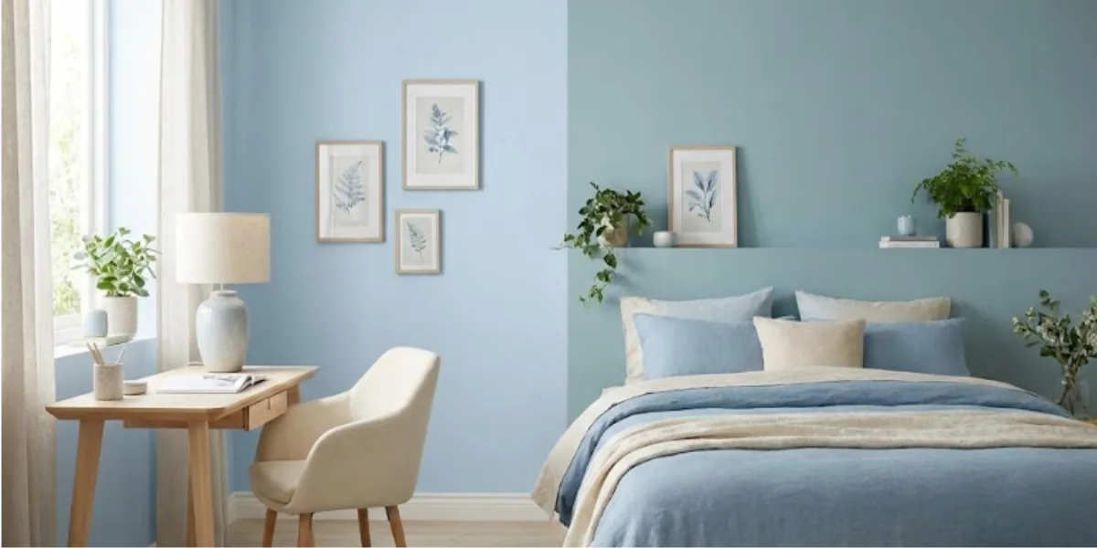
These tones are inherently calming, expansive, and cooling, making them ideal for spaces dedicated to relaxation or focused work, such as bedrooms or home offices. Shades like powder blue or duck egg blue are known to reduce blood pressure and stress levels.
| Colour | Brand | Shade Name | Colour Code | Shade Type |
| Sky Watch | Asian Paints | Sky Watch | 7362 [5] | Light blue / Blue family (interior wall shade) |
| Californian Sky | Nerolac | Californian Sky | 4903 [6] | Light blue / Blue shade |
2. Greens Pastel
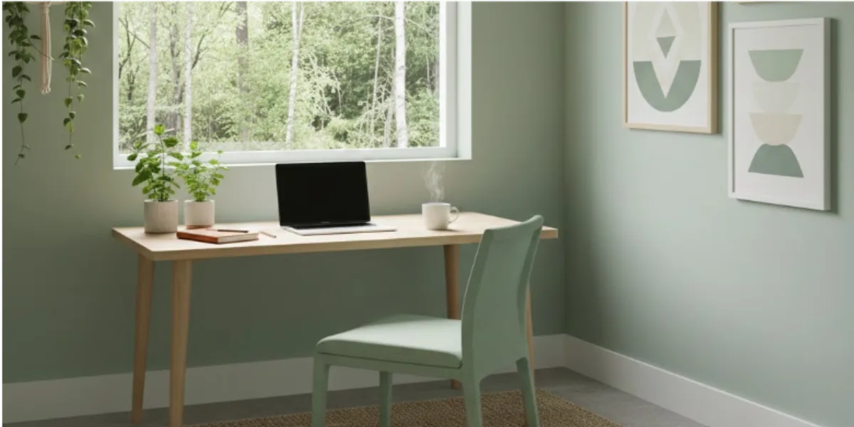
Offering a refreshing, balancing, and natural energy, soft green shades like mint or sage are perfect for areas requiring concentration or connection to the outdoors. They have the added psychological effect of reducing eye strain and improving overall focus.
| Colour | Brand | Shade Name | Colour Code | Shade Type |
| Silky Sage | Berger Paints | Silky Sage | 7T1509 [7] | Earth-tone / Sage family (light natural green) |
| Dry Sage | Asian Paints | Dry Sage | 7624 [8] | Sage-green family (soft, subdued green) |
3. Pinks Pastel
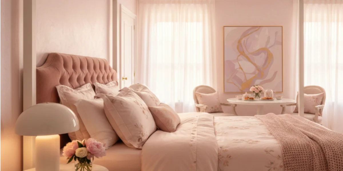
Gentle pinks, such as blush or pale coral, promote nurturing, uplifting, and soothing energies. They are perfect for master bedrooms, dining rooms, or spaces where comfort and an inviting, warm glow are the primary objectives.
| Colour | Brand | Shade Name | Colour Code | Shade Type |
| Rose Bud | Asian Paints | Rose Bud | 8035 [9] | Soft pink / pastel pink tone, interior wall shade |
| Little Pink Purse | Nerolac | Little Pink Purse | 4119 [10] | Soft pink / chiffon-like light pink shade |
4. Purples Pastel
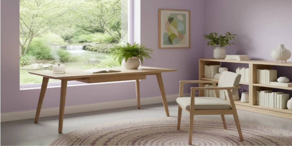
Shades like lavender or lilac introduce a creative, spiritual, and meditative energy. These are excellent pastel room paint choices for reading nooks, meditation spaces, or areas dedicated to reflective and artistic pursuits.
| Colour | Brand | Shade Name | Colour Code | Shade Type |
| Lilac Tint-N | Asian Paints | Lilac Tint-N | 9609 [11] | Light lilac/pastel purple wall shade |
| Sensuous Lilac | Nerolac | Sensuous Lilac | 4183 [12] | Muted lilac / delicate purple shade |
5. Yellows Pastel
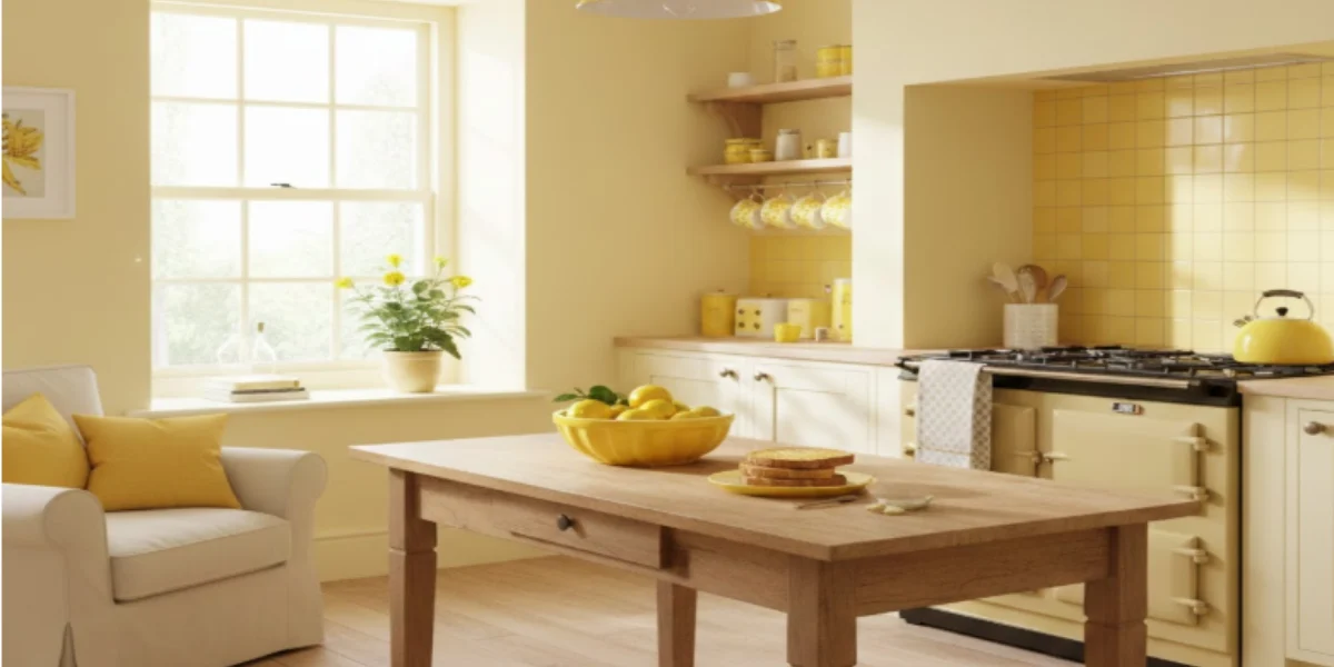
These colours are cheerful, optimistic, and naturally warm. Buttercream yellow is perfect for north-facing rooms that need brightening, or for kitchens that need a stimulating, energetic atmosphere to start the day.
| Colour | Brand | Shade Name | Colour Code | Shade Type |
| Light Butter-N | Asian Paints | Light Butter-N | L189 [13] | Neutral/soft beige-yellow wall shade |
| Burst of Energy | Nerolac | Burst of Energy | 4597 [14] | Vibrant yellow/energetic yellow wall shade |
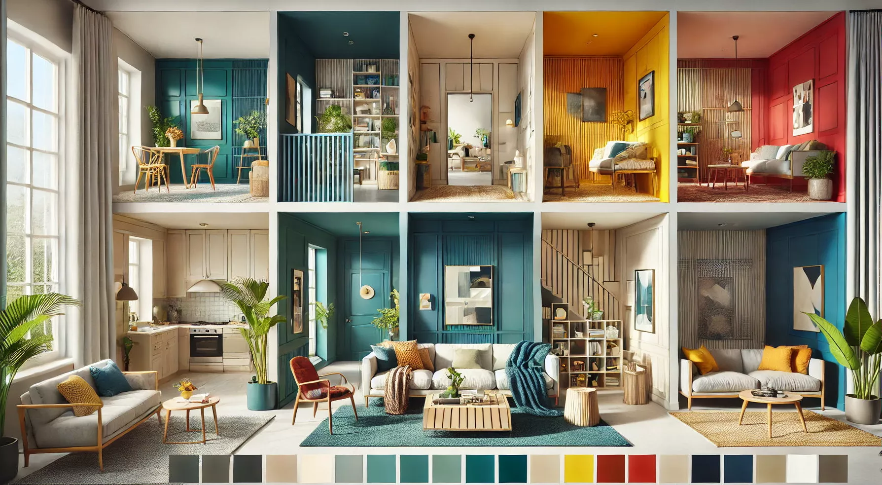
Pastel Colour Combinations for Walls
The key to successful interior design with pastel colour wall paint lies in creating smart contrast and balance, preventing the palette from looking too "sweet" or simplistic. Pastel wall colours pair beautifully with other pastel tones or with darker, contrasting shades to achieve sophistication.
6. Neutrals + Pastel: The Classic Approach
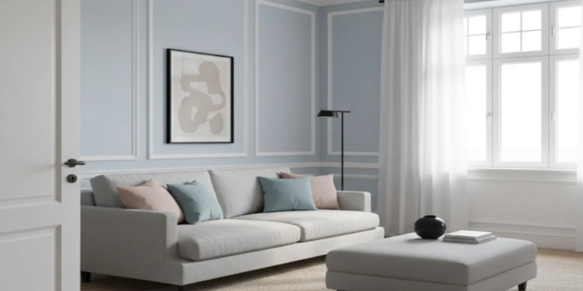
Pair light sky blue walls with crisp white trim for a fresh, timeless look. White edges enhance definition, while light grey furniture grounds the palette. Add subtle grey furniture to create contrast and keep the space elegant without feeling overly light.
| Colour | Brand | Shade Name | Colour Code | Shade Type |
| White Butter | Asian Paints | White Butter | L164 [15] | Off-white/warm creamy white wall shade |
| Light Sky | Asian Paints | Light Sky | 7331 [16] | Light blue / pastel blue wall shade |
| Cool Blue | Nerolac | Cool Blue | 4299 [17] | Soothing blue wall shade |
| Northern Winds | Nerolac | Northern Winds | W-154 [18] | (white shade) |
7. Metallics + Pastel: Adding Glamour
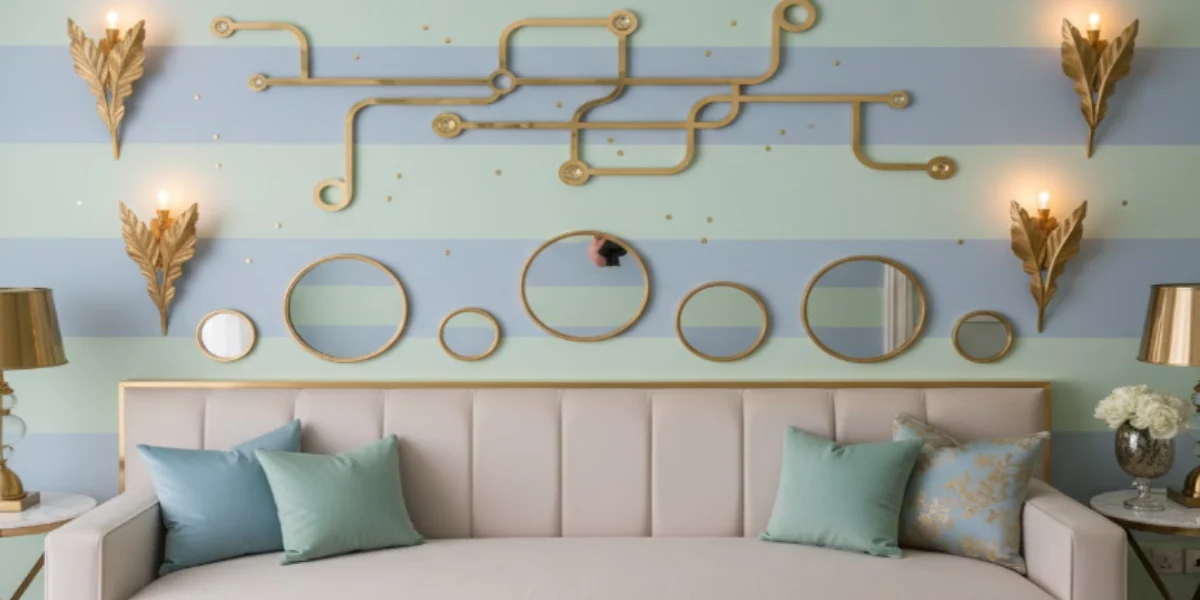
Applying shades like mint or powder blue to the walls and adding metallic accents such as gold or brass instantly adds warmth to cool pastel colours, giving your living room wall a glamorous look.
| Colour | Brand | Shade Name | Colour Code | Shade Type |
| Mint Blue | Asian Paints | Mint Blue | 7435 [19] | Light blue/breezy pastel blue wall shade |
| Iced Teal | Asian Paints | Iced Teal | 7483 [20] | Soft teal / muted green-blue wall shade |
| Clear Blue Sky | Nerolac | Clear Blue Sky | 4901 [21] | Clear light blue wall shade |
| Perrier | Nerolac | Perrier | 2563 [22] | Light green / pastel green wall shade |
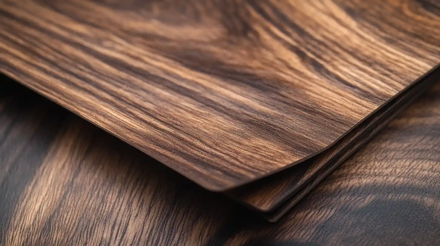
8. Wood Tones + Pastel: Natural Harmony
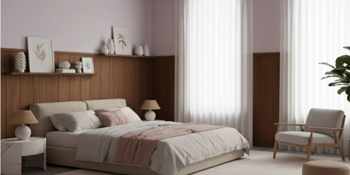
The brown wood tone on the walls looks beautiful with blush lilac walls, creating a light, airy, and comfortable atmosphere that's perfect for bedrooms and living areas. Overall, this combination brings an organic balance, lasting beauty, and a peaceful, nature-inspired harmony to modern interiors.
| Colour | Brand | Shade Name | Colour Code | Shade Type |
| Military Boots-N | Asian Paints | Military Boots-N | 9885 [23] | Deep earthy brown/brown family wall shade |
| Lilac Tint-N | Asian Paints | Lilac Tint-N | 9609 [24] | Light lilac / soft pastel purple wall shade |
| Down to Earth | Nerolac | Down to Earth | 4942 [25] | Beige/warm neutral earthy wall shade |
| Platinum Lilac | Nerolac | Platinum Lilac | 2296 [26] | Pastel lilac / cool violet wall shade |
9. Bold Accents + Pastel: Statement Making
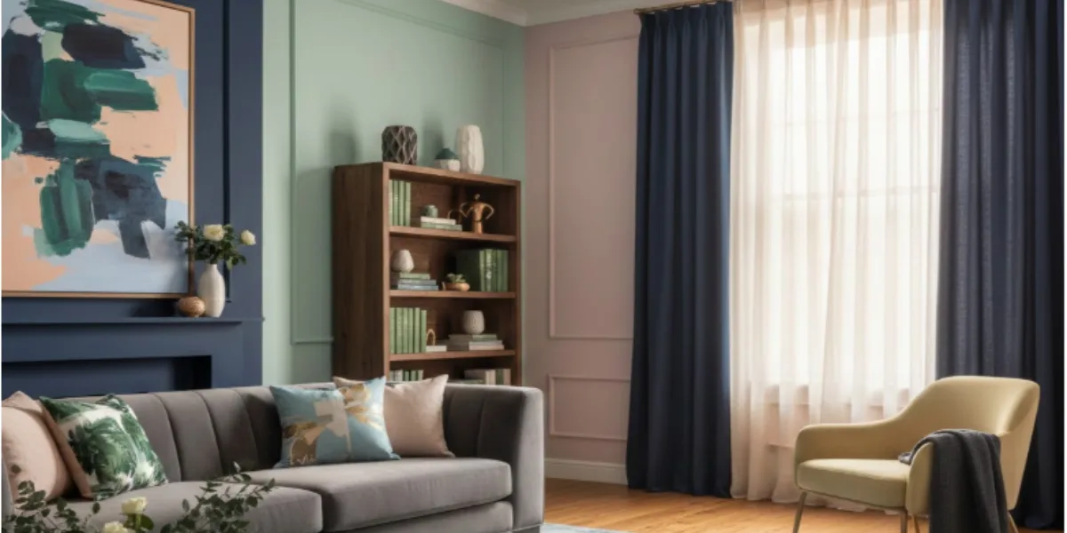
Deep navy blue creates a strong contrast with lighter pastel colours, giving the room visual weight. Incorporating charcoal grey or forest green in textiles and artwork creates a striking contrast, making the light pastel shades on the walls feel grounded and sophisticated rather than washed out.
| Colour | Brand | Shade Name | Colour Code | Shade Type |
| Barbie Pink-N | Asian Paints | Barbie Pink-N | K032 [27] | Vibrant/bold pink interior wall shade |
| Nightfall-N | Asian Paints | Nightfall-N | 9659 [28] | Deep blue/intense night-inspired blue wall shade |
| Celadon Mist-N | Asian Paints | Celadon Mist-N | 9761 [29] | Soft green/gentle celadon-like green wall shade |
| Loyalty | Nerolac | Loyalty | 2434 [30] | Rich blue/confident deep blue wall shade |
| Perrier | Nerolac | Perrier | 2563 [22] | Light green/refreshing spring green wall shade |
| Sugared Peach | Nerolac | Sugared Peach | 2115 [31] | Warm peach / soft blush peach wall shade |
Pastel Paint Ideas by Room Type
Applying the right pastel paint ideas depends entirely on the room's function, lighting, and the mood you wish to establish. Choosing the wrong shade for the light direction can lead to disappointing results.
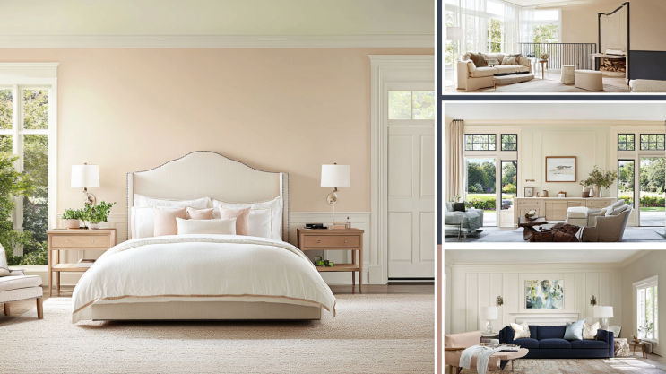
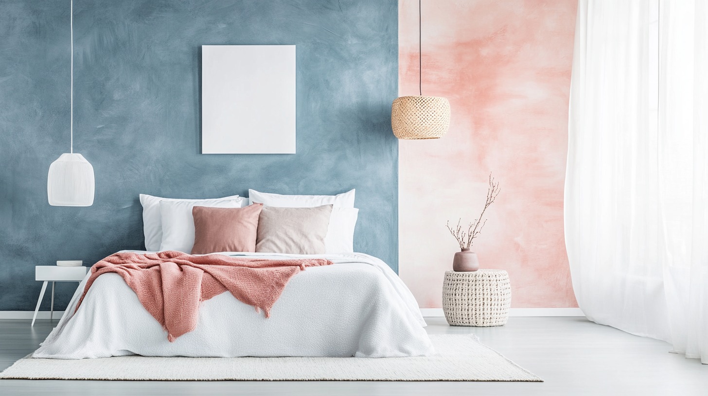
10. Bedrooms: Sanctuaries of Soft Color
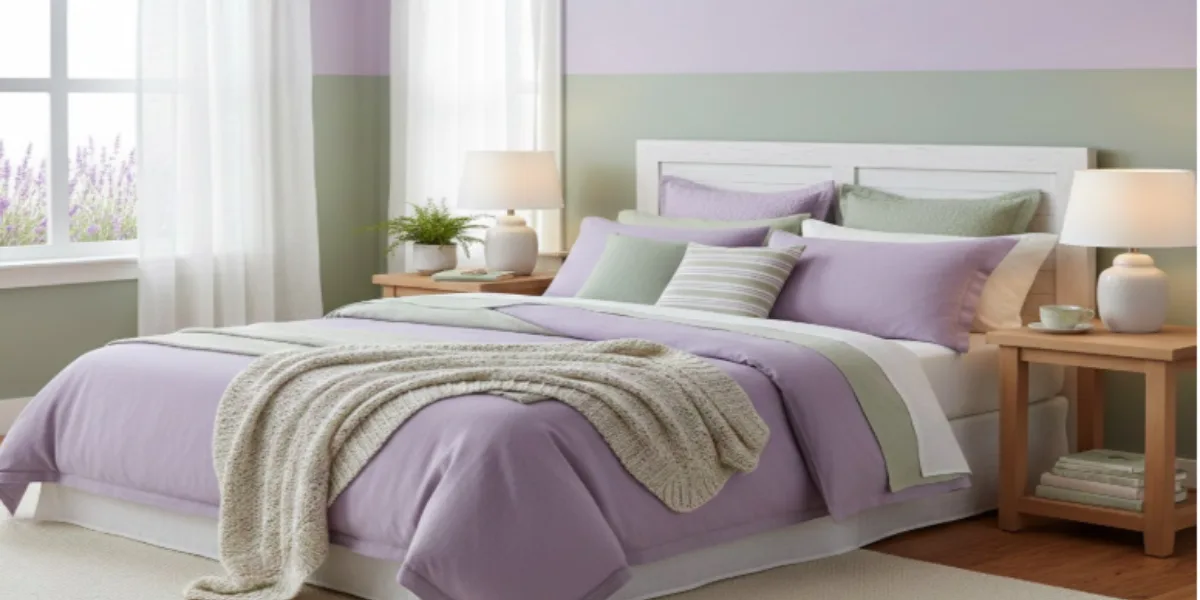
The best pastel coloured bedrooms utilise calming hues like lavender, soft sage, or pale blue, as these shades promote relaxation and enhance sleep quality. Design experts recommend layering different tones of the same pastel for depth and accenting with crisp white bedding and natural wood textures.
| Colour | Brand | Shade Name | Colour Code | Shade Type |
| Lilac Tint-N | Asian Paints | Lilac Tint-N | 9609 [11] | Light lilac/soft pastel purple wall shade |
| Dry Sage | Asian Paints | Dry Sage | 7624 [8] | Soft sage green wall shade (muted green) |
| Platinum Lilac | Nerolac | Platinum Lilac | 2296 [26] | Pastel lilac/cool violet wall shade |
| Pistachio Nut | Nerolac | Pistachio Nut | 2557 [32] | Pale green/pistachio-inspired soft green shade |
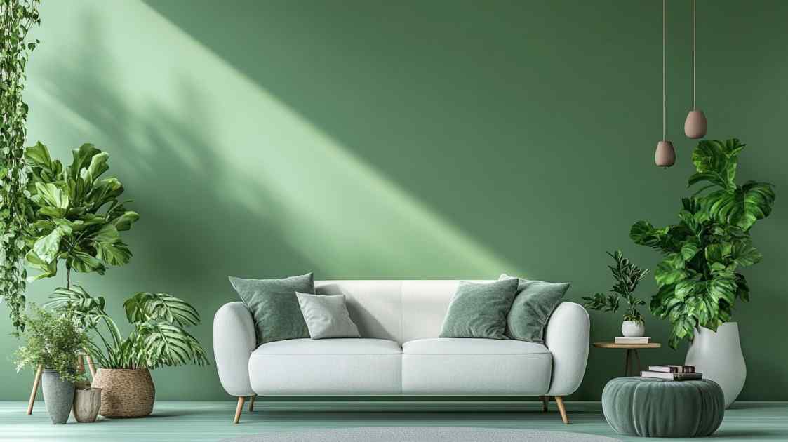
11. Living Rooms: Everyday Elegance
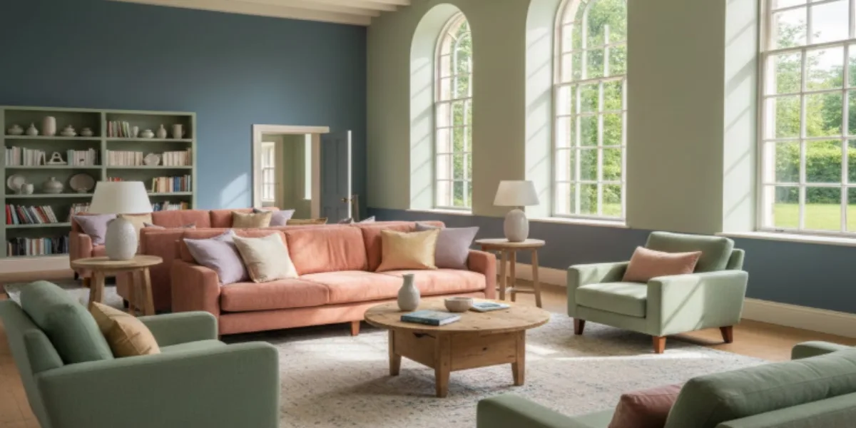
For common areas, choose soft sage green, duck egg blue, or a pink with subtle undertones. These colours provide a perfect, comfortable backdrop for conversation. In larger living areas, using slightly deeper pastel tones prevents the room from feeling empty or washed out by too much light.
| Colour | Brand | Shade Name | Colour Code | Shade Type |
| Wise Sage-N | Asian Paints | Wise Sage-N | K142 [33] | Calm sage green/muted green wall shade |
| Night Swimming-N | Asian Paints | Night Swimming-N | 9655 [34] | Deep blue/twilight-inspired blue wall shade |
| Pistachio Nut | Nerolac | Pistachio Nut | 2557 [32] | Pale nut-inspired green wall shade |
| Loyalty | Nerolac | Loyalty | 2434 [30] | Cool blue/confident blue wall shade |
12. Kitchens: Fresh and Inviting
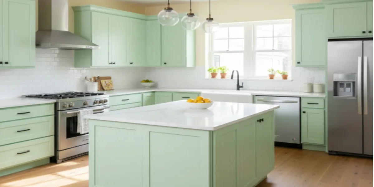
Kitchens benefit from slightly more energetic pastels such as mint green and soft aqua. These shades are energising yet stimulating. A popular modern trend is to apply these pastels directly to kitchen cabinets or islands for unexpected charm, contrasting with white countertops and stainless steel.
| Colour | Brand | Shade Name | Colour Code | Shade Type |
| Wise Sage-N | Asian Paints | Wise Sage-N | K142 [33] | Gentle sage green/muted green wall shade |
| Lemon Souffle | Asian Paints | Lemon Souffle | 7773 [35] | Fresh yellow-green/citrus-inspired wall shade |
| Pistachio Nut | Nerolac | Pistachio Nut | 2557 [32] | Pale green/pistachio-inspired soft green wall shade |
| Super Moon | Nerolac | Super Moon | 4595 [36] | Warm yellow/sunny golden wall shade |
13. Bathrooms: Spa-Like Serenity
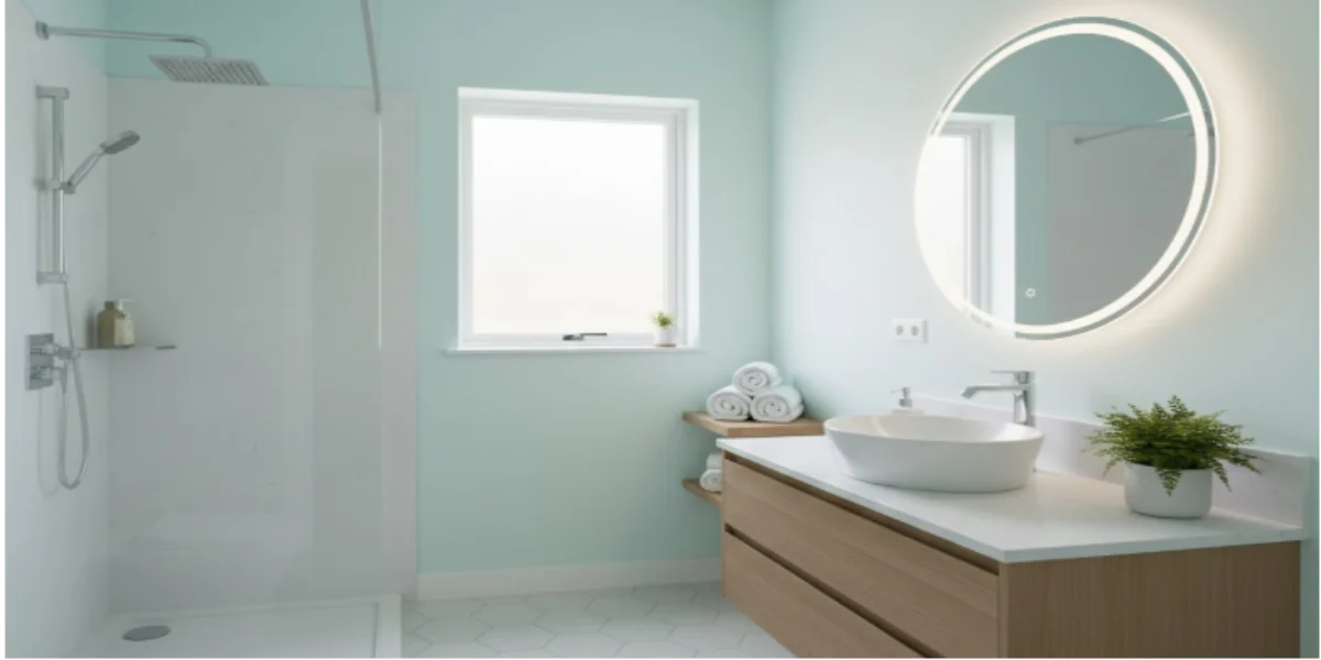
In smaller, functional spaces, pale blue, light aqua, or mint green create a clean, airy, and spa-like feeling. A key design tip for small bathrooms is painting the walls and ceiling the same pastel color to remove visual boundaries and optically expand the space.
| Colour | Brand | Shade Name | Colour Code | Shade Type |
| Baby Aqua | Asian Paints | Baby Aqua | 7507 [37] | Soft aqua green/fresh sea-like green wall shade |
| Fresh Mint | Asian Paints | Fresh Mint | 7516 [38] | Light mint green/pastel gentle green tone |
| Light Reflections | Nerolac | Light Reflections | 4297 [38] | Very soft, bluish-green / neutral pastel reflective shade |
| Perrier | Nerolac | Perrier | 2563 [39] | Pale green/refreshing natural green wall shade |
14. Home Offices: Focus with Flair
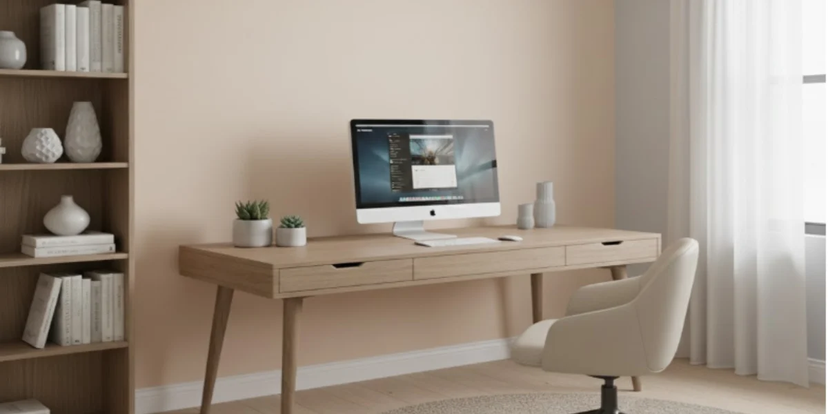
Soft greens, pale blue-grey, or gentle peach pastels promote concentration without distraction. For a focused look, consider painting only the wall directly behind the desk with a pastel accent, contrasting it with the other neutral walls to enhance productivity.
| Colour | Brand | Shade Name | Colour Code | Shade Type |
| Dusk Blue | Asian Paints | Dusk Blue | 7382 [40] | Grey-blue/muted deep blue-grey wall shade |
| Peach Rose | Asian Paints | Peach Rose | 7994 [41] | Peach-rose/soft warm peach-pink tone |
| Elegantly Lilac | Berger Paints | Elegantly Lilac | 7T2989 [42] | Soft lilac/pastel violet-grey-mauve wall shade |
| Peach Tea | Nerolac | Peach Tea | 4052 [43] | Warm peach/sunset-inspired peach shade |
How to Style Pastel Walls - Expert Tips
Successfully integrating pastel paint colour for walls requires careful consideration of textures, contrast, and accessory placement to prevent the space from appearing immature or dull. [1] [2] [3] [4]
- Use Texture to Add Depth: Create visual interest by layering textures like velvet cushions, rattan furniture, wool rugs, and linen fabrics, enriching soft wall colours with textural variation.
- Implement the 60-30-10 Rule: Follow the designer's formula: 60% dominant colour (pastel walls), 30% secondary (large furniture), 10% accent (artwork or pillows) for visual balance.
- Choose the Right Sheen: Choose matte or flat paint for bedrooms and living rooms to absorb light and hide imperfections. Use eggshell or satin finishes in kitchens and bathrooms for durability and easy cleaning.
- Ground the Space with Dark Accents: To avoid a "too sweet" look, add touches of black, navy, or charcoal gray in picture frames, lighting, or side tables for contrast and grounding.
- Maximise Natural Light Reflection: Place mirrors opposite windows to reflect natural light, boosting brightness and enhancing the pastel wall's ethereal quality.
Mistakes to Avoid When Using Pastel Wall Colours
Even experienced designers encounter pitfalls with pastels. Being aware of common errors ensures that your pastel wall shades translate beautifully from the sample swatch to the final room. [1] [2] [3] [4]
- Ignoring Natural Light Sources: Failing to consider the room's direction (North/South/East/West) can lead to disappointment; North-facing rooms require warmer pastels to avoid feeling cold, while South-facing rooms can handle cooler shades.
- Choosing the Wrong Undertone: A pastel's complexity is in its undertone (grey, purple, or green); selecting a shade that clashes with fixed elements (like wood flooring or marble) creates a jarring effect.
- Neglecting Proper Surface Preparation: Pastels require a clean, patched, and sanded surface due to their high white pigment; skipping primer results in a patchy, amateurish finish.
- Going Too Pure or Too Saturated: The pastel wall paint should maintain high white content. Overly saturated or bright shades lose their calming effect and may appear cheap rather than sophisticated.
- Failing to Sample Correctly: Don't rely on a small paint chip. Instead, paint 2x2 foot squares on two walls and watch how the color changes over 48 hours in different lighting before deciding.
Pastel Paint Colors vs Bright Colors – Which Should You Choose?
When deciding on the right pastel paint colour for walls or a bold hue, consider the fundamental impact each palette has on light, space, and mood. This comparison clarifies when tranquility is best, and when energy is required for your home.
| Aspect | Pastel Paint Colors | Bright/Saturated Colors |
|---|---|---|
| Psychological Effect | Calm, soothing, and relaxing; promotes serenity and reduces visual strain, ideal for winding down. | Stimulating, energising, and uplifting; promotes activity and high visual engagement, best for active hours. |
| Spatial Perception | High light reflection (due to high white content); effectively makes small rooms feel larger, airy, and open. | Low-light reflections fill large spaces with vibrancy but can make small rooms feel crowded or overwhelming. |
| Aesthetic Tone | Sophisticated, soft, and timeless, it serves as a versatile backdrop that complements bold textures and furnishings. | Bold, lively, and highly vibrant; used to create a strong visual focal point and add strong personality. |
| Best Use Cases | Bedrooms, home offices (for focus), bathrooms, and small apartments need an airy feel. | Play areas, dedicated accent walls, kitchens (for energy), and high-traffic communal spaces. |
How NoBroker Helps You Choose and Apply the Perfect Pastel Paint Colours
NoBroker simplifies the complex journey of choosing and applying the perfect pastel paint colour for walls by offering expert consultation and verified painting services. Our colour consultants provide personalised advice on selecting the right pastel wall colours based on your room's direction, existing decor, and desired psychological effect. We handle the entire application process, from flawless surface preparation and primer application to final, even coating, guaranteeing a professional and sophisticated finish that transforms your home into a beautiful, modern sanctuary.
Frequently Asked Questions?
Q1. What are the best pastel paint colors for walls?
Ans: The most effective pastel paint colour for walls includes soft shades like duck egg blue, sage green, blush pink, and buttercream yellow, as they balance light reflection with a sophisticated tone.
Q2. Which pastel shade is best for bedrooms?
Ans: Soft shades of lavender and pale blue are considered the best pastel colours for bedrooms, as they promote calmness and relaxation and are linked to improved sleep quality.
Q3. Can pastel colours make my room look bigger?
Ans: Yes, pastels have a high white content, which causes them to reflect more light than saturated colors, creating an optical illusion of expanded space and making the room look bigger.
Q4. Which pastel colours suit living rooms best?
Ans: Sophisticated shades like warm beige, soft grey-green (sage), and powder blue are best for living rooms, as they provide an elegant, neutral backdrop without dominating the space.
Q5. Are pastel wall colors good for Indian homes?
Ans: Yes, pastel wall colours are excellent for Indian homes as they help maximize natural light, mitigate the effect of heat, and provide a clean, modern contrast to traditional wooden or colorful furnishings.
Q6. Can I combine two pastel colours on one wall?
Ans: Yes, combining two pastel wall colours is effective if they share similar undertones (e.g., pale blue and soft grey-green) and are balanced using the 60-30-10 colour rule.
Q7. Do pastel shades fade quickly?
Ans: Modern pastel paint colours are formulated to resist fading. However, any light surface exposed to direct sunlight should use high-quality paint with UV resistance to ensure long-term colour stability.
Q8. Which furniture suits pastel walls?
Ans: Furniture with natural wood tones (walnut, oak), clean white lacquer finishes, or elegant accents in brass, gold, or charcoal grey best suits pastel wall colours.
Q9. Are pastel colours suitable for small apartments?
Ans: Yes, pastel shades for walls are highly suitable for small apartments because their high light reflectivity maximises the sense of space and reduces visual clutter.
Q10. Does NoBroker offer painting services for pastel wall colors?
Ans: Yes, NoBroker offers comprehensive painting services, including expert colour consultation to help select the perfect pastel wall colours and professional application for a flawless finish.
Recommended Reading
20 Best Pista Green Colour Combinations: Transform Your Home Interiors with Latest Designs in 2026
January 31, 2025
46828+ views
Best Ivory Colour Paint Combinations for 2026: Elegant & Modern Interior Ideas
January 31, 2025
33720+ views
17 Treading Wall Colour Combination with Light Green in 2026 with Codes
January 31, 2025
30454+ views
32 Best Stunning Sunmica Colour Combinations With Colour Codes to Elevate Your Interiors in 2026
January 31, 2025
30002+ views
36 Creative Door Colour Combination Ideas for Your Stylish Home Entrances in 2026
January 31, 2025
27297+ views
ARTICLE SOURCES
NoBroker Painting Tips & Color Ideas Testimonials
Before this festive season
get your house painted
Most Viewed Articles
40+ Best Stunning Two Colour Combinations for Bedroom Walls to Elevate Your Space in 2026
January 31, 2025
336452+ views
Top 25 Outside Color Combinations with Colour Codes for Indian Homes in 2026
May 16, 2025
313208+ views
Asian Paint Price 20 Litre for Different Variants in India: Coverage, Durability and Benefits
May 17, 2025
175554+ views
25 Latest Main Gate Colour Combination Ideas: Direction and Placement as Per Vastu in 2026
October 9, 2025
158493+ views
Top 26 Wall Paint Colour Combinations Ideas With Codes for Every Room in 2026
February 3, 2025
136781+ views
Interior Painting Services in Top Cities of India
Top Paint Brands in India
| Asian Paints | Nerolac Paints |
| Berger Paints | Indigo Paints |
| Dulux Paints | Nippon Paints |
| Shalimar Paints |
 Author
Loved what you read? Share it with others!
Recent blogs in
Best Colour for Home Exterior Based on Climate, Style and Modern Design with Colour Codes in 2026
February 19, 2026 by Priyanka Saha
Radium Paint for Walls: Types, Application and Protective Features in 2026
February 19, 2026 by Priyanka Saha
10 Best Brick Wall Painting Texture Design for Modern and Rustic Homes in 2026
February 19, 2026 by Krishnanunni H M


 Full RM + FRM support


Join the conversation!