Top 15 Colour Combinations for Drawing Rooms: Transform Your Home 2026
Painting Tips & Color Ideas
6.6K Views
Table of Contents
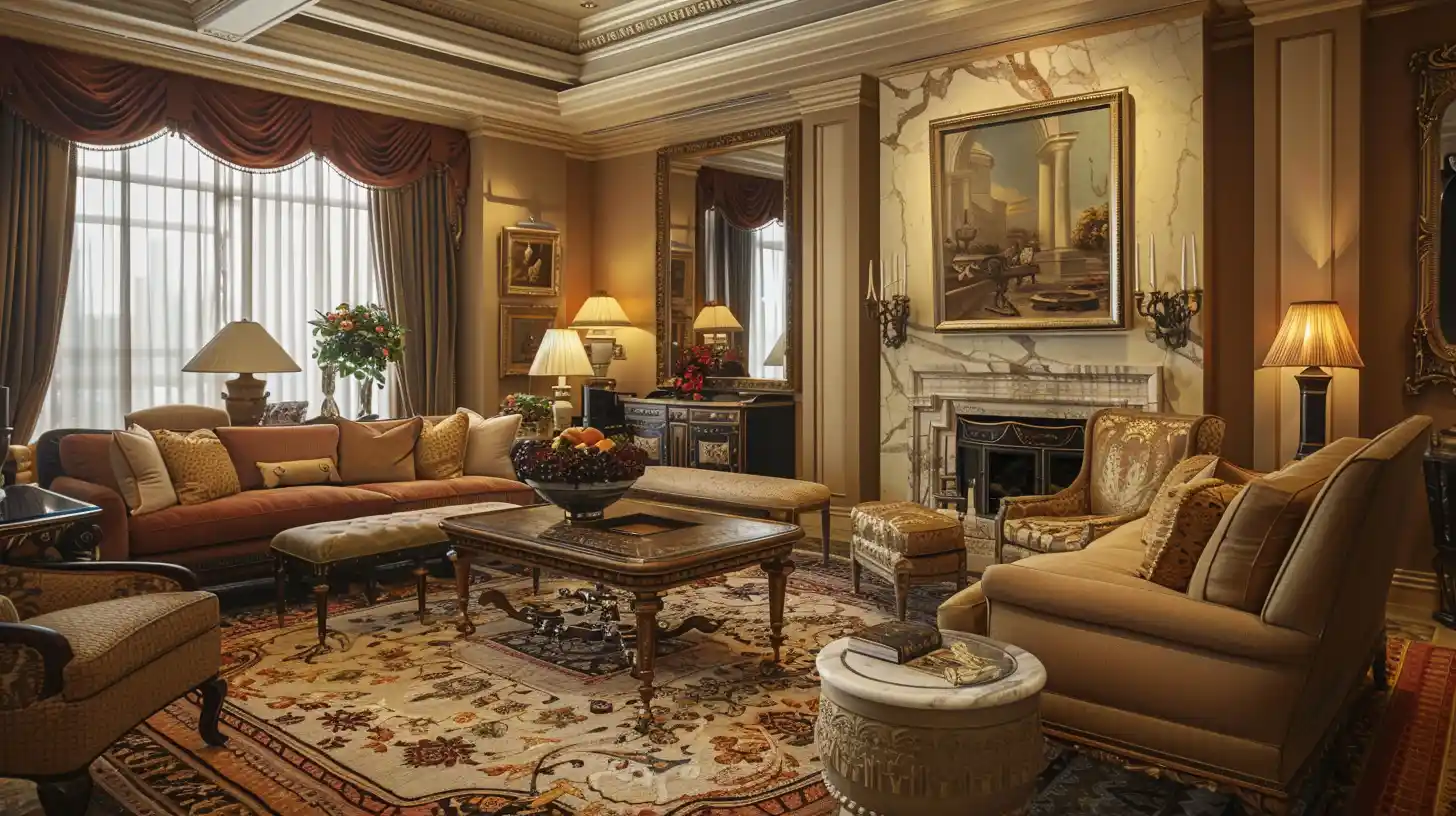
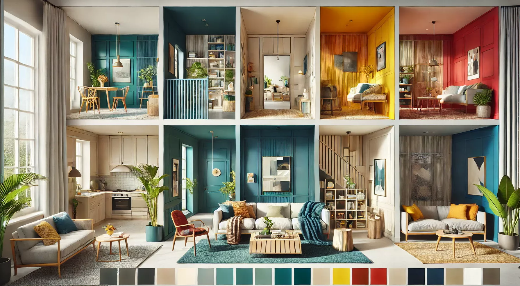
One of the most critical choices you can make for your living room is what colours to choose. Because this is where we spend most of our time, colour selection is vital. Colour schemes and ideas for a vibrant living room are sure to inspire you. Because of many alternatives, picking a colour combination for the drawing room may be challenging.
If you want to learn how to choose the greatest colours, you don't have to be a master painter or an expert in colour theory. A mood board is a great place to start brainstorming colour schemes for a space, but it's also a great place to experiment with various colours. Like cooking, colours signify components and tastes of drawing room wall colour combination.
Recommended Reading
40+ Best Stunning Two Colour Combination...
338.9K Views
Top 25 Outside Color Combinations with C...
320.7K Views
25 Latest Main Gate Colour Combination I...
169.6K Views
Top 26 Wall Paint Colour Combinations Id...
139.5K Views

Asian Paints Colour Codes with Colour Na...
117.1K Views
How to Choose a Suitable Colour Combination for a Drawing Room?
When decorating a living room, sticking to the tried and true might be tempting. On the other hand, the most stunning interiors use vibrant colours. The most important thing to remember is to conduct your homework, try different colour schemes, and use colour and fabric confidently.
When it comes to mood, colour can have a huge impact, and a vibrant colour scheme may help improve your spirits and provide dimension to your home. It's okay to use colours you wouldn't normally pair together, such as blue with red or orange with pink, as long as some neutrals like white woodwork or patterns are included to break up the appearance and create texture.
Try painting the interior of a shoebox with the colour you want to use on the walls first. This will allow you to see how light reflects off surfaces and into corners, giving you a better idea of how the colour would seem in a space.
A wide living room rug can easily bring vitality to an otherwise monochromatic space, and it may be paired with brightly coloured throw pillows and an upholstered ottoman.
Consult a colour wheel if you want bold colours that go well together. Remember that the colour you see varies depending on where it is. There is a distinct difference in tone depending on the surface material.
Selecting the proper paint finish may greatly alter the final appearance. Gloss and oil are bright surfaces that reflect light, whereas matte and eggshells give a more subtle shine. Before decorating, use sample paint pots to see how it will appear. Inspiration can be found in the latest trends.
1. Colours with Green Hue
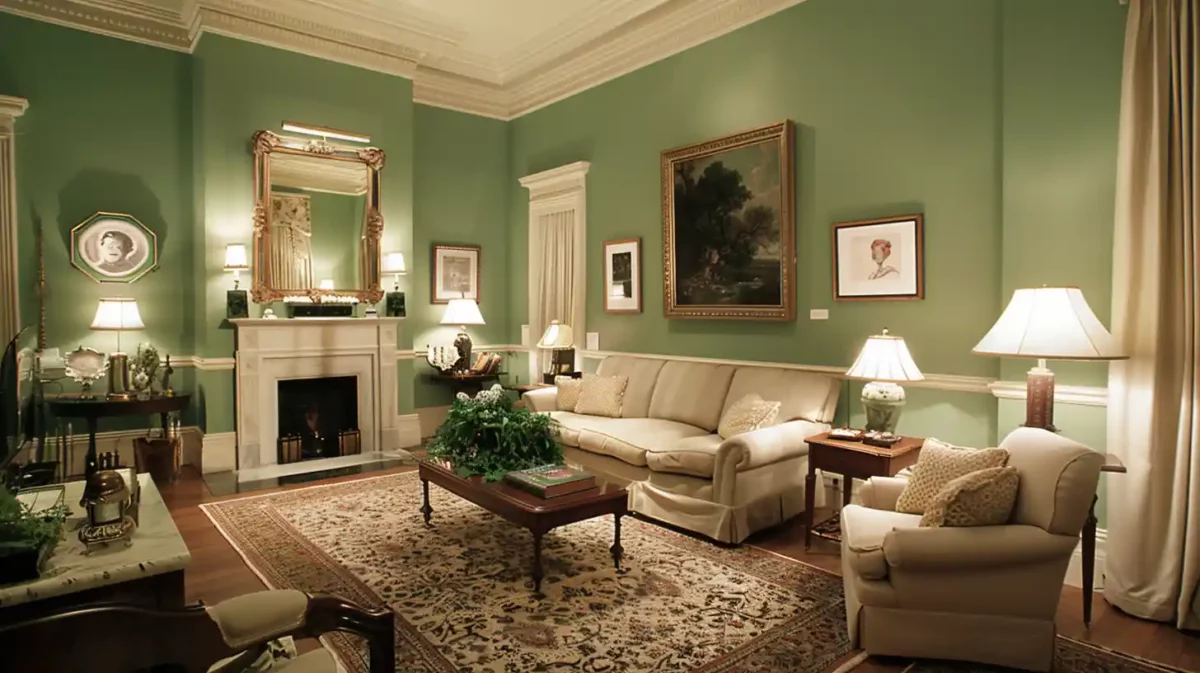
In the year 2026, is there any other hue that is more appropriate than green? Our happiness and health have become more essential than ever; therefore, it only makes sense that we want to decorate our homes with colours representing growth and rebirth. The colour green generates thoughts of tranquillity, brightness, and good fortune, and green living room designs promise to rekindle your connection to the natural world. Because there are so many shades of green, it’s simple to select drawing room colour combinations, Asian paint schemes and home decor items that complement your style and add a seasonal touch.
Colour Code:
- Green - #008000
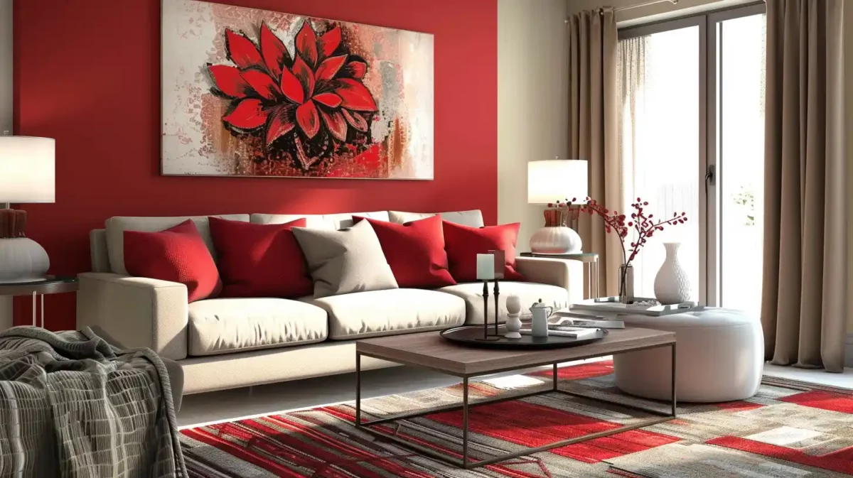
2. Vibrant Red and Grey Walls
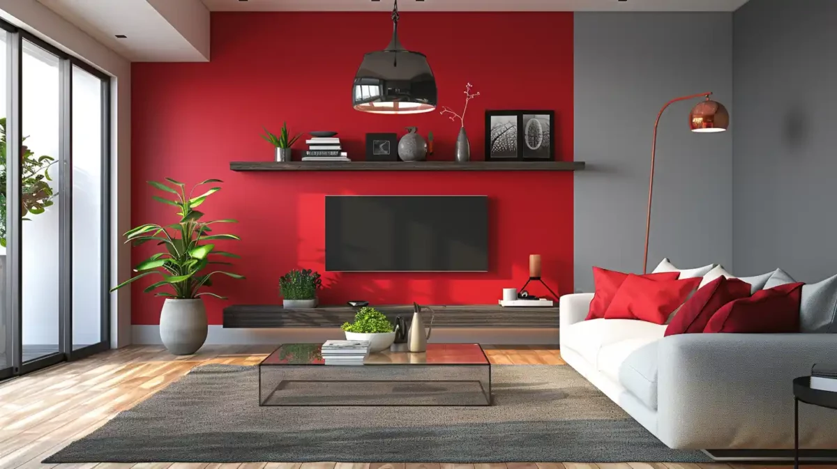
Do you have visions of a red-themed living room? Nothing is striking about the drawing-room colours Asian paints, but they’re quite simple to live with. Red's warmth, cocooning effect, and attractiveness under artificial light make it a great option for many living areas, especially in winter. The heat of red makes it a popular choice for a living room colour in colder climates, creating a welcoming ambience ideal for cosier living room ideas.
Colour Code:
- Vibrant Red - #FF5733
- Grey - #808080
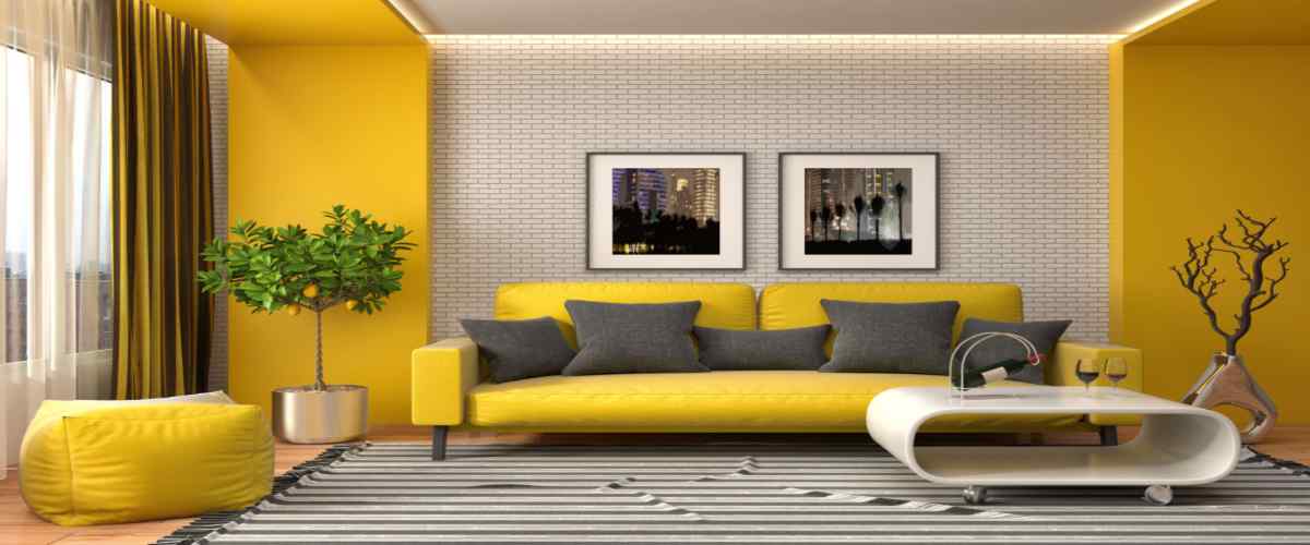
3. Pop Of Primary Neutral Hues Colours
Many living room colour choices are exhibited in a neutral living room with a yellow side table. Use bright colours sparingly, as in this neutral palette, to create a joyful and lively living room full of sophistication and vitality. Do you feel more confident now? It’s hard to deny the comforting impact of bright blue walls on a two-colour combination for drawing room walls. Choose fundamental hues like blue and mustard yellow, lavender purple, and tomato orange from design trends from past times, like Bauhaus. To give the colours a more realistic feel, choose muted colours that are still striking but not too so.
4. Glowing Orange Hues
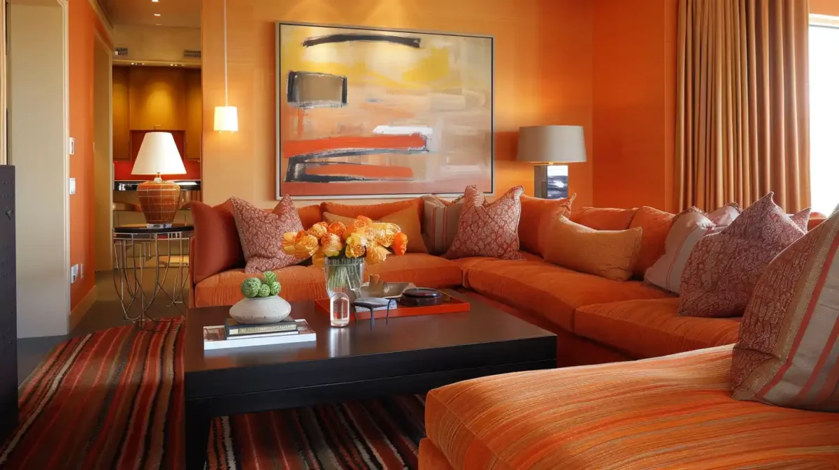
Colour schemes in fiery orange and salmon tones, with the best pop colour combination for the drawing room and a metal side table in the living area. Whether you want a cold living room or one that is warm and inviting, red is a terrific colour to use in both situations. The already well-established use of orange and deep red in living rooms inspired this scheme. While it is a bold hue, when matched with grey—the colour of sustainability—it indicates a complete routine.
Colour Code for Orange:
- Orange - #FFA500
5. Light Pink Hazels
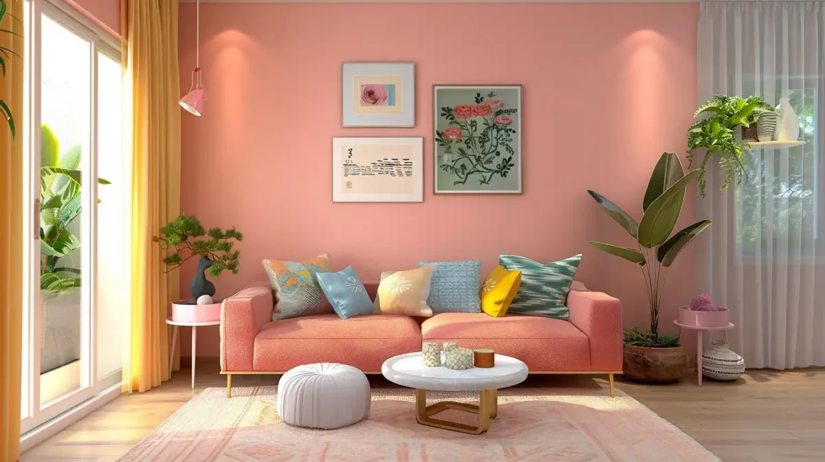
Pink is one of the best colours when it comes to colour combinations for the drawing room. It is a colour that is often associated with calmness and positivity. Coral couch, light pink walls, yellow, pastel blue, and drawing room paint combination make for a pretty pastel living room. A refined tone palette with a lot of warmth may be achieved by pairing it with burned reds; conversely, brilliant oranges and turquoises can create a tropical jungle intensity.
Colour Code:
- Light Pink - #FFB6C1
6. Earthy Brown and Green Tones

Colour designs for the living room in earthy tones, with pastel brown walls, wood furniture, and ochre accents. Your living room's colour palette should have a carefree, summery feel. You may get a fresh, fashionable style with a combination of raspberry and citron colours. This pleasant environment, inspired by boho living room ideas, is made even more attractive by the open design of the rattan couch and the soft filtering effect of the unlined curtains.
Luxurious, feminine, and daring all come together in this powerful blend of rose hues of this drawing room colour scheme. Pink has matured, giving up its sweet image in favour of a more refined, earthy, and sophisticated aesthetic. With this shade of pink, it is advisable to avoid using pristine and bright whites. Add depth and warmth with grey tones, or amp up the drama with dashes of charcoal, emerald green, or black.
Colour Code:
- Earthy Brown - #E97451
- Green Tones - #2E8B57
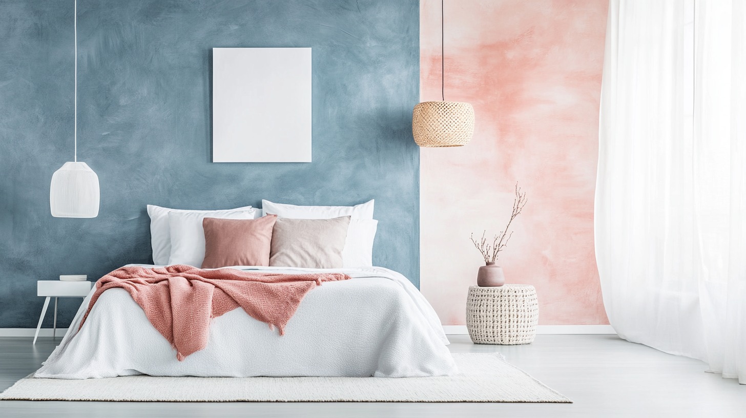
Beautiful Pastel Colour Combination for Drawing Room
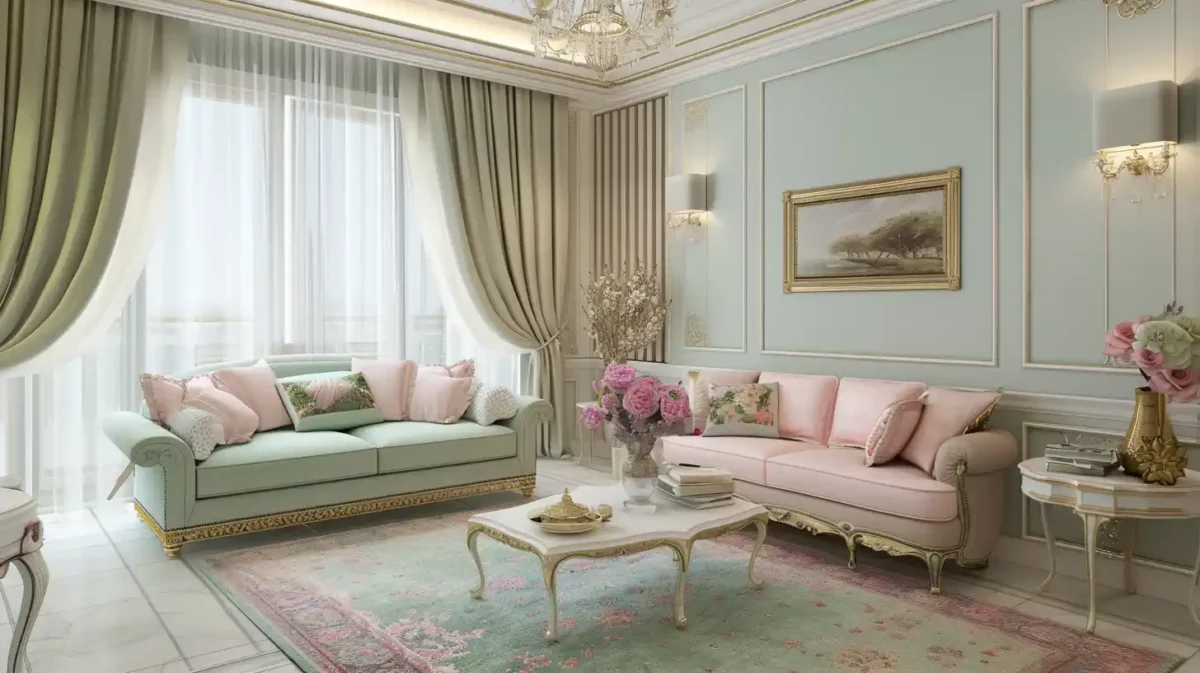
A white fur armchair, mild blush pink walls, white curtains and skirting boards create a pastel living room colour scheme. Chalky tones have long been a popular option for interiors, creating delicate, light, and easy-to-live-in spaces. Decorating with pastel colours doesn't need a complete lack of contrast. To counterbalance the more golden hues, paint one wall a deeper shade, such as a rich blue. Subtle textures of paint combinations for drawing rooms, such as patterned wool furniture, draperies, and carpets, may be used to create depth.
1. Berry Shades
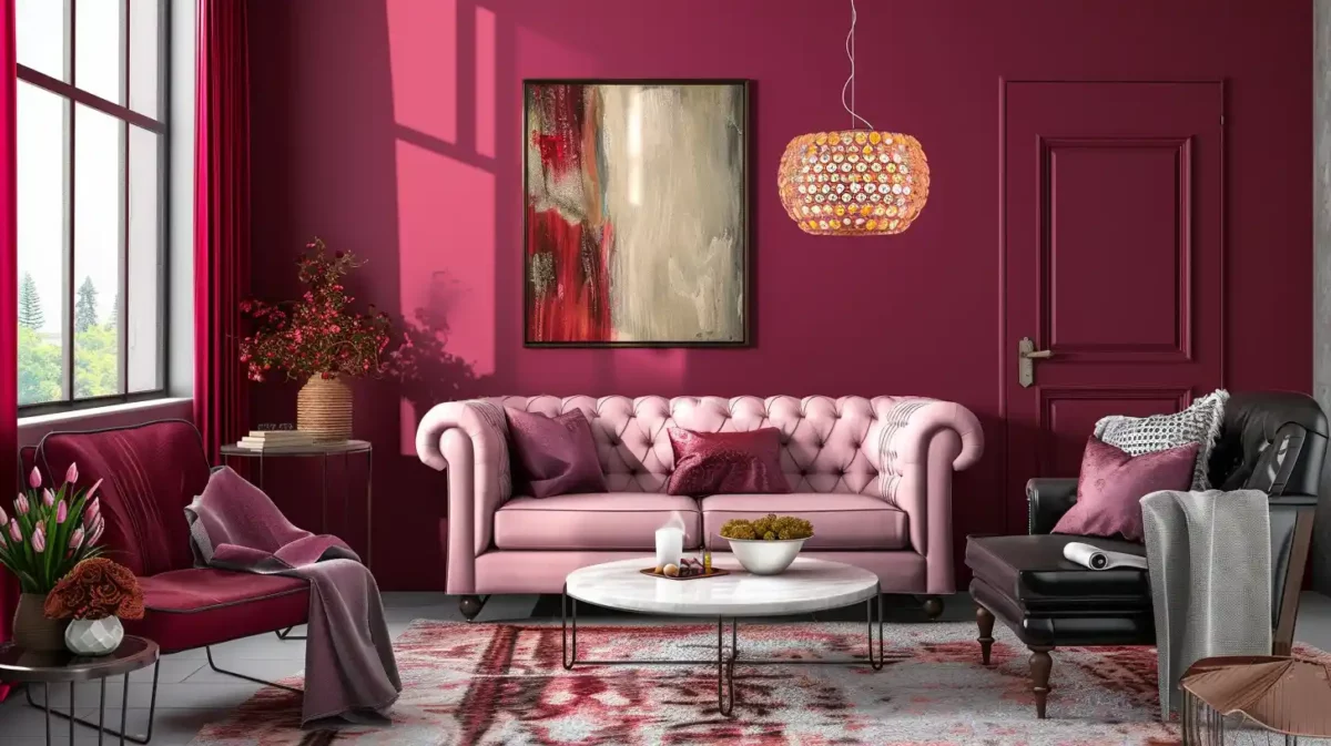
Colour ideas in berry tones, with plum walls and earthy furnishings in the living room. When used alone, the warm tones of aubergine, heather, and indigo might appear sterile in design. Flame orange or earthy tones may quickly warm things up in Asian paint drawing room colour combinations, especially if they have a blue foundation like purple or teal. The colour purple signifies strength and ardour. This colour is connected with the colours linked with innovation, individuality, and ingenuity.
Choose a shade or two lighters than the one you're going for the colour combination of the drawing room when selecting purple since it's more effective when applied. Even in the depths of winter, lavender is a great option for a tiny living room because of its ability to reflect light. Purple and pink produce calming and intriguing living spaces that may seem quiet or strong depending on the situation, whether used alone or as an accent in living rooms.
Colour Code:
- Berry Shades - #990F4B
2. Earthy yellow
Colour options for a living room are shown in a yellow-painted room with white and light green decor. Paler hues of yellow are typically disregarded for living room colour ideas because of their image as a bright and cheery colour. Still, they may work well and become more appealing when utilised in harmony or contrast. Cornflower yellow and mild blue-grey are gorgeous when combined in a subdued way. Yellow's counterpart hue on the colour wheel is blue but white and green goes well with it too. Include yellow tones to add a dash of warmth and brightness to your living area. The combination of yellow, charcoal, and black creates a sophisticated aesthetic that is in keeping with the newest living room trends. This colour is especially wonderful when paired with white or warm wood furniture, and the range of cheerful hues look lovely with a dash of grey or duck egg blue.
Colour Code:
- Earthy Yellow - #E1A95F
3. White And Black Colour Combination
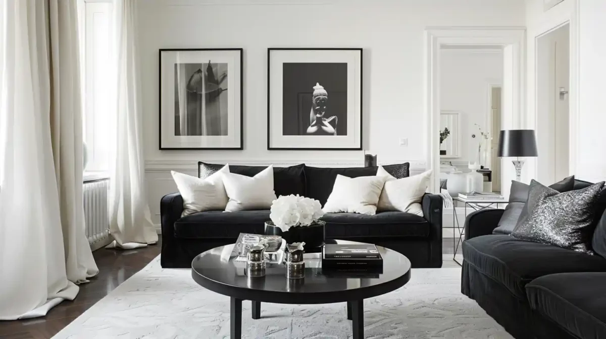
This simple drawing room colour combination for the living room has a monochromatic look with mild grey walls, a white sideboard, and black and white furnishings. Black and white is always a winning best colour combination for the drawing room and will make a bold statement in a living area. You may get a perfectly balanced look with equal quantities of both neutrals. Keep your furniture and accessories simple and monochromatic, but add some pattern and character with a bold rug or a framed artwork. Soft grey panelled walls provide sophistication to this motif’s black and white upholstered furnishings. In the shape of customised pillows and artwork, blocks of the pattern may bring interest and individuality to the contemporary style of the best drawing room colour combination.
Colour Code:
- Black - #000000
- White - #FFFFFF
4. Magenta, Red, Pink, And Teal Combination
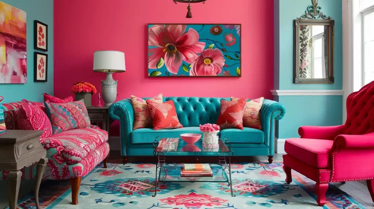
With a teal accent wall and red accents, this space makes teal the star of the show. The Grey couch and carpet, with white accents, helped break up the room's colour and ground it. Engage the services of a designer to assist you with the layout of your small drawing room colour combination. Consultancy and engineering firm. Alternatively, you may use white as the basic colour and accent it with teal, magenta, and wood elements. Combined with living room lighting ideas that include directing and ambient lighting, it will provide a bright and fresh appearance during the day and a dramatic and customised appearance at night.
Colour Code:
- Magenta- #FF00FF
- Red- #FF0000
- Pink - #FFC0CB
- Teal - #008080
5. Tranquill And Muted Neutrals
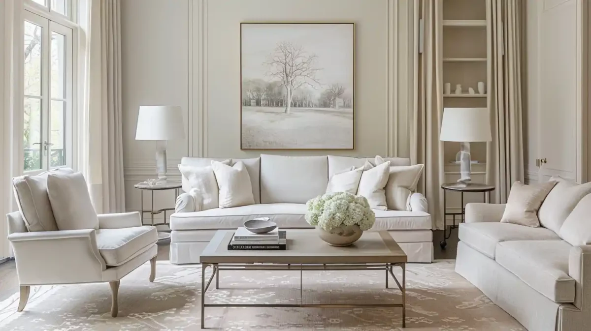
Neutral colours will never go out of vogue, but in 2026, we’ll be moving away from grey and taupe and toward something more vivid. This year’s two-colour combination for drawing room hues includes mocha, minty greens, mushrooms, and buttery yellows, among others. Neutral shades are good for folks who desire a steady tone throughout their full home design. T
This is the best colour combination for those who are on the hunt for the best drawing room colour ideas. Furniture selections are nearly unlimited when employing Berger paints colour combination for the drawing room, yet they provide a more inviting setting than an all-white house. Warm neutral tones are appropriate for contemporary rustic designs, while cooler moderate tones are better suited to a mid-century modern house design.
Colour Combination for Living Room
Picking the right colors for your living room can make it look really nice. You can mix colors together to create a balanced and pretty space that shows off your style and makes you feel good. This overview will show you different color combinations that work well for living rooms, giving you ideas and tips to make your home look amazing.
1. Blue and Green Colour Combination
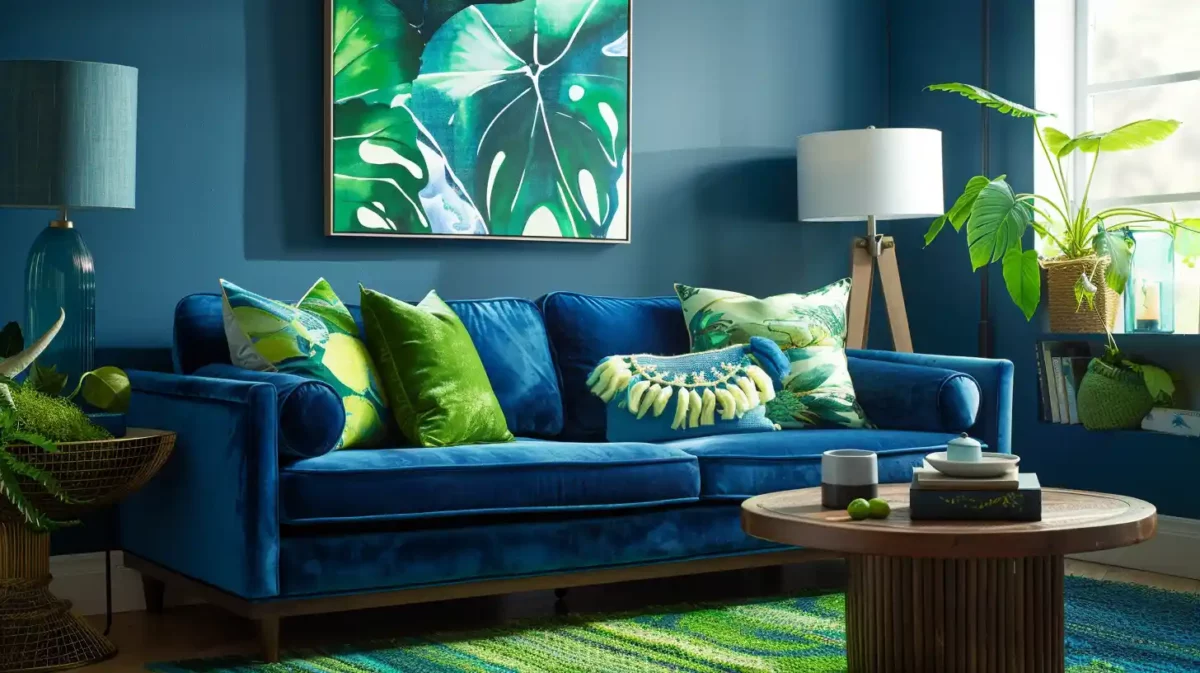
These living room colour combinations are calming and evoke feelings of nature. They can be a great choice for a living room where you want to relax and unwind. Use a light, airy sky blue for the walls and a deeper, more grounding forest green for furniture or accents. For a bolder look, flip the script with a teal wall and sage green accents.
Colour Code:
- Blue - #AACCFF
- Green - #90EE90
2. Grey and Yellow Colour Combination
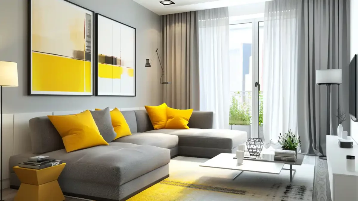
This living room combination is modern and stylish. The grey provides a neutral backdrop, while the yellow adds a pop of colour. A light, cool grey creates a crisp, modern feel, while warmer charcoal adds sophistication. Pair it with a sunny yellow for a cheerful pop or a mustard yellow for a more sophisticated touch.
Colour Code:
- Grey - #DDDDDD
- Yellow - #FDF38D
3. Jewel Tones Colour Combination
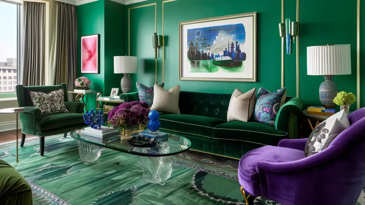
Jewel tones like emerald green, sapphire blue, and amethyst can add a touch of luxury and drama to your living room. Pair a rich emerald green accent wall with sapphire blue throw pillows and amethyst-hued artwork. Vastu also suggests specific colours based on the direction your living room faces.
Colour Codes:
- Emerald Green - #2ECC71
- Sapphire Blue - #007FFF
4. Scarlet and Hazelnut Colour Combination
The combination of scarlet (a vibrant red) and hazelnut (a warm brown) can be quite striking, but it can also be a bit bold. Scarlet is a powerful colour that will grab attention and create a dramatic focal point. Hazelnut grounds it and adds warmth, creating a dynamic contrast.
Colour Codes:
- Scarlet - #FF0000
- Hazelnut - #F0027F
Comforting Blues Colour Combination for Drawing Room
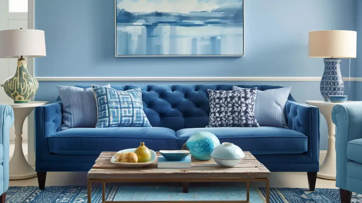
The colour blue never goes out of style since it can be adapted to any setting, and it's always relaxing to look at. It is easy to give your living space a jolt of colour this year, thanks to eye-catching blue colours of drawing room colour combination ideas that range in intensity from the gentlest to the most dramatic. Even though they make a statement, these colours exude the highest possible level of comfort and elegance. With its calming effect, the colour blue has the power to take you to another time or place immediately. It's almost as if you're flying through the air at this very moment of modern drawing room colour combination!
Getting the right colour combination for the drawing room is subjective and completely depends on the liking of the homeowner or occupants. The combinations listed above are some of the most popular and best-looking colour combinations for drawing rooms. If you need help in deciding the perfect interior décor for your home, you can always consult the excellent home interior design experts at NoBroker. If interested, please comment below this article, our executive will be in touch with you soon.

Frequently Asked Questions
What colours will be popular for living rooms in 2026?
Which hues bring light into the living room?
Which hues might make a space seem more expansive and luminous?
How many different colours can you find in the living room?
Which is the best colour combination for a calming vibe in the drawing room?
About the Author

Achinta Maity
Senior Editor
I am a seasoned content writer with over seven years of experience specializing in home renovation and painting. I bring strong expertise in paint types, finishes, surface preparation, waterproofing, and cost estimation, along with a keen understanding of interior design and color psychology. My writing focuses on practical guidance, DIY solutions, and real-world problem solving. I create clear, engaging content that helps homeowners make informed decisions, improve their spaces, and achieve durable, visually appealing results....
Recent Blogs
Subscribe to our Newsletter
Get latest news delivered straight to your inbox