Potato Pot (4645) - Nerolac Paints Colour Shade Card | NoBroker
Discover the charm of Potato Pot (4645), a warm amber shade from the Nerolac Paints Shade Cards. Lovely in dining spaces and kitchens, it harmonises with deep browns and terracotta accents for a refined finish. Find matching shades on NoBroker.

Love This Colour? Make It Yours
Tell us about your home - we'll send you free estimate & expert colour advice
Paint Collection
Potato Pot (4645)
#FDD17F

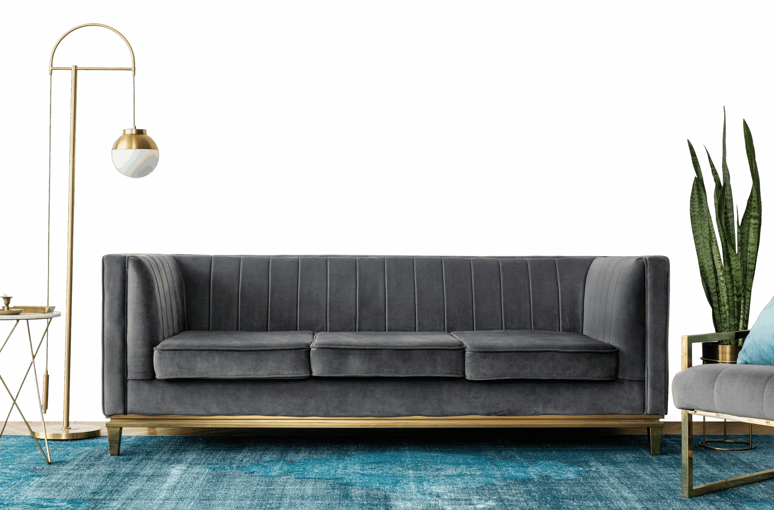
Potato Pot (4645): Rooms, Pairings and Finish
Potato Pot (4645) is an inviting amber from Nerolac paints, a light, easy tone that suits full walls in most rooms. The warm undertone means it works best alongside warm whites and natural woods.
Best Rooms for Potato Pot
- Living rooms: keeps shared spaces open, bright and welcoming.
- Dining rooms: a warm, golden glow at mealtimes.
- Home offices: an even, bright backdrop that aids focus.
- Kitchens: keeps cooking spaces clean, fresh and roomy.
- Bedrooms: calm and restful, and easy to wake up to.
Colours That Pair With Potato Pot
Potato Pot slots into a wider scheme as a soft base to build on. Reliable pairings:
- Muted teal or sage - a cool, balancing accent.
- Deep walnut or teak - grounds the glow.
- Cream and ivory - keeps the warmth soft.
Carry one of these into adjoining rooms to keep the whole home feeling cohesive.
Lighting & Finish
Lighting: Potato Pot glows under warm light and warms further in afternoon sun, while north light keeps it soft.
Finish: Matte in living rooms and bedrooms for a soft, premium feel; washable satin in kitchens, bathrooms and hallways.
Before You Paint
Try a sample pot on more than one wall before deciding, as amber shades can look quite different in morning and evening light. It covers cleanly, but light walls show scuffs in busy areas, so keep a little paint aside for touch-ups.
Frequently Asked Question's
What color is Potato Pot (4645) by Nerolac Paints?

Which room walls are best suited for Potato Pot (4645) paint?
Which colour shades pair well with Potato Pot?
Which paint finishes are available for Potato Pot?
Is Potato Pot suitable for small rooms?
Can Potato Pot be used for an accent wall?
Do I need to buy the paint, or will NoBroker painting services provide it after I choose the shade?
What's next after selecting paint colours for my home?
How can NoBroker help to select the right colour paint for your home?
How to contact NoBroker for selecting the right colour for my home?
Painting Services from NoBroker
Painting Services in Top Cities of India
- Painting Services in Bangalore
- Painting Services in Chennai
- Painting Services in Pune
- Painting Services in Mumbai
- Painting Services in Hyderabad
- Painting Services in Gurgaon
- Painting Services in Delhi
- Painting Services in Noida
- Painting Services in Greater Noida
- Painting Services in Ghaziabad
- Painting Services in Faridabad
- Painting Services in Ahmedabad