Petite Primrose (4616) - Nerolac Paints Colour Shade Card | NoBroker
Discover the charm of Petite Primrose (4616), a cosy yellow shade from the Nerolac Paints Shade Cards. Well suited to living rooms and entryways, it looks striking next to warm greys and natural linen. See colour combinations and book painting services on NoBroker.

Love This Colour? Make It Yours
Tell us about your home - we'll send you free estimate & expert colour advice
Paint Collection
Petite Primrose (4616)
#FFE38E

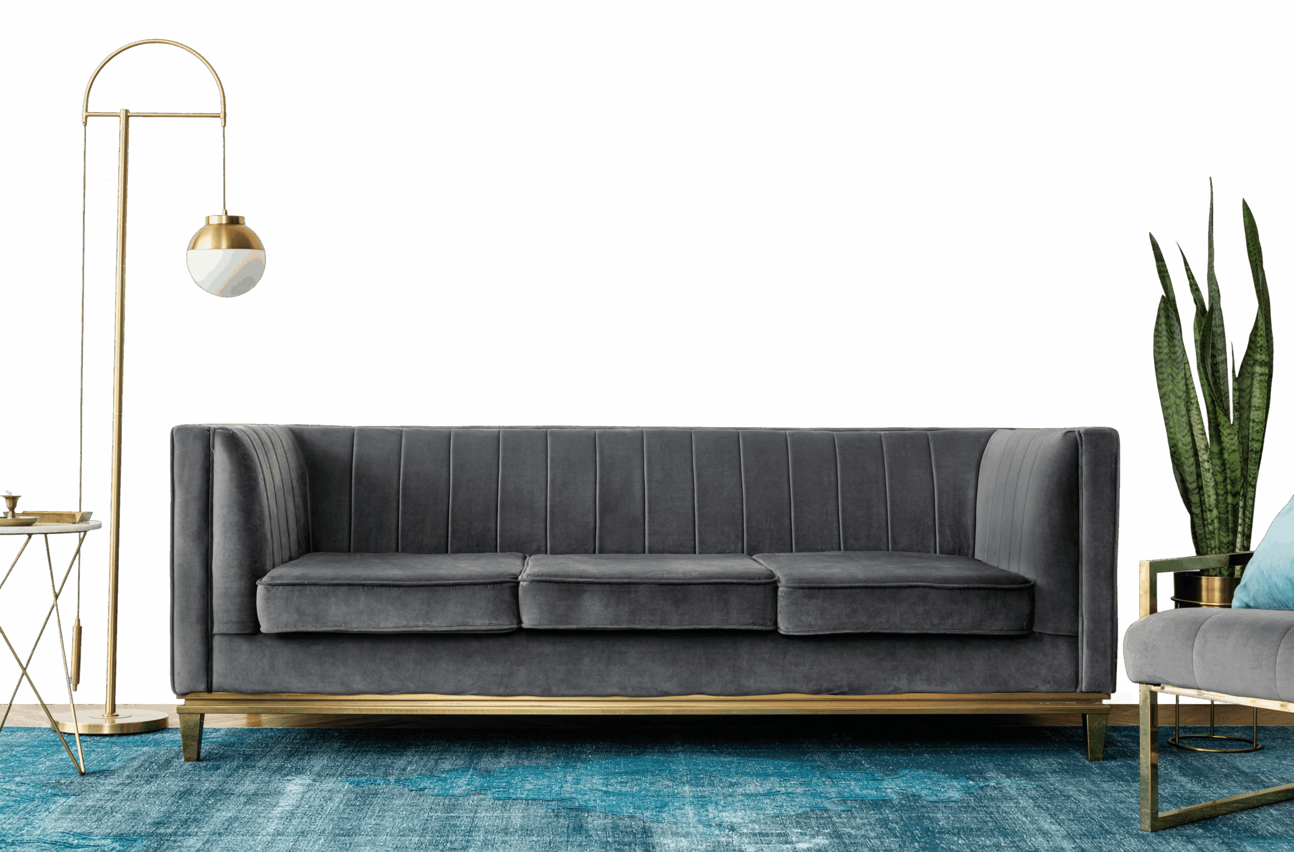
Using Petite Primrose (4616) at Home
Petite Primrose (4616) is a warm yellow from Nerolac paints, a light, easy tone that suits full walls in most rooms. The warm undertone means it works best alongside warm whites and natural woods.
Best Rooms for Petite Primrose
- Living rooms: keeps shared spaces open, bright and welcoming.
- Kitchens and breakfast nooks: bright and sociable.
- Home offices: an even, bright backdrop that aids focus.
- Bedrooms: calm and restful, and easy to wake up to.
- Hallways and small rooms: makes narrow or compact spaces feel larger.
Colours That Pair With Petite Primrose
Petite Primrose slots into a wider scheme as a soft base to build on. Reliable pairings:
- Charcoal - a sharp accent on details.
- Pale wood and rattan - a relaxed, sunny feel.
- Muted sage or teal - a calming counterpoint.
Carry one of these into adjoining rooms to keep the whole home feeling cohesive.
Lighting & Finish
Lighting: Petite Primrose glows under warm light and warms further in afternoon sun, while north light keeps it soft.
Finish: Matte in living rooms and bedrooms for a soft, premium feel; washable satin in kitchens, bathrooms and hallways.
Good to Know
Paint a sample on two or three walls first, since yellow tones shift with the light through the day. Two thin coats give the most even result; save some paint for touch-ups in high-traffic spots.
Frequently Asked Question's
What color is Petite Primrose (4616) by Nerolac Paints?

Which room walls are best suited for Petite Primrose (4616) paint?
Which colour shades pair well with Petite Primrose?
Which paint finishes are available for Petite Primrose?
Is Petite Primrose suitable for small rooms?
Can Petite Primrose be used for an accent wall?
Do I need to buy the paint, or will NoBroker painting services provide it after I choose the shade?
What's next after selecting paint colours for my home?
How can NoBroker help to select the right colour paint for your home?
How to contact NoBroker for selecting the right colour for my home?