Prairie Light (1112428) - Dulux Paints Colour Shade Card
Bring Prairie Light (1112428) into your home, a warm warm neutral from Dulux that adds a soft, easy lightness to walls. Try it in living rooms and hallways, teamed with muted green or blue and white and ivory. Get a free painting quote on NoBroker.

Love This Colour? Make It Yours
Tell us about your home - we'll send you free estimate & expert colour advice
Paint Collection
Prairie Light (1112428)
#EAE6E2

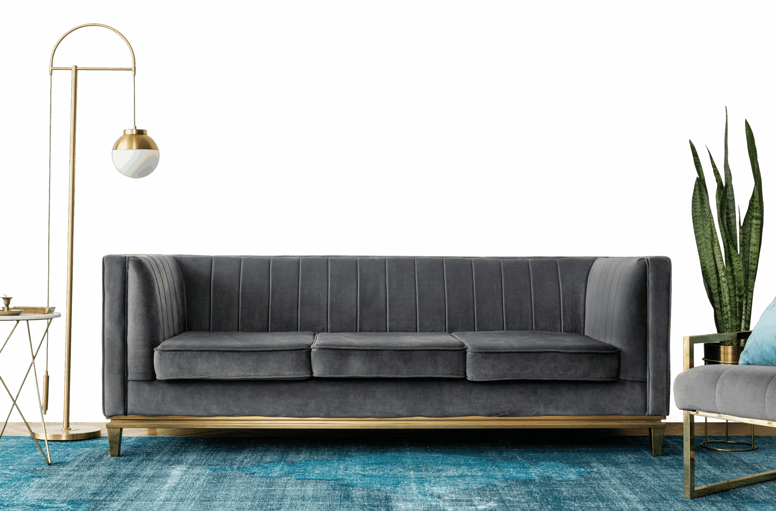
Your Guide to Prairie Light (1112428)
Prairie Light (1112428) is a warm warm neutral shade by Dulux - a light, easy shade that suits full walls across the home. The warm undertone means it settles best next to warm whites and natural timber.
Best Spaces for Prairie Light
- Living and family rooms: a light shade keeps everyday spaces bright and sociable.
- Whole-home walls and hallways: a warm neutral flows well between rooms and feels welcoming.
- Study and work corners: an even, bright wall keeps a workspace feeling open.
- Bedrooms: pale walls feel restful and make mornings a little easier.
Building a Palette With Prairie Light
Planning colours across the home? Treat Prairie Light as a base to build the rest of the palette on and add:
- Natural oak and linen - to add warmth and texture.
- White and ivory - for a soft, layered neutral.
- Muted green or blue - for a gentle colour lift.
A shared accent between two rooms is an easy way to make the whole home feel considered.
Light and the Right Finish
In different light: Prairie Light warms up under lamps and afternoon sun, and stays soft and light in north-facing rooms.
Best finish: A matt finish looks smooth and modern in living rooms and bedrooms; use a washable soft-sheen in kitchens, bathrooms and hallways.
Worth Knowing
Brush a tester onto your own walls first - warm neutral can look different at noon and by lamplight. Pale tones cover easily; just keep a little paint back for scuffs in busy spots.
Frequently Asked Question's
What type of color is Dulux shade Prairie Light (1112428)?

Which rooms does Prairie Light (1112428) work best in?
What colours go well with Prairie Light?
What paint finishes does Prairie Light come in?
Does Prairie Light work in small or compact rooms?
Is Prairie Light a good choice for a feature wall?
Does NoBroker supply the Dulux paint, or do I buy it myself?
Once I've chosen my colours, what happens next?
Can NoBroker help me pick the right colour for my home?
How do I get in touch with NoBroker to choose a colour?