Clay Pot (1111825) - Dulux Paints Colour Shade Card
Bring Clay Pot (1111825) into your home, an inviting orange from Dulux that adds a warm, welcoming feel. It's a natural fit for living rooms and dining rooms, and looks great next to teal or petrol blue and charcoal. See it in real rooms and book a painter through NoBroker.

Love This Colour? Make It Yours
Tell us about your home - we'll send you free estimate & expert colour advice
Paint Collection
Clay Pot (1111825)
#AB684F

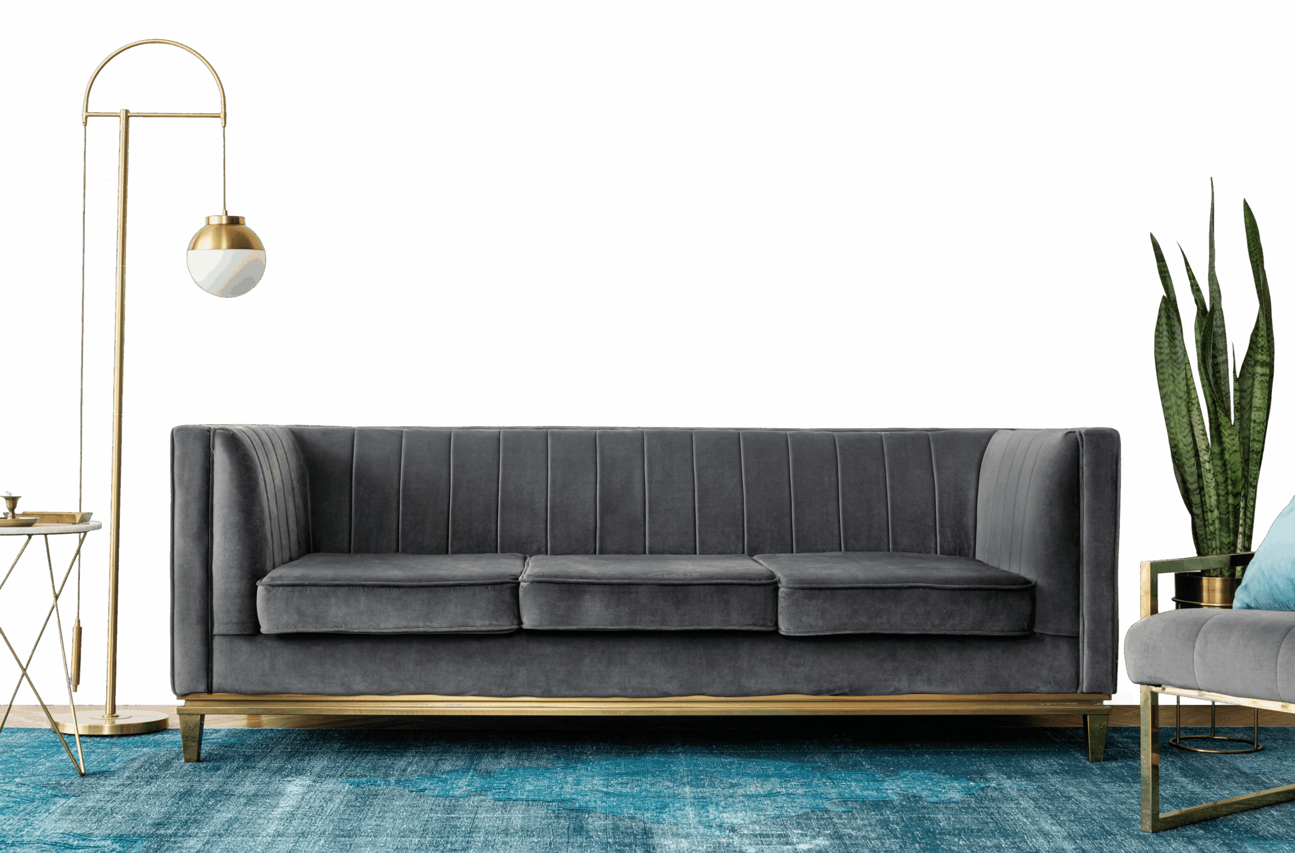
Clay Pot (1111825): Where and How to Use It
Clay Pot (1111825) is an inviting orange shade by Dulux - a flexible mid-tone that works on full walls or a single feature. The warm undertone means it settles best next to warm whites and natural timber.
Rooms That Suit Clay Pot
- Living rooms: a mid-tone adds warmth and personality without taking over.
- Dining rooms and hallways: orange brings warmth and energy to social, busy spots.
- A single feature wall: mid-tones add definition on one wall while staying versatile.
- Bedrooms: enough colour to feel cosy, still calm enough to relax in.
What Goes With Clay Pot
Planning colours across the home? Treat Clay Pot as a flexible base or a feature and add:
- Charcoal - for a modern edge.
- Teal or petrol blue - for a striking contrast.
- Natural wood and leather - to warm it further.
A shared accent between two rooms is an easy way to make the whole home feel considered.
Light and the Right Finish
In different light: Clay Pot richens under warm light and sun, and settles to an even tone in cooler, north light.
Best finish: A matt finish looks smooth and modern in living rooms and bedrooms; use a washable soft-sheen in kitchens, bathrooms and hallways.
Before You Start
Check a tester patch morning and evening, as orange shifts with the light in a room. Over a tinted primer, a mid-tone builds to full colour in two coats.
Frequently Asked Question's
What type of color is Dulux shade Clay Pot (1111825)?

Which rooms does Clay Pot (1111825) work best in?
What colours go well with Clay Pot?
What paint finishes does Clay Pot come in?
Does Clay Pot work in small or compact rooms?
Is Clay Pot a good choice for a feature wall?
Does NoBroker supply the Dulux paint, or do I buy it myself?
Once I've chosen my colours, what happens next?
Can NoBroker help me pick the right colour for my home?
How do I get in touch with NoBroker to choose a colour?