Iris Impact (7109) - Asian Paints Colour Shade Card | NoBroker
Iris Impact (7109) from the Asian Paints shade card is known for its soft and elegant look. Explore how it appears in real homes, discover matching colour combinations, and get expert tips to style this shade beautifully.

Love This Colour? Make It Yours
Tell us about your home - we'll send you free estimate & expert colour advice
Paint Collection
Study In Scarlet (7114)
#E7D0E2

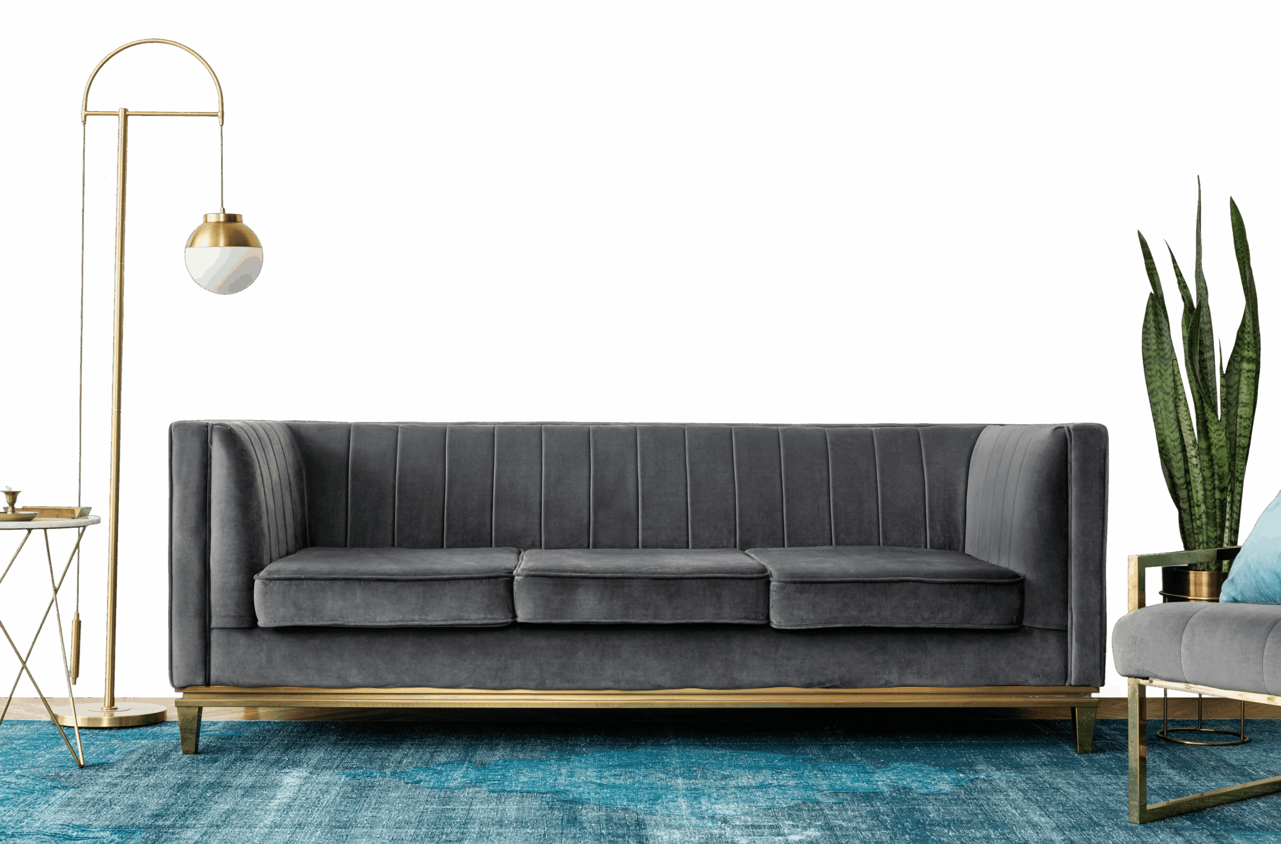
How to Style Iris Impact in Your Home
Iris Impact (7109) is one of the richer shades in the Asian Paints range. Its depth gives a room dramatic and luxurious weight, but it asks for good lighting and considered styling to look its best, rewarding when used thoughtfully.
Best Rooms for Iris Impact
- Accent walls: The most common and forgiving use, anchor one wall in living rooms, bedrooms or studies for drama without overwhelming the space.
- Ceilings in tall rooms: Painting the ceiling in a deep shade in a high-ceiling room makes the space feel more proportioned and intimate; avoid in standard-height apartments.
- Feature walls behind beds and headboards: A single dark wall behind the bed adds drama and depth to a bedroom without committing the entire room to a dark scheme.
- Cabinetry and built-in joinery: Painting only the wardrobe fronts, bookshelves or kitchen island in a deep shade is a lower-commitment way to use the colour.
Lighting & Finish
Lighting: Dark warm shades absorb more light than they reflect, so they work best in rooms with generous natural light or strong layered artificial lighting, in dim rooms they can feel heavy.
Recommended finish: A matte finish gives dark shades their richest, most velvety appearance and is the recommended choice for accent walls; in bathrooms, kitchens or any space exposed to moisture, switch to a washable satin finish to maintain the colour over time.
Frequently Asked Question's
What color is Iris Impact (7109) by Asian Paints?

Which room walls are best suited for Iris Impact (7109) paint?
Which colour shades pair well with Iris Impact?
Which paint finishes are available for Iris Impact?
Is Iris Impact suitable for small rooms?
Can Iris Impact be used for an accent wall?