Furniture Colour Combinations: Elevate Your Home Decor with Inspired Palettes
Painting Tips & Color Ideas
4.5K Views
Table of Contents
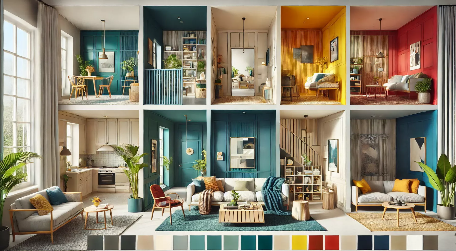
Are you in need of some new furniture? You need not go out and buy entirely new furnishings; a fresh furniture colour combination is sometimes all that's required to make a room look current again.
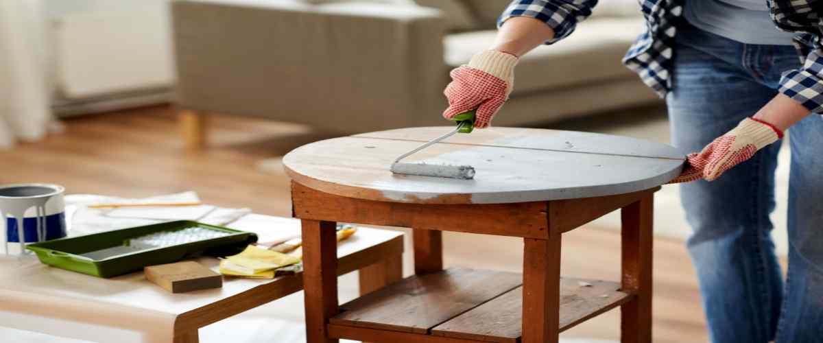
Interior design enthusiasts are gradually rethinking their perspectives on furniture. Not only is it a significant financial commitment, but shopping for new furniture could be more exciting. Do you have a piece that is structurally in excellent condition but has a stain showing its age? If you're lucky, you'll find a fantastic item at a garage sale or flea market that needs a little TLC. Sometimes, giving an article of furniture a new coat of paint is all required to make it look modern and on-trend. If you're looking for some ideas for furniture colour combinations, here are some of our top picks.
Recommended Reading
40+ Best Stunning Two Colour Combination...
338.9K Views
Top 25 Outside Color Combinations with C...
320.7K Views
25 Latest Main Gate Colour Combination I...
169.6K Views
Top 26 Wall Paint Colour Combinations Id...
139.5K Views

Asian Paints Colour Codes with Colour Na...
117.1K Views
How to Select the Perfect Furniture Colour Combination?
When it comes to choosing the right furniture color combination for your space, you must take several factors into account, including:
- Cupboard Color Combination: The size and shape of the area where you plan to place your furniture.
- Kitchen Furniture Colour Combination: The style of the room in which the furniture will reside.
- Best Sofa Colour Combination: The ambiance you want to create within that space.
- Colour Combination for Wardrobe Doors: The amount of natural light the room receives.
- Sliding Wardrobe Color Combinations: The existing colors in your room's decor.
Color holds immense power in shaping the mood of any room, so it's crucial to start by considering the desired atmosphere and mood you wish to establish.
Before you commit to a specific furniture color scheme, it's essential to define the purpose of the space. Doing so will help you achieve a cohesive aesthetic and a harmonious atmosphere.
5 Effective Approaches to Choosing Furniture Colors: Tips and Tricks
The color of your furniture can significantly influence the overall atmosphere of a space. While some colors exude warmth and coziness, others evoke a sense of calm and relaxation. To master the art of furniture color coordination, you should delve into the world of color theory, a vital tool in interior design.
Furniture Colour Schemes: Start by considering the overall design of your space, including the cupboard color combination and the color of your kitchen furniture. A fundamental principle is to select furniture colors that differ in character and intensity from the walls and flooring.
For instance, if your kitchen features light-colored cabinets and you have wooden floors, opting for light-toned furniture will impart a polished and sophisticated look. However, if your kitchen boasts pale walls, contrasting them with dark furniture will infuse a sense of dignity and harmony.
Wooden Furniture Colour Combination: Pay heed to the interplay of lighting and color. Both natural and artificial lighting play pivotal roles in how colors appear. It's crucial to comprehend how lighting can affect the tones of your furniture before committing to a particular color.
Warm colors like reds and yellows will appear more vibrant in natural sunlight than under artificial lighting. Moreover, various types of artificial light sources can alter the perception of color. Incandescent bulbs tend to impart warmth, while fluorescent lighting might introduce cooler, bluer undertones.
Analogous or Complementary Color Scheme: Consider employing an analogous color palette, which utilizes colors in close hues and shades that naturally complement one another. This approach is often employed to create a warm and inviting ambiance. You can introduce such a scheme with a red sofa, an orange rug, and yellow decorative elements.
On the contrary, a complementary color scheme, characterized by contrasting furniture colors, can infuse a dynamic energy into any room. For instance, a navy blue sofa adorned with mustard yellow cushions can achieve this striking effect.
Furniture Color Combination with Brown Furniture: Adhere to the 60-30-10 rule to balance your color scheme. The dominant color should occupy 60% of the room's palette, the secondary color 30%, and the accent color 10%. Typically, the dominant color resides in the walls, large furniture, and flooring, while the secondary color is applied to upholstery and window treatments. The accent color finds its place in accessories like pillows, artwork, flowers, and decor.
Furniture Color Schemes with Brown Furniture: Implement the Rule of Three to craft beautiful and harmonious color schemes. This concept entails selecting three colors for your walls and furniture, using them in equal parts. Opt for furniture colors within the same family but in varying shades and saturation levels, such as a navy blue sofa with aqua blue cushions and a sky blue ottoman, to bring this rule to life.
Choose Furniture Colour Combination as per Vastu
The furniture in your home, especially its colour scheme, dramatically impacts the overall aesthetic. The selection process considers the time-tested principles of Vastu to provide the best possible outcomes for all family members. As a result, choosing the right hue for the furnishings in each house room is crucial. Read on if you want to know which colours are suitable for your home according to Vastu and which ones you should avoid.
[widget_interior_form]1. Bedroom Vastu colours
Blue
Truth, beauty, and commitment are associated with the blue colour palette. Both the master suite, which should face southwest and the guest suite would benefit from this layout.
Green
Experimenting with such a broad palette is indicative of optimism and development.
White
The goal is to create a calm and relaxing atmosphere. The colour scheme of the furnishings should be considered.
Lavender
In this palette, we want to convey feelings of love, calm, and purity.
Yellow
The brighter shades of this colour are selected to evoke feelings of happiness and gladness.
2. Kitchen Vastu colours
Red
Since the kitchen symbolises the fire element, red is frequently selected.
Orange
The same rationale underlies our selection of this colour palette. Similarly, an orange can signify the element of fire.
Pink
Pink's comforting tones evoke feelings of tenderness and affection. It's a great way to boost kitchen efficiency.
Brown
Brown, It's a sophisticated shade that requires careful coordination with the rest of the kitchen's decor.
Pale Hues
Shades like these can make a kitchen feel twice as big. They make a fashion statement and impart an air of sophistication to any room's decor.
Lord Varuna, the water deity, is symbolised by the darker shades of blue; thus, you should avoid wearing them. Lord Agni is the God of fire, and this will anger him.
3. Colours for the bathroom furniture
Blue
Bathrooms located in the northeastern corner benefit from the use of lighter blue hues.
Green
Bathrooms located towards the east of a home's northeast corner typically feature a lighter shade of green due to the abundance of natural light they receive.
Brown
The lighter variation of this colour is typically used in restrooms facing southeast.
Purple Or Mauve
Those bathrooms that face east or southeast typically have these colours installed.
Tones of ivory or beige
No bathroom design wouldn't benefit from these bright colour palettes.
4. Child's bedroom furniture
White
This colour works well in the northwest, where it may be seen from the study or children's bedroom.
A Pale Green
This is an attractive option for a child's bedroom. It shows how life develops and becomes more sophisticated over time.
Blue
Vastu suggests using cool blues in rooms where the mind is busy. You can relax and unwind with their help.
Pale Yellow
The colour of joy is a pale yellow. It calms the soul and dispels any anxiety.
Purple
At the same time, this shade conveys contentment and pleasure.
The Vastu Colour Scheme for the Family Room
Green
In terms of Vastu colours for the home, it indicates development and recovery.
Brown
It's a sign of durability, serenity, and ease of living.
Shades of white or beige
These hues are meant to induce a state of tranquillity.
Orange
This colour choice invigorates the space and encourages interaction among the residents.
5. Guest room Vastu colour Principles:
Blue
A calming impact is exerted on those who are in attendance.
Green
The gentler greens are calming and balance interpersonal interactions.
Bright yellow or beige
Feelings of excitement and contentment will radiate from this space thanks to the illumination provided.
A fiery shade of red or orange
Brighter tones of these primary hues inject life with energy and optimism.
Violet and Lilac
Brighten up a guest room with these colours and spark some romance.
Budget-Friendly DIY Furniture Colour Combination Ideas for Cabinet
1. Modish Furniture with a Painted Poured Finish
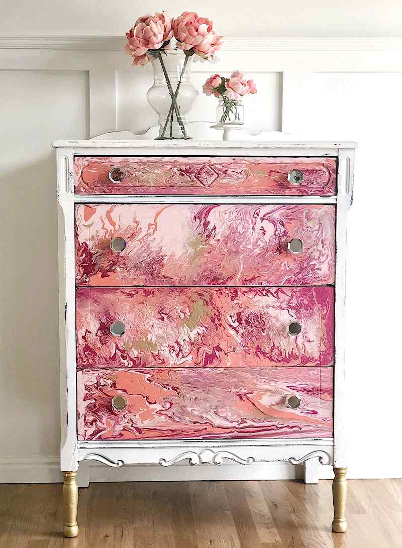
The paint-pour technique is a hip and stylish way to use colour. Creating the mesmerising tie-dye look is a lot of fun, and this is in large part because of how well different colours merge. This design is flexible enough to work with several pieces of furniture that can be readily rearranged to provide a unified colour scheme. If you want the 'paint pour' parts of a dresser to stand out more, consider painting the base a solid colour.
2. Dresser Abstract Art with Geometric Patterns
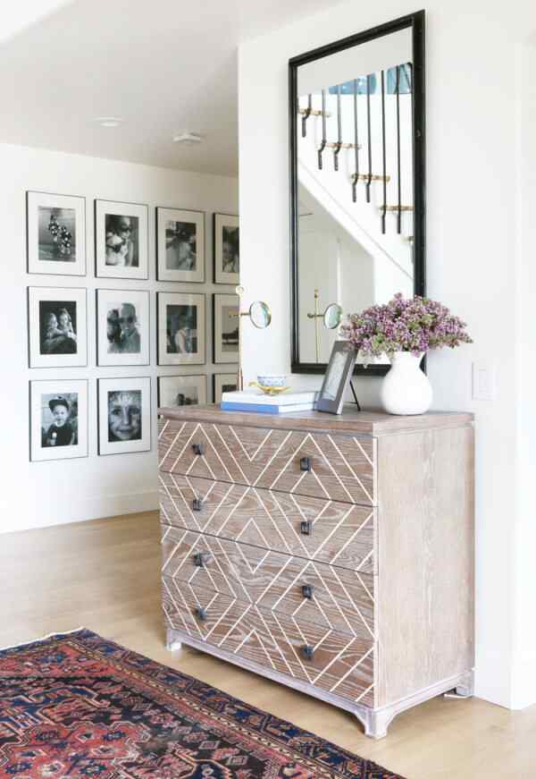
If you're not looking for a statement piece, a minimalist, naturalistic approach to painting may be more your style. For this makeover, we emphasised the dresser's natural wood tones and gave the geometric patterning throughout the piece a more fluid look by painting it a few shades lighter. Additionally, it functions well as a modern furniture item, and its use of more subdued, earthy tones means it can be easily integrated into spaces of varying colour schemes.
3. An Invigorating Cabinet Facelift with a Floral Patterned Paint
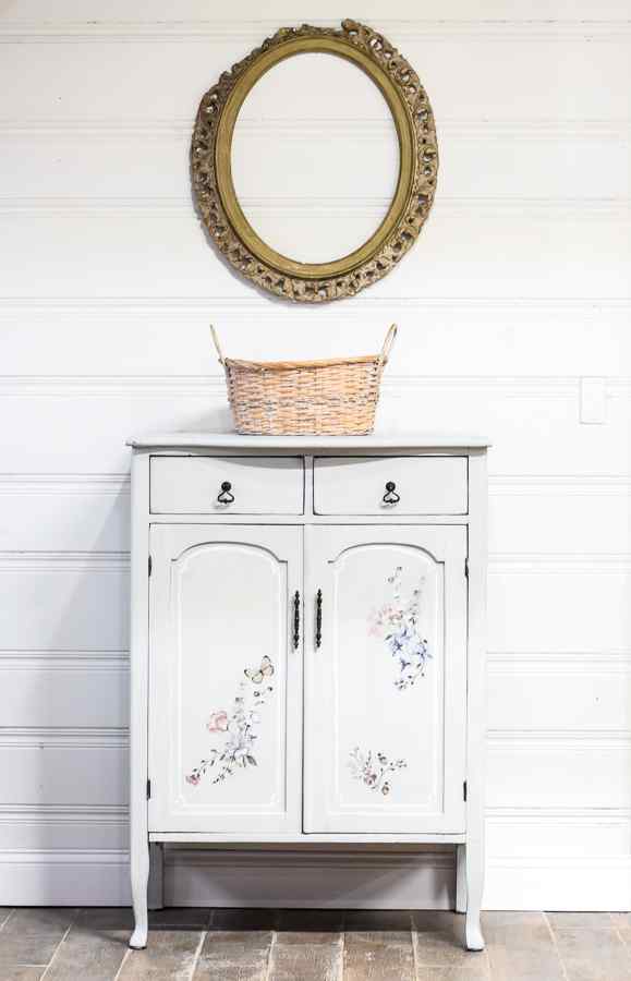
Oak cabinets are great candidates for a painted makeover since the wood is so durable that it can be refinished multiple times without showing signs of wear. Lighter colours help bring more light into a room, but you may need more than one coat of paint to cover the furnishings fully. Consider including some delicate flower details for a touch of elegance that will make the piece stand out. It can provide charm and a touch of femininity to the furnishings.
4. Traditional Lowboy Painted in Tuscan Red and Chocolate Brown
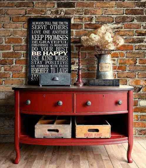
With a fresh coat of paint, a lowboy can be a transitional piece of furniture between conventional and contemporary styles. A vibrant colour like Tuscan red would be great here because it would enliven the space without detracting from the antique feel of the furnishings. Whether your taste runs to farmhouse chic, sleek modern, or cosy rustic, you'll find that this design fits right in.
5. Dresser Repurposed in a Dreamy Blue Chalk Paint with Gold Knobs
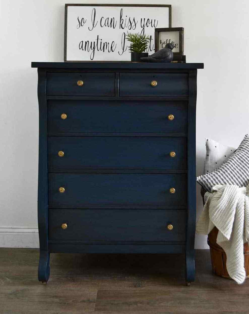
This recycled dresser project is the next level of upcycling. Consider using darker chalk paint on the dresser in this scenario to stand out more against a lighter background. Choose gold knobs to complement the richer tones of the wood. The end effect can make the dresser suitable for various settings, including rooms with a maritime theme or a nursery.
6. Incredible Repurposed Trunk in Gold Paint with White Cushion
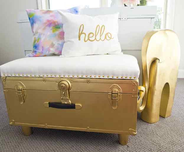
This beautiful painting project will shatter the stereotype that trunks are dull. Bold gold painting can breathe fresh life into the trunk and make it look much more luxurious than it is. The white upholstery stands out beautifully against the gold and gives a touch of class to the piece overall.
10 Surefire Sofa Colour Combinations
Need help deciding how to decorate your living room? Which sofas and chairs to choose, and whether to choose contrasting or coordinating colours, is a significant design decision. Let's examine how to create an elegant living space with the help of a great sofa set colour combination.
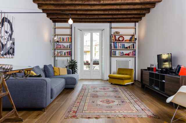
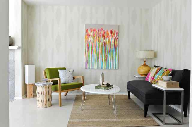
1. Rustic Tan and Brown Combo
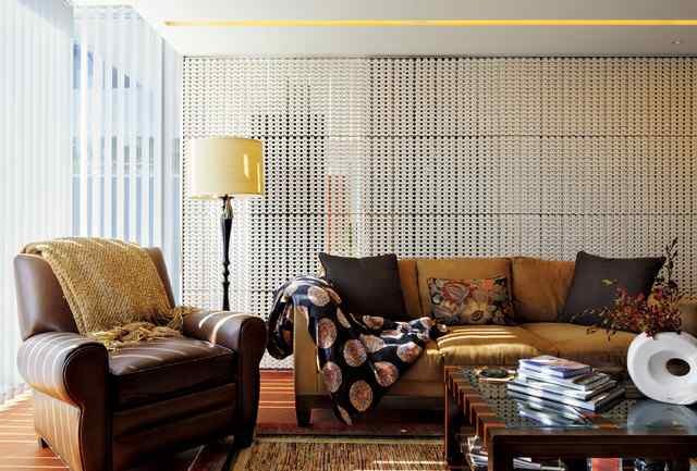
The tan sofa and the brown armchair complement this room because they are both upholstered in neutral colours. The room is decorated in neutral tones, such as the hardwood floor, the brown centre table, the beige drapes, and the reddish carpet.
2. Pale and Aquamarine with a hint of Floral Print
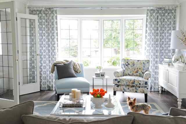
The room's soothing blue colour scheme is a nice touch. Everything from the printed drapes to the arabesque rug to the delicately hued glass coffee table to the blue flowery armchair creates a lovely scene.
3. Pristine White with Witty Dark Brown
The brown armchair complements the carpet and the central ottoman, while the white sofa takes colour cues from the rest of the room's subtle palette. The contrast between the white and the brown (almost like coffee and cream) is very appealing. Mild purple accents in the pillows and rugs breathe new life into the space.
4. Shades of Brown and Turquoise
We've noticed that most Indian homes have brown couches. It's brilliant because it's a neutral that works well with many other colours and looks timeless. You can increase the piece's energy level by substituting a different hue. A good illustration of this can be seen in the room's brown, high-end sectional sofa, which is given a jolt of colour by the addition of teal throw pillows. The two teal sofa chairs are a stylish addition.
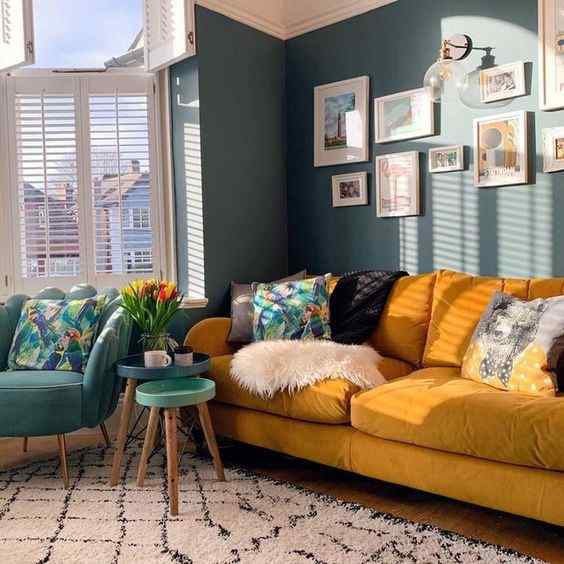
5. Colours of Nature: Cloudy Blue with Sunny Yellow
A colour scheme that is both sophisticated and daring is produced when cloud blue and mustard yellow are combined. This is one of the most trending modern sofa fabric colour combinations you can go for. Please zoom in to see how the cushions that are soaked in this colour combo, coupled with the yellow couch chair, offer flashes of colour to the blue sofa, boosting its look and appealing to more people.
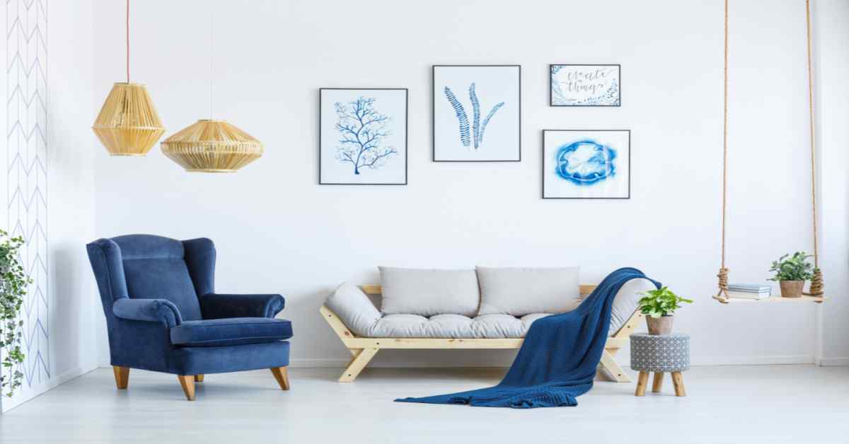
6. A Royal Blue One-Shot Wonder
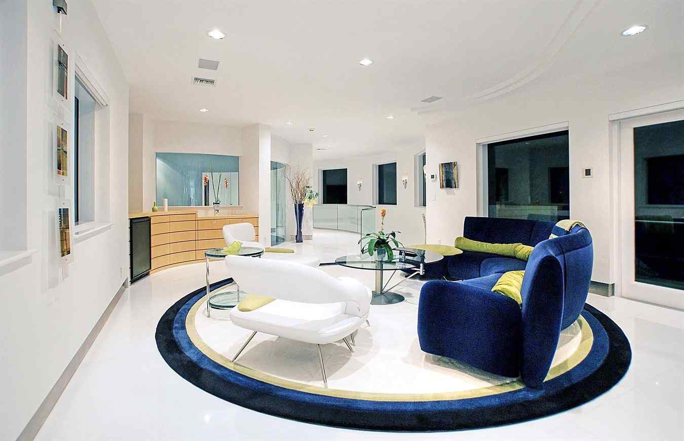
Blue is a hue that effortlessly combines energy and luminosity. It's appropriate for every event and works with any interior design style. Plus, it comes in unlimited colours that will blow your mind. Some colour schemes to go with a blue sofa are white, green, and yellow, and even lighter tones of blue can do wonders. The 2 colour sofa combination of royal blue and more delicate tones is warm and inviting. You can jazz up a blue sofa by adding throw pillows in various bright colours. What could be less appealing than a living area furnished with blue couches? Everything is different this time.
7. Invigorating Red with Calming Contrasts
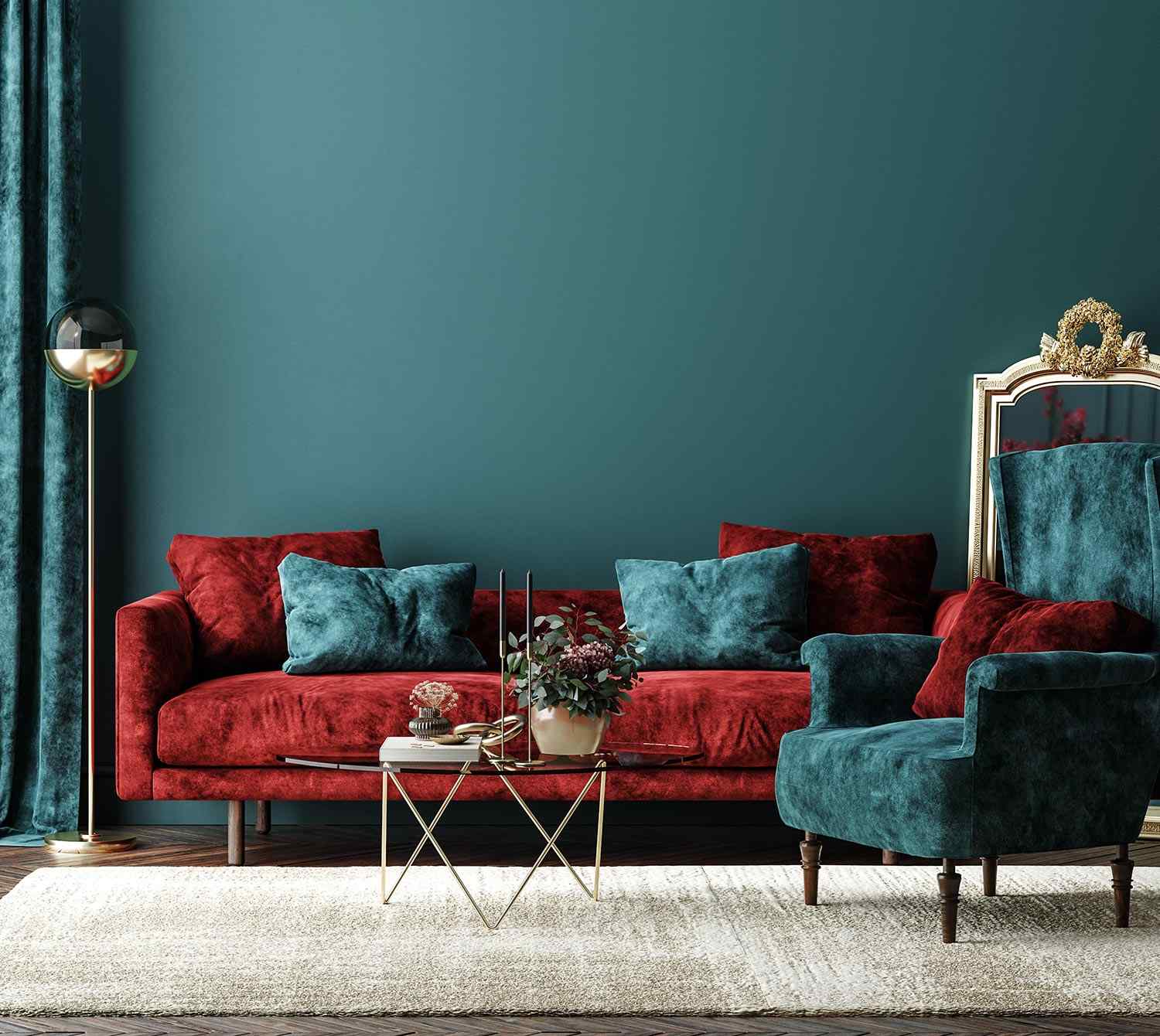
Red's remarkable combination of aggressiveness and brightness makes it an effective charmer in any setting. Red is the colour to use if you want to add a dash of individuality to your home's decor. You may taste the Scandinavian design aesthetic by purchasing a red sofa set online in India. A red sofa is not a welcome addition to your living room, but its stimulating hue may encourage you to keep working toward your goals. Black, white, cream, brown, and lighter shades of pink, yellow, etc., work well with a red sofa.
8. Yellow that's Still Young with Some More Mature Tones
Introduce some cheerful yellow to your living area with a new sofa. The colour yellow is associated with sophistication and youth. You may be familiar with the bohemian aesthetic achieved by painting a home's walls in various colours of yellow and decorating it with vintage wall art.
The time has come to proclaim with a bright yellow sofa set. Throws and pillows in dark blue and lemon-yellow look great with a yellow sectional sofa. Two yellow loveseats can be paired with a turquoise three-seater or a grey sectional. Many different sofa colour combinations work well with yellow. Only one new one needs to be introduced.
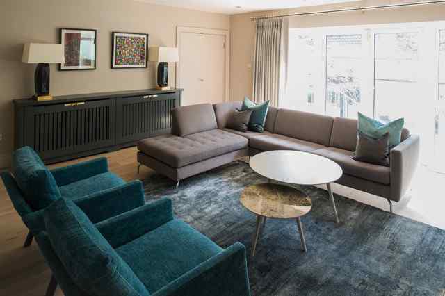
9. The Tint of Green with the Dominance of Charcoal
The way the colours play off one another in this space makes for a very energising atmosphere. The dark grey loveseat on the right contrasts the bright green chair, which gives off the appearance of being a plush spot to sink into. These colours are opposed to one another; thus, they are separated by a painting placed in the middle to soften the stark contrast between them.
10. Purple and Pink
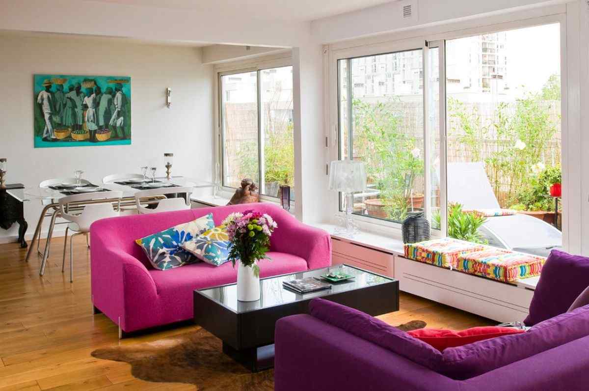
Pink, purple, and every shade in between on a sofa set is a beautiful choice for a contemporary living room. You can't go wrong with a lovely sofa in Pink and Purple with White pillows. The photograph above will give you a clear notion of 2 colour sofa colour combinations in beautiful tones. You'll adore the sofa sets displayed in the images below if you have a soft spot for English colour palettes.
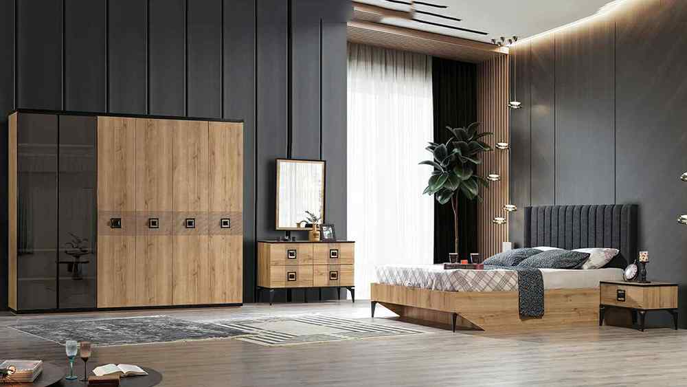
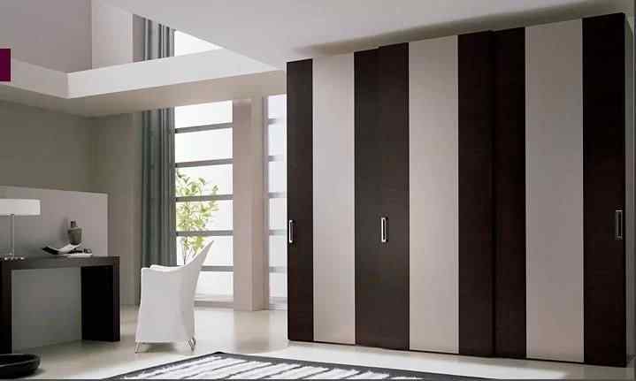
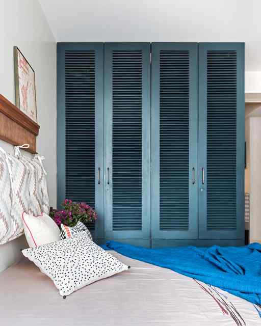
5 Brilliant Bedroom Wardrobe Colour Combinations
When it comes to wardrobes, appearance is just as important as function. They have evolved from only serving as a place to put things to being an artistic expression. These wardrobe design colour combinations are meant to inspire your room redesign.
1. On the Same Note - Sunmica Colour Combinations for Wardrobe
Adding subtle splendour and cosiness to your bedroom, matching the colour scheme of your wardrobe to the colours and tones of your bedroom furniture is a great way to start. A favourite with bedroom dual-colour wardrobe laminate colour combinations is mixing excellent white furniture with white pine wood tones for an airy and expansive impression. Plush textures from bedding, rugs and other soft furniture can also help to elevate a room. Ensure that your wardrobe hue precisely complements these shades, giving an overall sensation of effortless luxury. If you like to keep your wood raw for that natural effect, you can easily combine light oak hues with an espresso or rosewood shade.
2. Different Blocks of Colour
For a more up-to-date take on bedroom furniture colour combinations, try mixing and matching sunmica hues for clothing elements that command attention and inject life into the space. Explore stylish wardrobe laminate colour combinations like a deep matte grey with a softer dove or a delicate green coupled with a darker tone of the same hue. On the other hand, if you like a more subtle splash of colour, a bright yellow or orange accent shelf set against an otherwise all-white cabinet could be just the thing. Or maybe mix a neutral beige colour wardrobe body with austere white doors for a classy spin on modern colour blocking.
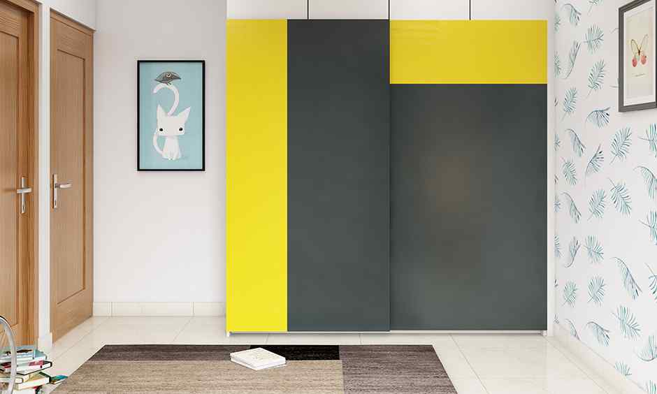
3. All in Monochrome Modern Two-Colour Combination of Wardrobe Design
Black and white is the ultimate two-tone colour scheme for a timeless and always chic wardrobe. While some could argue that this colour scheme is a tried and true classic, the timeless elegance and versatility of a black and white cabinet make it an excellent choice for a wide variety of today's interior design styles. Your bedroom wardrobe colours will complement and improve your décor no matter the undertones of your design because of the balance of neutral light and neutral dark. Black and white can be used to create a classic and modern look by adjusting the percentages of each colour to suit your taste in décor.
4. All About True Neutrals
Slate grey and blue are another attractive colour combination to play with when designing a wardrobe because they are both neutrals. Due to their versatility and individuality, grey blues and their cousin, the "greige" tints, have become popular neutrals in recent years. Grey doors with crisp white trim on a painted almirah are an unusual but practical approach to updating an antique object. On the other hand, a dark grey and blue wardrobe would provide a striking splash of colour to a bedroom decorated in chilly tones.
5. Combining a Wooden tone with a Bluish hue
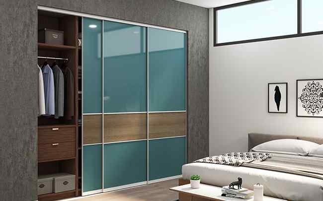
Simple tones of blue and wood are one of the most classy wardrobe laminate colour combinations and a brilliant upgrade to the traditional neutrals used in bedroom wardrobe colour choices in an eye-catching modern setting. Medium wood browns and softer powder blue closet doors make for an inviting and on-trend combination. Experiment with laminates and their infinite colour combinations to create a wardrobe as distinctive as your imagination allows. With careful colour coordination, the possibilities are virtually limitless.
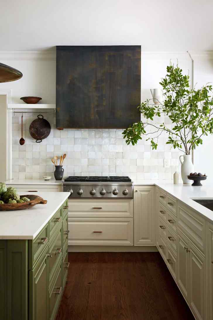
6 Energetic Kitchen Cabinet Colour Combinations
Avoid having a dull kitchen using cabinets of two or more different colours. Both muted and bright colour palettes are represented in these examples of kitchen cabinetry.
1. Olive Green and a Creamy White
Cabinetry in shades of olive green and gentle white might give the impression that you are at a health spa. A patinated finish was applied to the range hood in this designer kitchen décor to make it appear as though it were made of iron and to warm up the room further.
2. White and Sky blue
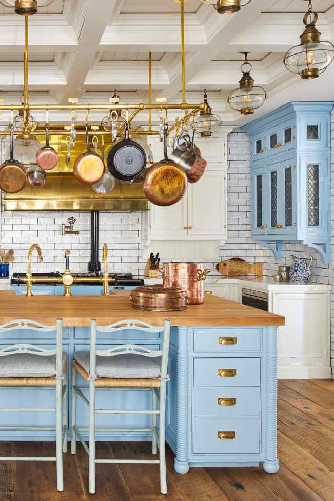
With sky blue and white cabinetry, you may produce an upscale yet childlike environment, just like in this kitchen. Many metallic accents lend an air of luxury to the space.
3. Cabinetry that is both Pure Black and Pure White
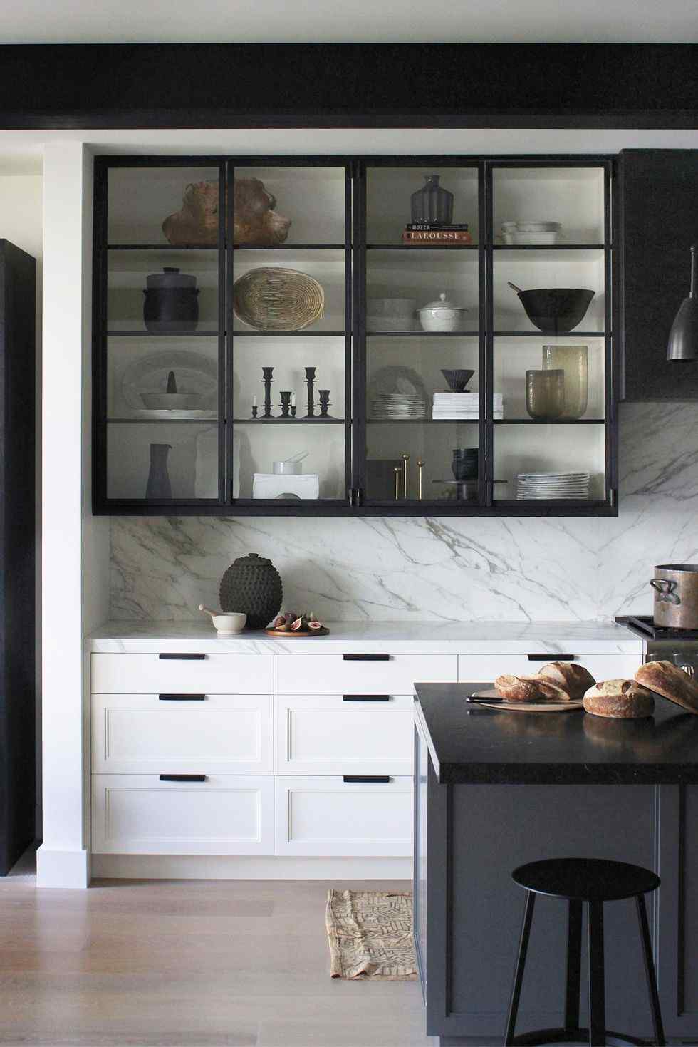
Choose cabinets in shades of black and white to create a gloomy atmosphere. In this kitchen, the upper cabinetry is black with glass fronts and a white backdrop, which works well with the crisp white cabinetry and bears black hardware on the lower cabinets.
4. Seal The Deal With Teal & Soft Blue
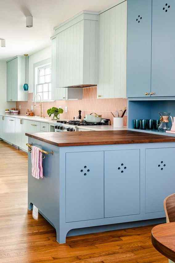
Stone Blue and Green were the colours that the designer used to cover the handcrafted woodwork in this mid-century kitchen. The cheerful presentation is finished with a fireclay tile backsplash in a peach colour.
5. Cozy Kitchen in Deep Purple and Eggshell
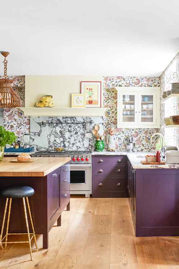
Consider combining cabinets in shades of dark purple and eggshell if the cottage-chic look is what you're looking for. The designer completed the look with luxurious marble with purple veining for the countertop and an imaginative wallpaper with a regal theme.
6. A Jeweller's Kitchen In Emerald Green & White
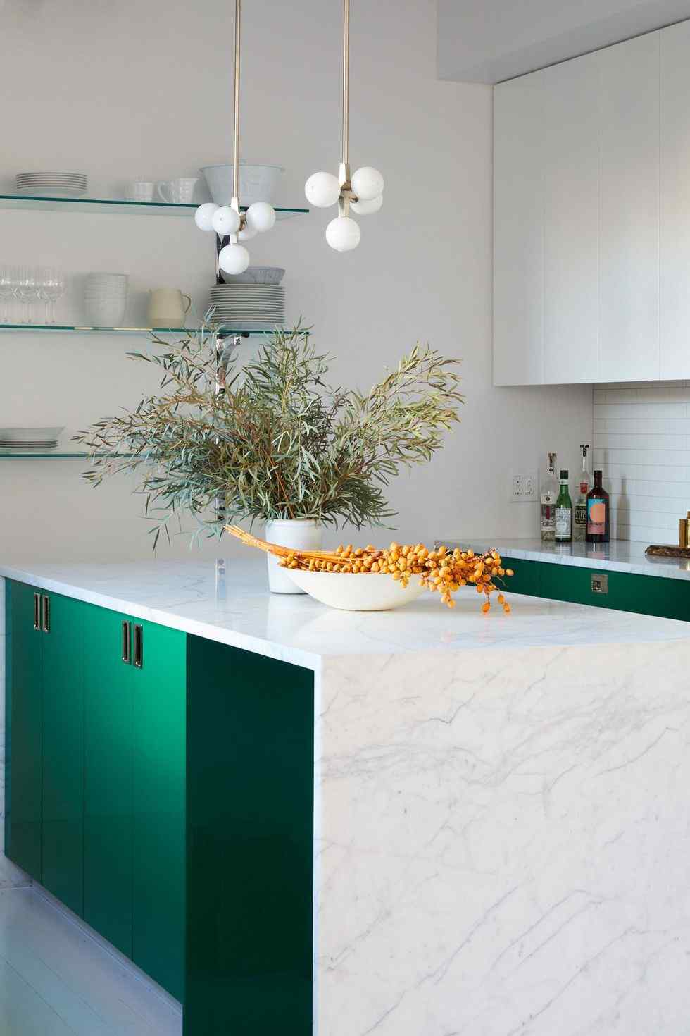
The addition of cabinets in emerald green is an easy way to inject vitality into your kitchen. Because it is the room's focal point, it looks best when paired with cabinets in white.
Whether you're looking to redecorate your living room with new couches or update your bedroom wardrobe colour combinations, the most crucial part is picking a layout and colour scheme that feels natural to you and your space. We hope that these suggestions have given you some food for thought and an idea of how we can assist you at NoBroker interiors with furniture colour combination options for your home decor.
To help you realise your vision for your ideal house, NoBroker Interior Service is committed to working hand in hand with you. We're here to help with everything you might need in design or remodelling when you're ready to begin making your house a home. Let the professionals at NoBroker help you find the perfect furniture colour combination for your home. Call us right now!
Frequently Asked Questions
Which furniture colour combination goes well with the living room paint colour combination?
What's the best colour scheme for contrasting floors and furniture?
If 2023 had a decorative style, what would it be?
Which colours of furniture best enhance the illusion of space?
Q5. Is grey still a popular colour choice?
About the Author

Sriharsakthi
Senior Editor
I am a SEO content writer with 4 years of working experience in the painting category. I create simple and clear content about interior, exterior, and decorative painting services. I focus on explaining colors, finishes, and techniques in an easy way, making painting information easy to understand for readers....
Recent Blogs
Subscribe to our Newsletter
Get latest news delivered straight to your inbox