Tranquil (2164) - Nerolac Paints Colour Shade Card | NoBroker
Give your home a fresh look with Tranquil (2164), a delicate red shade from the Nerolac Paints Shade Cards. A natural fit for dining spaces and studies, it blends nicely with soft creams and brass. Discover finishes and styling tips on NoBroker.

Love This Colour? Make It Yours
Tell us about your home - we'll send you free estimate & expert colour advice
Paint Collection
Tranquil (2164)
#E1B9B5

Using Tranquil (2164) at Home
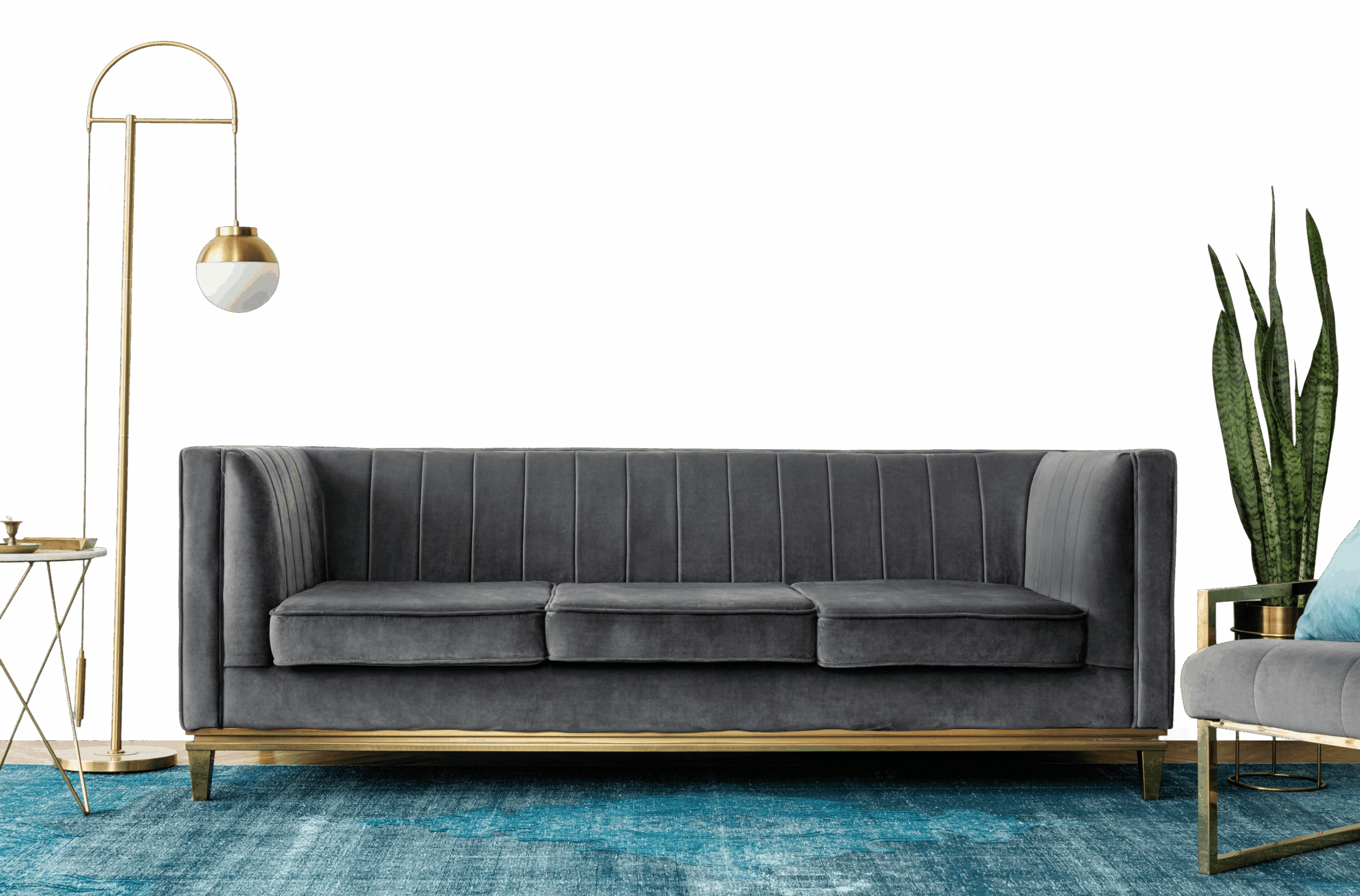
Tranquil (2164) is an airy red shade - a light, easy tone that suits full walls in most rooms. Its warm undertone pairs best with warm whites and natural woods.
Best Rooms for Tranquil
- Living rooms: keeps shared spaces open, bright and welcoming.
- Dining rooms: energises conversation and appetite.
- Bedrooms: calm and restful, and easy to wake up to.
- Hallways and small rooms: makes narrow or compact spaces feel larger.
- Kitchens: keeps cooking spaces clean, fresh and roomy.
Colours That Pair With Tranquil
Tranquil slots into a wider scheme as a soft base to build on. Reliable pairings:
- Dark wood and leather - matches its richness.
- Warm cream and beige - gives the eye a rest.
- Deep green or navy - a sophisticated contrast next door.
Carry one of these into adjoining rooms to keep the whole home feeling cohesive.
Lighting & Finish
Lighting: Tranquil glows under warm light and warms further in afternoon sun, while north light keeps it soft.
Finish: Matte in living rooms and bedrooms for a soft, premium feel; washable satin in kitchens, bathrooms and hallways.
Practical Tips
Paint a sample on two or three walls first, since red tones shift with the light through the day. It covers cleanly, but light walls show scuffs in busy areas, so keep a little paint aside for touch-ups.