Prelude (2365) - Nerolac Colour Shade Card | NoBroker
Discover the charm of Prelude (2365), an airy green shade from the Nerolac Paints Shade Cards. Great for study spaces and bedrooms, this tone partners well with soft creams and natural stone. Get expert advice and a free estimate on NoBroker.

Love This Colour? Make It Yours
Tell us about your home - we'll send you free estimate & expert colour advice
Paint Collection
Prelude (2365)
#E7EBE6

Prelude (2365): Rooms, Pairings and Finish
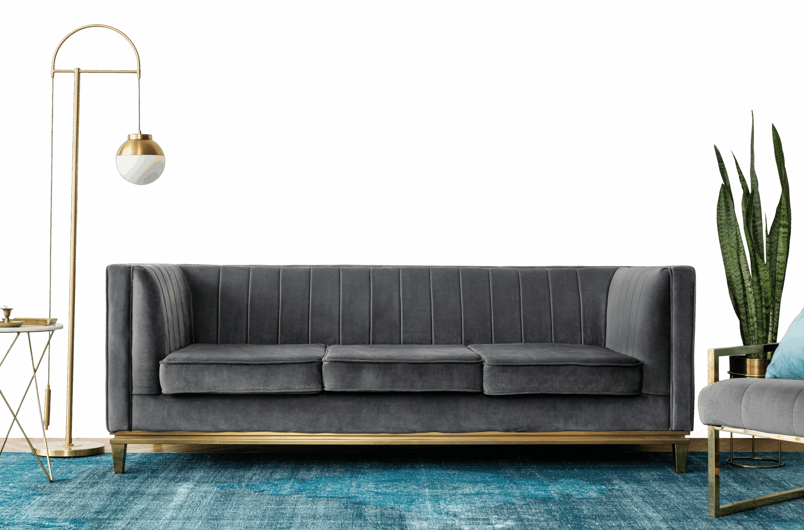
Prelude (2365) is a light green from Nerolac paints, a light, easy tone that suits full walls in most rooms. The fresh, green undertone means it works best alongside off-whites and natural materials.
Best Rooms for Prelude
- Living rooms: keeps shared spaces open, bright and welcoming.
- Reading corners and studies: a natural tone that aids focus.
- Kitchens: keeps cooking spaces clean, fresh and roomy.
- Home offices: an even, bright backdrop that aids focus.
- Bedrooms: calm and restful, and easy to wake up to.
What to Pair With Prelude
Prelude slots into a wider scheme as a soft base to build on. Reliable pairings:
- Terracotta or ochre - a warm, earthy accent.
- Charcoal or matte black - definition on frames and fittings.
- Off-white and cream - keeps it fresh and natural.
Carry one of these into adjoining rooms to keep the whole home feeling cohesive.
Lighting & Finish
Lighting: Prelude stays light and even all day, lifting darker rooms.
Finish: Matte in living rooms and bedrooms for a soft, premium feel; washable satin in kitchens, bathrooms and hallways.
Practical Tips
Try a sample pot on more than one wall before deciding, as green shades can look quite different in morning and evening light. Two thin coats give the most even result; save some paint for touch-ups in high-traffic spots.