Graciously (4895) - Nerolac Paints Colour Shade Card | NoBroker
Set the perfect tone with Graciously (4895), a light violet shade from the Nerolac Paints Shade Cards. Great for studies and bedrooms, this tone partners well with soft greys and silver accents. Get expert advice and a free estimate on NoBroker.

Love This Colour? Make It Yours
Tell us about your home - we'll send you free estimate & expert colour advice
Paint Collection
Graciously (4895)
#C8C3D5

Graciously (4895): Rooms, Pairings and Finish
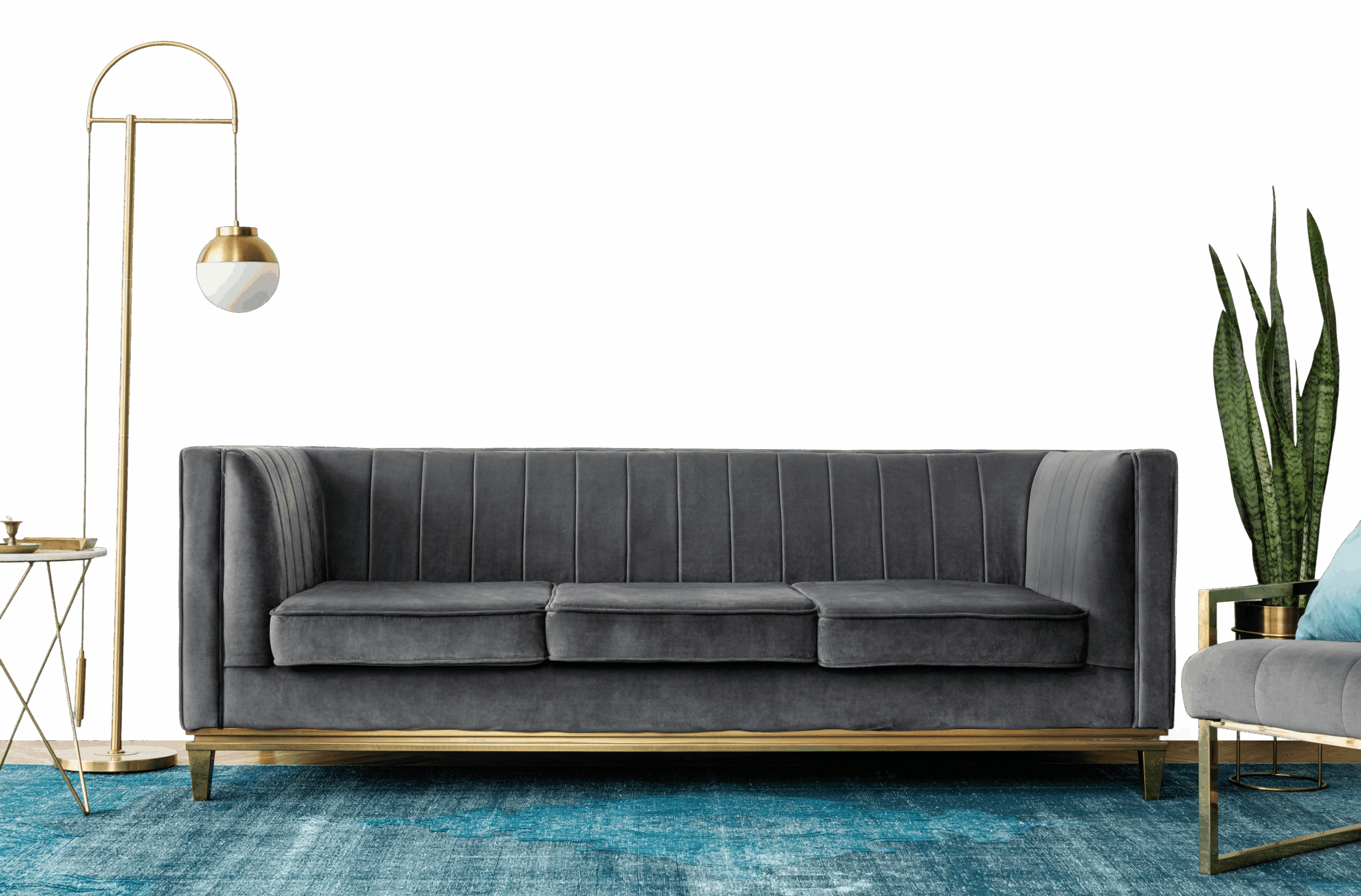
Graciously (4895) is an airy violet from Nerolac paints, a light, easy tone that suits full walls in most rooms. The cool undertone means it works best alongside cool whites and soft greys.
Best Rooms for Graciously
- Living rooms: keeps shared spaces open, bright and welcoming.
- Reading nooks and meditation corners: a calm, creative retreat.
- Home offices: an even, bright backdrop that aids focus.
- Kitchens: keeps cooking spaces clean, fresh and roomy.
- Hallways and small rooms: makes narrow or compact spaces feel larger.
Colours That Pair With Graciously
Graciously slots into a wider scheme as a soft base to build on. Reliable pairings:
- Silver or chrome - a cool, elegant accent.
- Dove grey and soft white - calm and refined.
- Pale ash wood - softens the depth.
Repeating a pairing across connected spaces ties the home together.
Lighting & Finish
Lighting: Graciously stays crisp in daylight and softens under warm evening light.
Finish: Matte in living rooms and bedrooms for a soft, premium feel; washable satin in kitchens, bathrooms and hallways.
Before You Paint
Try a sample pot on more than one wall before deciding, as violet shades can look quite different in morning and evening light. Two thin coats give the most even result; save some paint for touch-ups in high-traffic spots.