Blue Planet (4239) - Nerolac Paints Colour Shade Card | NoBroker
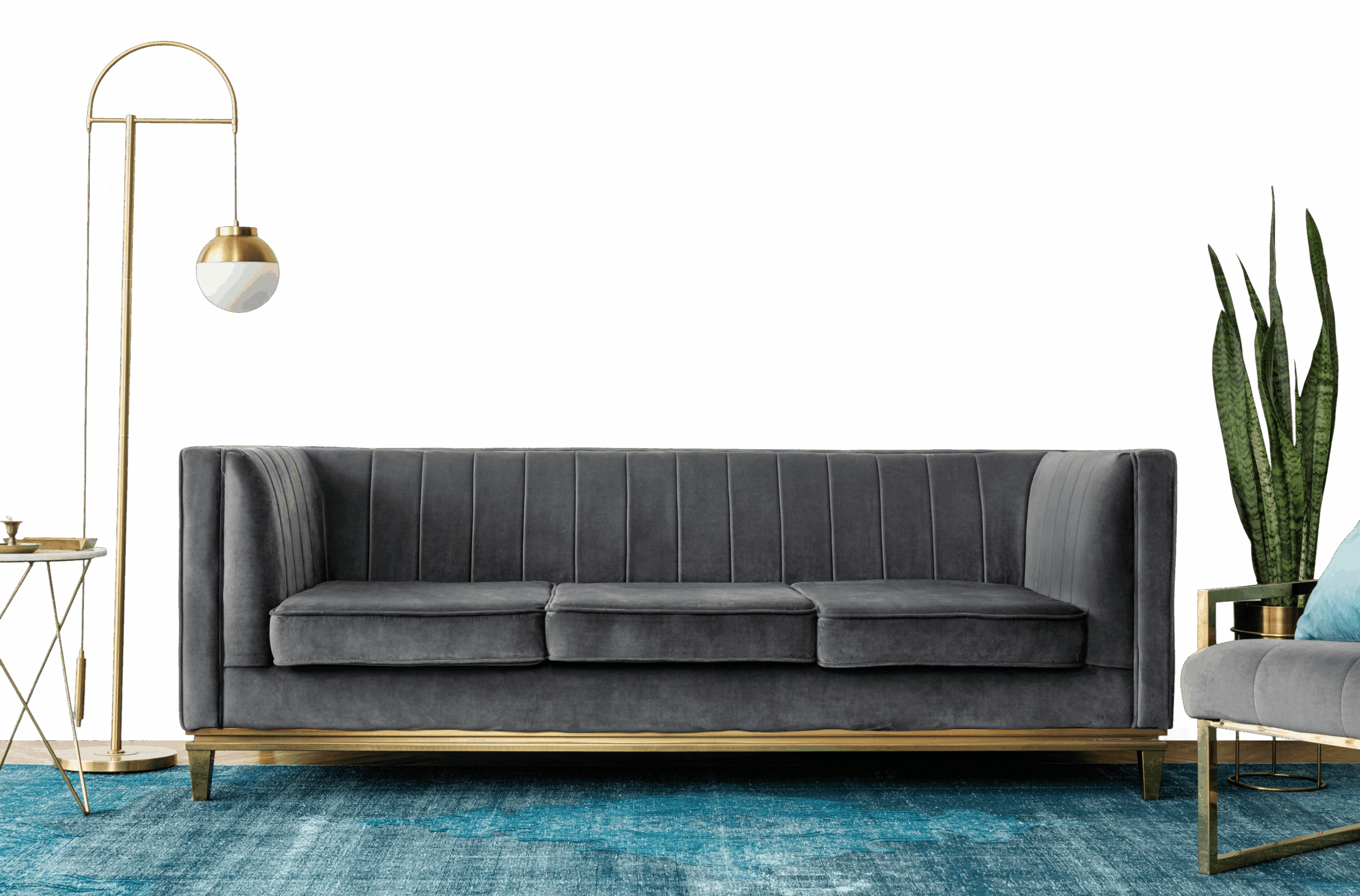
Give your home a fresh look with Blue Planet (4239), a calming blue shade from the Nerolac Paints Shade Cards. Well suited to living rooms and bedrooms, it looks striking next to warm whites and brass accents. See colour combinations and book painting services on NoBroker.

Love This Colour? Make It Yours
Tell us about your home - we'll send you free estimate & expert colour advice
Paint Collection
Blue Planet (4239)
#3D4E70

Blue Planet (4239): Rooms, Pairings and Finish
Blue Planet (4239) is a calming blue from Nerolac paints, a deep tone best kept to a feature wall, not every wall. The cool undertone means it works best alongside cool whites and soft greys.
Best Rooms for Blue Planet
- Accent walls: anchor one wall for drama without overpowering the room.
- Bathrooms: a clean, spa-like calm.
- Bedroom feature walls: wraps the bed wall in a restful, enveloping calm.
- Media rooms and home theatres: the depth absorbs stray light and sharpens on-screen contrast.
- Studies and home libraries: a cocooning, focused space for reading and work.
Colours That Pair With Blue Planet
Build a whole-home palette around Blue Planet as a feature against lighter walls:
- Warm oak or walnut - softens the coolness with warmth.
- Crisp white - trims and ceilings, to keep it fresh.
- Soft dove grey - a calm, tonal palette next door.
Carry one of these into adjoining rooms to keep the whole home feeling cohesive.
Lighting & Finish
Lighting: Blue Planet needs good light - it reads rich in well-lit rooms but can look flat in dim ones.
Finish: Matte for the richest, most velvety look; switch to washable satin in kitchens, bathrooms and damp areas.
Good to Know
Try a sample pot on more than one wall before deciding, as blue shades can look quite different in morning and evening light. A deep shade like this usually needs two coats over a tinted primer for an even, rich finish.