


In the ever-evolving realms of design and fashion, each year heralds a fresh trend that perfectly captures the zeitgeist of the era. At the forefront of colour authority, Pantone consistently identifies a hue that embodies the year’s spirit. For Pantone colour of the Year 2024, the spotlight has been placed on Peach Fuzz, a colour that promises to leave a lasting impact on various facets of our lives. This blog will delve into the enchanting world of Peach Fuzz, exploring its significance and how it shapes our visual and emotional landscape, heralding a year of warmth, comfort, and nurturing connections.
Things we covered for you
+


The Essence of Peach Fuzz

Celebrating the 25th anniversary of Pantone’s colour of the Year initiative, Peach Fuzz emerges as a symbol of our intrinsic desire for closeness and personal solace. This colour transcends aesthetic appeal, embodying our collective quest for tranquillity and heartfelt connections in an increasingly tumultuous world. Laurie Pressman, Vice President of the Pantone colour Institute, encapsulates this sentiment, highlighting our craving for moments of quietude and the joy of being in tune with our inner selves.
Read: Boost Productivity with Inspiring Office Colour Combinations


Book Best Packers & Movers with Best Price, Free Cancellation, Dedicated Move Manager

This is third
This is third
This is fourth
This is fourth
This is fifth
This is fifth
This is six
This is six
This is seven
This is seven
This is eight
This is eight
Transitioning from the bold and audacious Viva Magenta of 2023, Peach Fuzz represents a shift towards a softer, more nurturing perspective. It’s a testament to our refined priorities and a homage to the simple pleasures of life—those serene moments spent with loved ones or immersed in personal reflection.
Why Peach Fuzz for 2024?

The selection of Peach Fuzz as the Pantone colour of the Year 2024 is a deeply meaningful choice that resonates with the current era’s ethos. This inviting hue embodies a gentle embrace of comfort, kindness, and empathy. It motivates individuals to nurture their connections and cultivate a sense of peace and contentment in their lives. Peach Fuzz is not merely a colour; it’s a manifesto for a softer, more nurturing approach to life—a hue that envelops us in warmth and encourages inclusivity.
What People Are Saying?
The excitement surrounding Peach Fuzz is unmistakable within the creative community. Designers, artists, and trendsetters are drawn to its soothing presence, which sparks imagination and serves as a fountain of inspiration for heartwarming and innovative designs. It’s quickly becoming a symbol of gentle strength and a beacon for a future filled with hope and tranquillity.
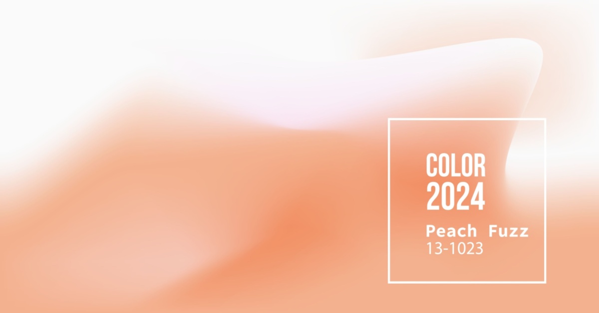
Decoding Peach Fuzz 13-1023

A closer look at Peach Fuzz 13-1023 reveals a colour that radiates with a soft glow and tender energy. It symbolizes a return to simplicity and authenticity, offering a comforting embrace to all who encounter it. This welcoming colour breaks down barriers and invites us to celebrate the joy of quiet moments and simple pleasures.
Incorporating Peach Fuzz Accents at Home

The question then becomes: how can we weave the serenity of Peach Fuzz into our daily living environments? The opportunities are endless. Consider painting an accent wall in Peach Fuzz to bring a cosy warmth to any room. Introducing Peach Fuzz through furniture or decorative accents can transform a space into a haven of comfort. For a natural touch, add Peach Fuzz flowers or plants to bring the beauty of the outdoors inside. And let’s not forget the impact of Peach Fuzz in fashion—incorporating this colour in your wardrobe can make a statement of soft power and understated elegance.
In the living room, Peach Fuzz can shine as a soothing sofa or as part of a tranquil art piece set against calm backgrounds. In bedrooms, this nurturing hue offers a comforting escape, whether through plush bedding, cushions, or drapes. Welcome it into your garden with Peach Fuzz planters for a charming outdoor vibe. Elevate your attire with pieces in this hue for a look that’s both comforting and chic. Peach Fuzz’s adaptability ensures it blends seamlessly into various decor styles, creating an atmosphere that’s both inviting and stylish in your abode.
Incorporating Peach Fuzz into Your World

Peach Fuzz is not just a colour but a canvas for creativity. Its versatility in design is unmatched, offering a plethora of ways to bring this comforting hue into our lives and spaces.
- Entryway Elegance: Painting your entrance in Peach Fuzz sets a tone of warmth and welcome, inviting positivity from the threshold.
- Accentuate with Accents: Transform living and sleeping areas with accent walls in Peach Fuzz, creating a focal point that’s both soothing and stylish.
- Fabric Fantasies: Embrace the tactile appeal of Peach Fuzz through textured fabrics—velvet throw pillows or linen draperies—to add layers of comfort and luxury.
- Retro Revival: Pair Peach Fuzz with vintage finds or mid-century pieces to craft spaces that are both nostalgic and forward-looking.
- Kitchen Chic: Revitalise your kitchen by incorporating Peach Fuzz on cabinets or walls, blending seamlessly with wood, marble, or metal finishes for a contemporary vibe.
- Artistic Ambience: Use Peach Fuzz as a backdrop for art displays or bookshelves, creating a subtle yet captivating visual interest.
- Outdoor Oasis: Extend the warmth of Peach Fuzz to outdoor living spaces with cushions, wall paint, or decorative elements for a cohesive indoor-outdoor flow.
- Bedroom Bliss: Apply Peach Fuzz on walls or bedding to foster a serene retreat, conducive to relaxation and tranquillity.
- Bathroom Beauty: Enhance the bathroom’s ambience with Peach Fuzz, offering a flattering glow that complements all skin tones.
- Workspace Wonder: Integrate Peach Fuzz in home offices to stimulate creativity and maintain a calm, focused environment.
- Texture and Tone: Experiment with different textures and finishes in Peach Fuzz to add depth and interest, from matte walls to glossy ceramics.
Beyond Aesthetics: The Cultural Impact of Peach Fuzz

Peach Fuzz is more than a visual delight; it’s a cultural touchstone that mirrors our aspirations for a future filled with empathy, care, and mutual respect. It stands as a counterpoint to the complexities of modern life, offering a palette of peace and positivity. As we navigate the challenges and changes of our times, Peach Fuzz acts as a gentle reminder of the beauty in simplicity and the strength in softness.
The Color of the Year 2023

Every year, Pantone’s Color of the Year is an eagerly awaited announcement that sets the tone for design, fashion, and aesthetics in the months ahead. This year, the spotlight shines on Viva Magenta, a hue that’s as daring as it is vibrant. Rooted in nature and stemming from the red family, Viva Magenta represents a new facet of strength. It’s a colour that radiates audacity and welcomes creativity and self-expression with open arms.
Why Viva Magenta for 2023?
The selection of Viva Magenta as the Color of the Year for 2023 is a profound choice that mirrors the spirit of the times. This vibrant colour represents a bold embrace of joy and optimism. It encourages individuals to explore their creativity and express themselves without reservation. Viva Magenta isn’t just a colour; it’s a statement in itself—a boundaryless hue that exudes audacity and inclusivity.
What People Are Saying
The buzz around Viva Magenta is palpable among designers, artists, and trendsetters. Its dynamic and fearless presence ignites creative sparks and serves as a wellspring of inspiration for innovative designs. It’s swiftly becoming a symbol of rebellion against the ordinary and an embodiment of vivacity in every sense.
Decoding Viva Magenta 18-1750
A deeper dive into Viva Magenta 18-1750 reveals a shade that pulsates with vim and vigour. It epitomizes a carefree confidence and an unapologetic spirit. This electrifying colour knows no boundaries and welcomes everyone with enthusiasm and unbridled zest for life.
Incorporating Viva Magenta at Home

Now, the intriguing question arises: how can you infuse the vivacity of Viva Magenta into your life and living spaces? The possibilities are boundless. You can paint an accent wall in Viva Magenta, infusing your space with an energetic burst. Consider incorporating Viva Magenta furniture or accessories to inject boldness into your rooms. For a refreshing twist, bring the outdoors inside with Viva Magenta flowers or plants. And, of course, don’t overlook the opportunity to include Viva Magenta in your wardrobe, making a confident and stylish statement.
In your living room, Viva Magenta can take centre stage as a lively couch or statement artwork against neutral backdrops. Bedrooms adorned in this vibrant hue offer a bold retreat, whether through bedsheets, cushions, or even curtains. Embrace the outdoors with Viva Magenta planters, adding a delightful touch to your indoor garden. Elevate your style with clothing and accessories in this eye-catching colour – a Viva Magenta dress or tie can transform your outfit into a bold fashion statement. This colour’s versatility shines as it seamlessly integrates into diverse design styles, ensuring a spirited and chic ambience in your home.
The Color of the Year 2022 – Very Peri

Before we conclude, let’s take a moment to reminisce about the Color of the Year for 2022, Very Peri. This warm and friendly blue hue introduced an uninhibited expression and an experimental attitude to the world of design. Its dynamic presence allowed for limitless colour harmonies and spontaneous statements, rendering it a versatile choice for various materials and textures.
Why Very Peri for 2022
Very Peri’s selection as the Color of the Year in 2022 marked a groundbreaking moment. It was the first time a color had been custom-created for the Pantone Color of the Year program. Merging the steadfastness of blue with the vibrancy of red, VERY PERI brought a potent blend of novelty to apparel, beauty, home furnishings, product design, and packaging.
Using Very Peri at Home

If you’ve been pondering how to incorporate Very Peri into your life, consider the dynamic presence it can bring to your living spaces. Use it to infuse spontaneity and vibrancy into your home, whether it’s in your living room, bedroom, or even your kitchen. Very Peri has the potential to elevate your interiors, adding a fresh dose of style and creativity.
In your living room, Very Peri can be introduced through statement furniture pieces like a bold sofa or accent chairs. Pair them with neutral walls and decor for a striking contrast that exudes modernity. In bedrooms, consider bedding, throw pillows, or curtains in Very Peri to create a tranquil yet stylish retreat. Even your kitchen can benefit from a splash of this versatile hue – think about colourful appliances, kitchenware, or a fresh coat of paint on cabinets or an accent wall.
Ultimately, the flexibility of Very Peri allows it to adapt to various design styles. Whether you prefer a minimalist, eclectic, or traditional aesthetic, this colour effortlessly weaves its charm throughout your living spaces, making your home an embodiment of 2022’s spirit of spontaneity and creativity.
What Lies Ahead

Pantone’s Color of the Year isn’t just a shade; it’s a mirror reflecting the world’s evolving trends and emotions. As we stand on the verge of 2024, our excitement mounts for the next colour revelation. With each announcement, artists, designers, and enthusiasts gain inspiration for a year of creative expression.
Pantone traditionally unveils the Color of the Year in December of the preceding year. So, in December 2023, all eyes will be on Pantone’s choice for 2024. What shade will define the year ahead? It’s a mystery only Pantone can solve, and it will capture the spirit, mood, and essence of that upcoming year.
As we await the announcement, the design world holds its breath. The Color of the Year isn’t just a hue; it’s a trendsetter that influences fashion, design, and aesthetics. Keep an eye out for Pantone’s revelation, as it holds the key to the colours that will shape our creative world in 2024!
Influence on Marketing Trends

Pantone’s Color of the Year extends its influence beyond fashion and design, shaping marketing trends with its annual revelation. Companies strategically incorporate this colour into branding, logos, and product packaging, utilizing its psychological impact to connect with consumers. It sends a clear message that the brand is contemporary and in touch with current values.
Marketing campaigns also adapt to the Color of the Year, seamlessly integrating it into advertisements, in-store displays, and social media content. In the digital era, this vibrant hue takes centre stage in website design, email marketing, and social media visuals, drawing attention and encouraging engagement. In summary, Pantone’s Color of the Year profoundly influences marketing trends, helping brands convey adaptability, creativity, and cultural alignment while engaging consumers in a visually-driven world.
How Can NoBroker Help
In the vibrant world of color, Pantone’s Color of the Year is a guiding light. For 2023, Viva Magenta takes centre stage, inviting us all to embrace creativity, self-expression, and a fearless spirit. Whether you use it to breathe life into your living spaces, elevate your fashion, or make a memorable statement in marketing, Viva Magenta promises to be a colour that leaves its mark. Embrace the boldness, experiment with the vibrancy, and celebrate the audacious spirit of Viva Magenta.
If you’re looking to transform your living space to embrace the Color of the Year or seeking a new home that aligns with your vibrant tastes, NoBroker can assist you every step of the way. Contact us today for expert guidance and efficient solutions to your real estate needs.
Painting Service in Top Cities in India
Frequently Asked Questions
Q1: What is Pantone’s Color of the Year?
A1: Pantone’s Color of the Year is an annual colour selection that represents the mood and trends of the upcoming year. It’s a shade that influences various industries, from fashion and interior design to marketing.
Q2: How does Pantone choose the Color of the Year?
A2: The selection process involves trend analysis, cultural influences, and expert opinions. Pantone’s colour experts closely observe global developments to determine a colour that reflects the zeitgeist.
Q3: What does the Color of the Year represent?
A3: Each Color of the Year has its unique symbolism. It often embodies themes like innovation, hope, or environmental consciousness. The colour’s meaning can vary each year.
Q4: How can I incorporate the Color of the Year into my home decor?
A4: You can add accents like throw pillows, artwork, or even paint a wall in the Color of the Year. It’s a versatile way to stay trendy in interior design.
Q5: What impact does the Color of the Year have on the fashion industry?
A5: The fashion industry eagerly embraces the Color of the Year, influencing clothing, accessories, and even makeup trends. You’ll likely see it on runways and in stores.
Q6: What is the significance of the Purple Pantone color in recent trends?
A6: The Purple Pantone colour, known for its regal and imaginative qualities, has gained prominence in recent design and fashion trends. Designers and stylists have embraced this vibrant hue to evoke a sense of creativity, luxury, and individuality. Its versatility allows it to be used in various contexts, from home decor to high fashion, making it a standout choice for those looking to add a touch of elegance and innovation to their surroundings.
Q7: Can I use the Color of the Year in branding and marketing?
A7: Absolutely, many businesses incorporate the Color of the Year into their branding and marketing materials. It can make your brand appear fresh and current.
Q8: Where can I find products in the Color of the Year?
A8: You can find products featuring the Color of the Year in home goods stores, fashion boutiques, and online marketplaces. It’s usually widely available.
Q9: How long does the Color of the Year trend typically last?
A9: The trend’s longevity can vary, but it typically remains influential throughout the year it’s designated for. However, some aspects may persist longer.
Q10: What’s next for Pantone’s Color of the Year in 2024?
A10: Pantone usually announces the Color of the Year in December of the previous year. So, the Pantone Color of the Year 2024 will be announced in December 2023, reflecting the mood and tone of the year ahead.
